
(From “Silver Streak Comics” number 1, 1939.)

(From “Silver Streak Comics” number 1, 1939.)
Posted in Daily Random Panel
Lately I’ve been putting the Caption Contest Finalists up in visual format for you all to vote on one as the winner. But this week, I just thought one was so clearly the best, I’m going with it. Congratulations to the winner of Caption Contest 83, and any item or portrait he wants in HeroMachine 3, Bob Loblaw!

Other ones I thought were also funny included:
Nick Hentschel:
BOX: “American Idol’s” ratings continue to decline….
BALLOON: “If you like it, then you shoulda put a ring on it…”Phatchick:
Box: Bender’s secret weekend gig…
Balloon: “Welcome to Robo-Hooters!”Mr. Q :
Box: The results of the FBI saving J. Edgar Hoover’s brain speak for itself.
Balloon: Who wants to kiss the briiide?!Gregg:
BOX: But now, driven to the final extremity, Skynet unleashed the most dastardly enemy John Connor would ever face…
CAPTION: HASTA LA VIVA LAS VEGAS!!!Mr. Q:
Caption box: The worlds first robotic Rocky Horror Picture Show fan.
Balloon: LETS DO THE TIME WARP AGAAAAAIIN!!Bribo:
Box: New to the CW’s Fall lineup…
Buuble: Hillbillies In Spaaaaaccceeee……joel:
Box: by the last season, Battlestar Galactica was just getting desperate.
Balloon: I’m a Cylon!
Congratulations to Bob and thanks to everyone who entered! You can enter the character contest going on now, or you can wait till next week for another caption contest if you prefer.
Posted in Challenge Favorites, Challenges
In honor of the American holiday of “Labor Day”, your character creation challenge for the week is to come up with a character who in some way incorporates the concept of a laborer, your basic person who works with their hands and tools in some ways. Ditch diggers, brick layers, construction guys, assembly line workers, the people who go out and toil away in the hot sun getting their hands dirty.
Only in this case, they do it with super powers.
Some examples from the comics would be “The Absorbing Man”, who has a demolition ball and chain as his weapon, or the “Bulldozer”, or even the horrible “Truk”.
The rules are the same as always:
Good luck, everyone!
Posted in Challenges
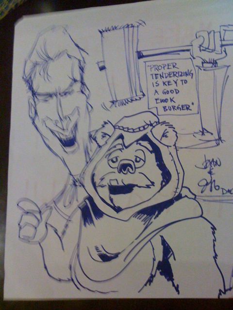
Collaborative marker sketch by Mr. Hartwell and myself.
Posted in Randomosity
Out of the blue, I got a fantastic set of potential layouts for the HeroMachine 3 interface from all around awesome UI Guy Jim Marcus. You can see some of his other stuff at LiquidCrack.com. Here’s what he had to say about this redesign:
What I was trying to do was to keep the interface professional and recessive, so that the characters would pop. I wanted to try and make it feel very much like an application that might run on the desktop. I also think that the comic loving community is savvy and might enjoy a nice dark interface.
Here’s the basic page (click to embiggen all of the screen shots):

I think it has a very clean look to it, and everything seems to be organized rationally. The space is used well, and everything seems to fit. I especially love the various “View” options below the character canvas, that’s awesome. The space for the ad in the upper right corner is perfect and I don’t feel like it’s intrusive any more than it has to be.
If you can’t tell, I like this proposed treatment a lot. I definitely want to hear what you all think, though, and after the jump I’ll post the remainder of the screen shots. I’m going to put them in as a gallery, so just click on any one to see it at the larger size. And please, let me know in the comments what you think, what you like, what you’d change, and so on.
Posted in HeroMachine 3, Previews, Things I Like

(From “Super Mystery Comics” number 2, 1940.)
Posted in Daily Random Panel
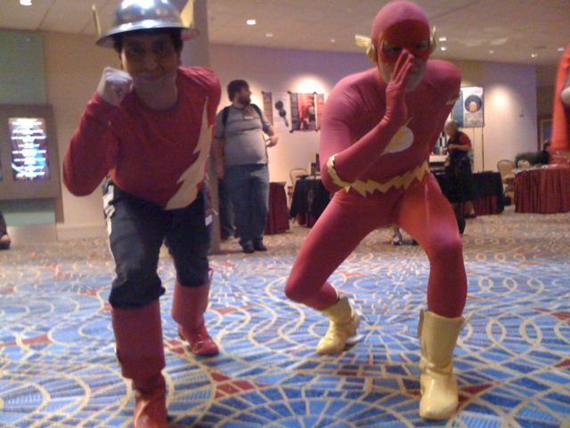
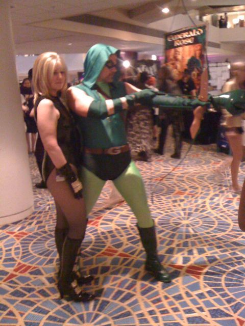
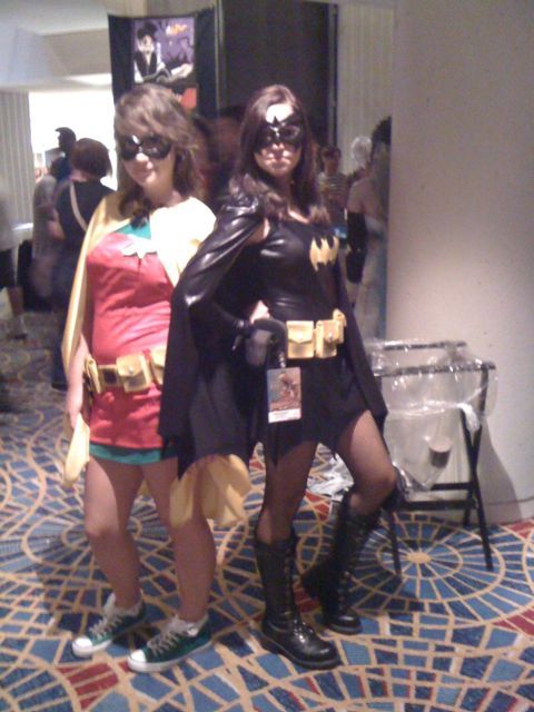
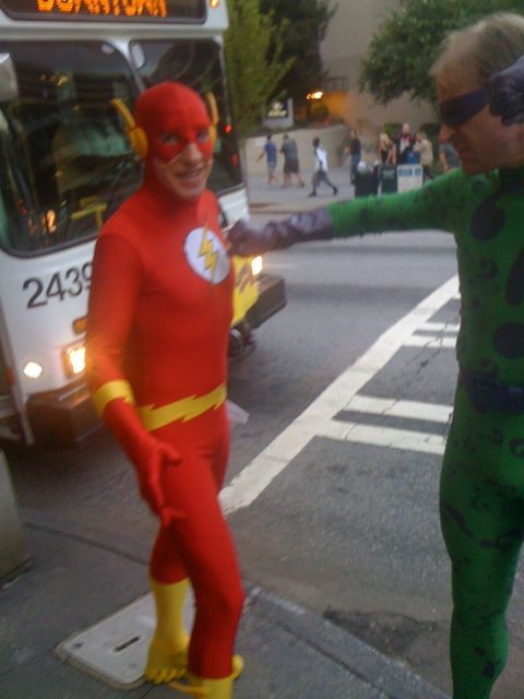
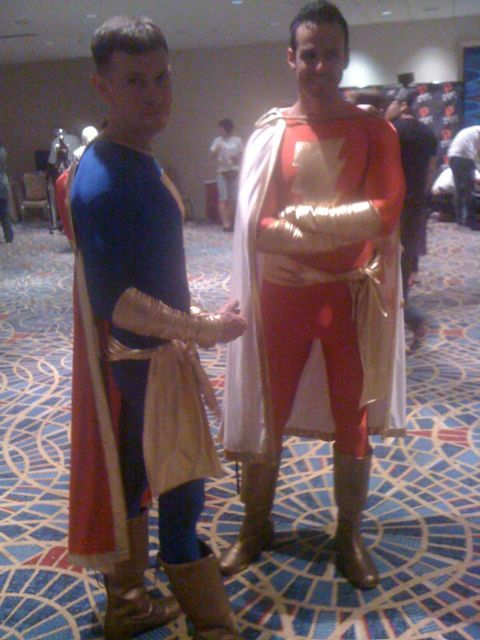
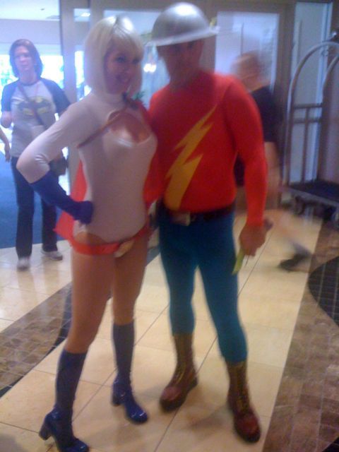
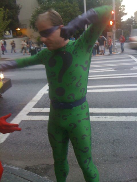
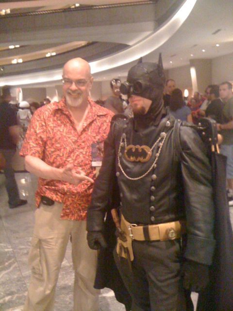
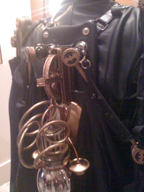
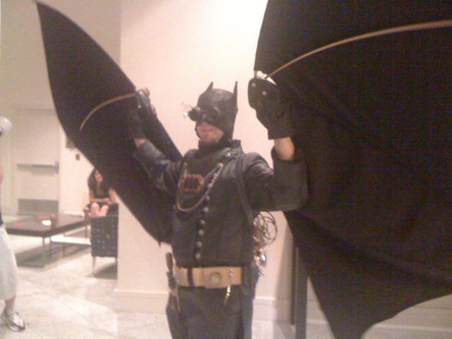
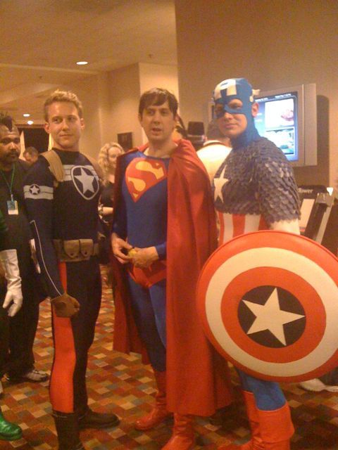
Dragon*Con has been fun so far. I passed Edward James Olmos in a walkway, said hi to George Perez. And have seen more unadulterated geek joy than you would think possible.
Half of the experience is, of course, the fan costumes. We’ve been taking a lot of photos (albeit with my crappy iPhone), and thought I’d share a few with you.
I am doing this via the WordPress app for iPhone, which I have never used before, so apologies if this blows.
Posted in Randomosity
 Three middle-aged nerds (including yours truly!) review all of the MCU movies in chronological order. Short, funny, and full of good vibes, check it out and let us know what you think!
Nerdmudgeon.com
Three middle-aged nerds (including yours truly!) review all of the MCU movies in chronological order. Short, funny, and full of good vibes, check it out and let us know what you think!
Nerdmudgeon.com
