Many thanks to everyone who entered Character Contest 16! This was a tough contest to design for, and even tougher to judge, as there were a lot of high-quality submissions. You all did a nice job, and even if I don’t include yours in the “Honorable Mentions” below, rest assured I still very much enjoyed it and you have my thanks.
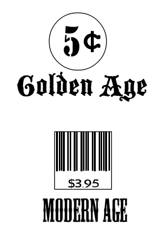
Before getting to the more serious entries, I wanted to present Hammerknight’s succinct summary of the biggest change from the Golden Age to today:
And with that, awaaaaaaaaay we go!
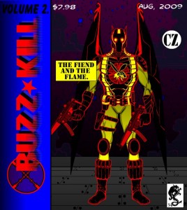
I thought DementedClown did a great job capturing the essence of Golden Age, Silver Age, and Modern Age comics through a set of three covers featuring “Buzz Kill” through the years:
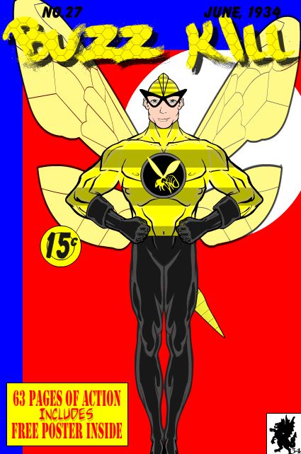
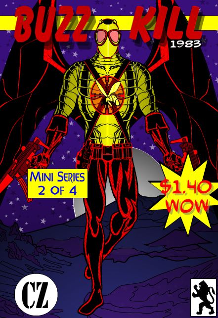
Not only is each character very reminiscent of the era, but the cover designs and blurbs are as well. I can’t even imagine how much time that all took, great job!
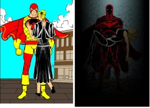
Lawrence also has alternate cover-style shots, featuring the same basic scene with two very different feels. There was definitely a “darkening” in tone and art both over the decades between the Golden Age and now, and Lawrence captured that very well with this duo:
Fishpants did something similar, though the big “Movie Premier” revamp poster is saved til the end. It tells a pretty good story of how comic book characters have been treated by major media outlets since the Forties, though.
Next we have two different people submitting a character with the same name, which I thought was kind of funny. The treatments are different, but work really well. First up is Kyle’s version of “Flyboy”:
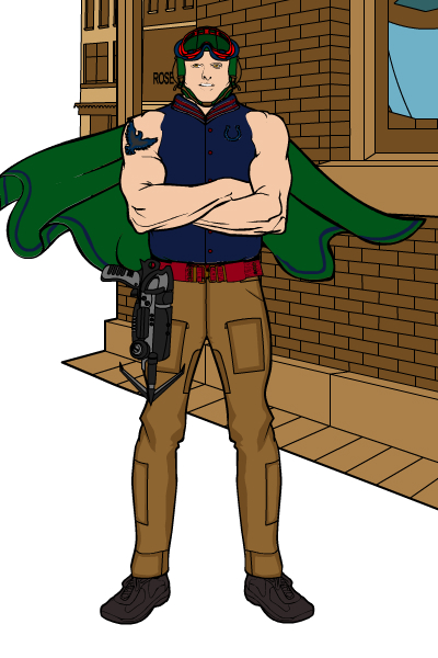
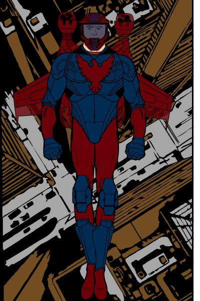
I particularly liked the Golden Age version, I think it captures the era very well.
Next up was Zyp’s take on the name. I think both of these illustrations are stellar, from the color choices to the basic character design to the fantastic falling scream in the Modern version. Really nice job on all this, Zyp!
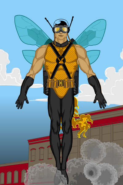
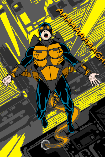
Finally, I have had a very difficult time deciding between these final few submissions below.
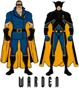
MartianBlue’s “Warden”:
I like the clear difference from the one version to the other, with the modern guy much sleeker and more detailed. I think the Golden Age Warden is perfect, a great embodiment of what characters from that time were like.
Matt’s “Furnace”:
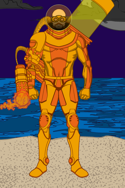
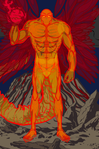
These are both stellar illustrations. I don’t quite get the jump between them as strongly as some of the others; although the Golden Age diver-suit guy is perfect, the demon version doesn’t quite follow it and could be almost anywhen. Still, fantastic looking drawings, with lots of excellent color choices and well-suited elements.
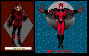
Kaldath’s “Jersey Devil”:
I particularly like how the Golden Age version is done in HM2, I think that’s very clever. And it looks like that time period as well, with the neck-mask and the horns and the more somber colors. The modern one is just as strong, I like the wings and the pose and the brighter red and just the overall more refined look.
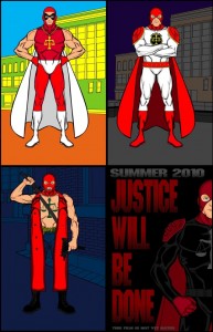
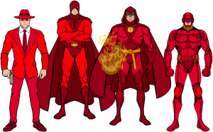
Brons’ “Men in Red”:
A great progression. I get a very “Phantom” vibe off of this, the reds ally them all strongly, and the designs are each great, which is hard to do that many times in a row. You can definitely see the evolution of the character through the decades.
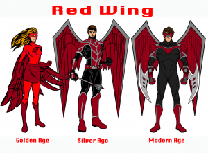
TitansFan’s “Red Wing”:
Our first gender bender! Like Kaldath’s, the use of HM2 here for the earlier versions is clever and well done. I like the changes in the modern version, it’s a very clean and appealing drawing. The giant blades are very Image Modern, too!
And finally, Rancid’s “Hawk”:
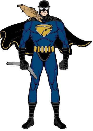
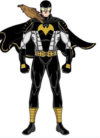
I like both of these illustrations very much. The colors, the costume elements, the way they echo each other but are still distinct, it’s all just superbly well done.
I keep changing my mind every ten seconds on this. They’re all so good. Aaaagh! Must … choose … one …
All right, that’s it — I’m going with my gut and choosing Rancid as the overall winner! Ultimately it just came down to each of the two illustrations being very strong on its own, and their working so well together. So congratulations to Rancid, who wins any custom item, OR a caricature of his or her face, to be included in HeroMachine 3. Well done!
Thanks again to everyone for making this such a great week, the entries were phenomenal. I am exhausted having to pick just one! I hope you enjoyed looking through them all, and even if you didn’t make the list above, that you’ll try again next time.


@Lawrence Was The 2nd Picture Inspired By The Infamous Crisis on Infinite Earths Cover? http://i27.tinypic.com/el34ph.jpg
@Rancid Congrats And Great Job
@Jeff Thanks Very Much For The Honorable Mention
Congratulations everyone, Thanks for the Honorable Mention Jeff, and Congratulations to our winner Rancid
Oh, I think I enjoyed this contest more than any other so far.
@Rancid: Congrats!
Congratulations everyone
Congrats Rancid, nice designs.
@Lawrence Seems To Be Alot Of Comics Using That Pose
http://i28.tinypic.com/2urbkno.jpg
http://i27.tinypic.com/3357hp1.jpg
Congrats to all the winner and others featured.
@Jeff, some very tough choices there. This was not only a really fun contest to do, but probably my favorite to watch. Really excellent submissions.
@Rancid, congrats. Well done. Yours was one of my favorites, easily.
@Zyp, I loved your Flyboy. The posing and composition were excellent and I loved the humor and “feel” of the pieces.
@MartianBlue, I really liked your contribution, and as I said above, you’re right, this contest was great, both as a challenge and for the great submissions.
Congrats Rancid and everybody who entered. Great job! This one was definitely fun to see.
They were all excellent. I was particularly impressed with the way Lawrence was able to use HM 3 to place the female figure in the hero’s arms in the “modern” version.
Congrats, Rancid! Fishpants is my fav though. You people rock with HM3!
Stellar job guys, and congrats to Rancid. (Have Jeff draw your face so Hakoon and me aren’t all alone in there… 😀 )
Congrats to the winner and to the honorable mentions! This was a great contest and I loved almost all of the entries! Thank you, Jeff, for a contest with such a cool theme!
Yay! Honerable Mention thanks Jeff and well done everyone else.
@ demented clown.
You’re right you do see it a lot of places but that one is from a batman cover. http://www.fanpop.com/spots/batman/images/2808645/title/detective-comics
@dementedtheclown
I don’t know why superheros insist on lifting people like that. It could do spinal damage! Silly superheros.
@ Lawrence Im Curious How You Made That Pose, A Tutorial Would Be Awsum
holy persistence batman I WON at last !!! thanks i didnt think i would win with all those great entries. how do i get in contact to tell you about my choice?
You deserved it, Rancid 🙂
You can either post your prize request here, or use the Contact Us form at the top, or email me directly at afdstudios at gmail dot com.
@dementedtheclown
Sure thing. I figured that her arm and head etc was pretty self explanatory so a focused on the torso and legs. I also put a clearer image on so that you can see the detail a bit easier.
http://forums.ugo.com/attachment.php?attachmentid=62239&d=1253210396
http://forums.ugo.com/attachment.php?attachmentid=62240&d=1253210411
The main part of this is just adjusting the proportions of the components which takes up most of the time. The parts are quite straight-forward. I used the forearms in the “body section” to make up her leg, stretching them out. Her stomach was an enlarged upper arm.
Her bum is just a stretched out head and so are her boobs.
To stop her arm looking to “manly” I just made the line colour the same as her skin to cut out the muscles.
There is another all black head where her shoulder would be to stop her torso looking like a giant arm.
I hope this makes sense.
Wow! Well done everyone who entered and special congrats to Rancid. I wish I hadnt missed out on this contest though, it looked really fun- but work, though less important, has to be done… 😉
@Lawrence Thanx, Wish My Internet Wasnt Getting Turned Off Now lol