Many thanks to the many entries for the “Angels and Demons” character creation contest! We had 74 entries, which is fantastic, and as in the first three contests the quality was quite high. After the jump I’ll display the ones I thought were particularly deserving of mention, and then finally the overall winner. If you don’t see yours here it’s not that it wasn’t good, it’s just that I only have so much space. Thank you very much for entering, everyone!
Alais amazed me with his illustration, because it’s one of the rare examples of someone doing something with my program that doesn’t look like I am the one who drew it. Which hurts my brain, but is simultaneously very cool:
The consistent scaling and color scheme combine with a clever design and a minimalist setting to make an actual composition that’s very striking.
Next, Andre had several entries that I liked a lot, but I just wanted to choose one to highlight here. Check them all out, though, they’re really nicely done. This is the one he calls “Final Drayar Angel”, and I chose it because a) it’s a nice looking illustration, b) I liked the way the different sash lengths combine to make a new loincloth effect, and c) I like the way the weapons echo the wings.
Apollyna turned in a fairly traditional conception of an “angel”, but I think this is an excellent example of how important your palette selection is for making a solid, interesting drawing:
The multiple wings are nice, along with the hand selection and as I said, the yellow/off-yellow colors really set the whole thing up for success.
I think my favorite part of Dan’s “General Baal”, besides the “I am totally nuts” facial expression, is the way he used shoulder pads to make big ol’ honkin’ Frankenstein boots:
Certain design elements showed up several times, as you’d expect given our shared cultural iconography when it comes to angels, but I think Darkvatican did a nice job personalizing his angel with the multiple flame effects and the Namor-like ankle wings. The two-part upper tunic with the loincloth looks great together, thanks to his consistent coloring on them.
My favorite of Darkvatican’s entries, though, is this fallen Lucifer:
Look at those wicked cool hands! I just love the semi-transparent look, and how they seem to float over the “real” hands thanks to the patterning. A really inspired effect, I love it.
Hammerknight always brings something new to the table in terms of creativity, and this week is no exception:
Most people heard “angel” and immediately went with a European conception, but Hammerknight took a different tack with his Native American interpretation. It’s a really nice shaman-rific look that still works into the overall concept. Nice job!
Iago mentioned in his entry that he had the hardest time making this wine glass, which I can believe because I have no clue how he did it at all:
More than fancy effects, though, much like Alais he manages to create a unique feel to this illustration through the use of coloring and the subtle rescaling of some of the facial features. This guy has a real sense of personality, and the image overall looks like a professional illustrator did it. It really strikes a chord.
Isia also has an ability to put together extremely coherent and interesting compositions, and her “Demon” is no different:
What drew me to this one was the deer antlers, to be honest. I love me some “Hearne the Hunter”.
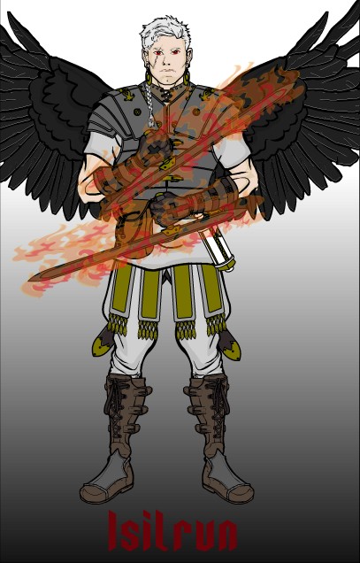
I was really close to choosing LoneWolf’s “Isilrun” as the winner:

He really nailed the “hard-bitten angelic fighter” vibe here, particularly the combination of the flaming swords with the muted clothing colors, the combat boots, and the eye scar. This guy looks like he has a story to tell, and I want to hear it!
I don’t have anything particularly intelligent or insightful to say about Timespike’s “Lonely Warrior”, I just think it looks cool:
I love how Worf put this scene together, it was completely unexpected:
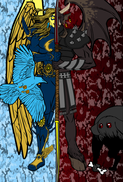
Finally, your winner really blew me away. When it came up on my screen I just stared at it for a few seconds. My first thought was “Wow, that’s cool.” My second thought, which still hasn’t been resolved, was “How the hell did he do that?” He’s got a great philosophical underpinning to go with it too, which I encourage you to read. Here it is, the winning entry for the HeroMachine Character Contest 4: Angels & Demons”, Solander’s “The Inhuman”!

Isn’t that neat?! Great job Solander, and all of the Honorable Mention/Finalists above, not to mention all of the other great entries submitted. I’ll post the next contest here in a little bit, but in the meantime, keep on bringing your imaginations to life!


Ho. Ly. Crap. I never expected that. Solander, that is freaking amazing. Everybody else made some very awesome stuff too!
(PS, Jeff: Wine glass item?)
How DID he do that?!
i give up i’m not worthy of the mighty jeffs time 🙂
Don’t give up RJ! I actually had Thunderhoof in as a finalist, but I just had too many by the time I got to it and had to leave it out. You’re doing great!
awwwwwwwww shucks
Good job Solander. And thanks Jeff.
Some FANTASTIC entries this time around. Wish I’d had time to enter… 🙁
Congrats to Solander, but my personal favorite is Isia’s. That is damn cool.
I don’t envy you Jeff. Those were some pretty awesome characters. everyone did a fantastic job coming up with their versions of angels and demons, i don’t think i would have been able to decide on the winner, although you made a good choice. CONGRATS SOLANDER! that is just too cool.
Aww, I entered mine too late. It would have been a futile effort, however; I didn’t see Solander’s entry before I entered. Mine was like his except much worse.
Thanks for the mention, Jeff! I am genuinely honored.
Yeah, the wine glass….
It’s a whole bunch of the deep crescent insignia layered together, with other insignia pieces forming the stem and base. I messed with the opacity on the top parts for like, half-an-hour to get it just right. Hope that helps if anyone wants to make their own.
I’m late in my comments, but way to go, Solander. I told you that one was very well-conceived!
Thanks to Jeff, for listing my entries. Maybe next time, eh? ^_^
As soon as I saw that on the forums I knew it would win! Congratulations Solander!
i give up i’m not worthy of the mighty jeffs time 🙂
how did solander do that some1 plz answer meeeeeeeeeee!!!!!!!!!!!!!!
Wow, I never thought that entry would actually win the contest. Thanks for the nice compliments and congrats everyone!
For those interested in knowing how I made that image, know that it took a lot of trial and error. Making the demon half was the easy part, the hardest part was how to morph it together with an angel half. I solved it by selecting equipment that would only cover half of the characters’ body, like the half-iron mask, and then using other items like the bird and the hair to “hide” those parts that I didn’t want to be visible for the viewer. Sometimes I also had to use several copies of the same item and build them on top of one another. But the real trick was using the double-bladed sword-staff to cover up any remaining parts in the center, making it look like some sort of a fused angel/demon hybrid.
And Jeff, for the winning prize could I have a caricature of my face added to HM?
Absolutely Solander, and thanks for sharing your secrets. As usual, what looks like magic turns out to be a combination of hard work and imagination!
Just send me an email (afdstudios at gmail dot com) with a good front-view photo of your face Solander and I’ll definitely add you in.
Speaking of adding faces to HM3, you know what would be cool and/or funny? If you added in celebrity faces. We could have Super Burt Reynolds, or Keira Knightly: Vampire Slayer. 😀
You probably couldn’t do that since it would most likely violate copyright in some way, but you gotta admit, it’d be awesome.
Imp, the current set of male faces are actually already based on famous folks. I tried to fudge a bit so they’re not automatically recognizable, but I’ve got a couple of athletes, a couple of actors, and the guy Alex Ross uses for Superman 🙂
Sweet heaven/hell type image! Definitely way ahead of the pack.
But, now we’re stuck with Solander’s mug forever! :rolleyes:
.
.
.
( kidding! )
THAT IS SO SICK SOLANDER INSANE DUDE INSANE!!!!!!!!!!!!!!!!!!!!!!!!!!!!!!!!!!!!!!!!!!!!!!!!!!!!!!!!!!!!!!!!!!!!!!!!!!!!!!!!!!!!!!!!!!!!!!!!!!!!!!!!!!!!!!!!!!!
@Jeff: I thought one of those faces looked familiar – is the Ross Superman the one with the snooty/nose in the air look to him? 😀
Yep, that’s the one Imp! One of the others is very Patriotic, in a Seventies family sit-com kind of way. And yes, that’s a riddle.
I know that it would have been nearly impossible to make the wine glass just right with the current pieces, but it looks like he took a bite out of it.
Awesome contest; awesome entries. Solander’s pic really blew me away when I saw it – a deserved victory sir! LoneWolf’s illustration was really cool as well!
That picture was amazing. I can believe someone could do that, but the hard part is trying to believe someone could accomplish it without giving up. Congradulations Solander!!!!! And great job to everone else!!!!!
grim reaper
http://s668.photobucket.com/albums/vv48/300_01/heromachine/?action=view¤t=art020.jpg