The Nerdmudgeon Podcast
 Three middle-aged nerds (including yours truly!) review all of the MCU movies in chronological order. Short, funny, and full of good vibes, check it out and let us know what you think!
Nerdmudgeon.com
Three middle-aged nerds (including yours truly!) review all of the MCU movies in chronological order. Short, funny, and full of good vibes, check it out and let us know what you think!
Nerdmudgeon.com

Sponsored Links (which Premium Members will never see):
Comments Off on Random Panel: Is any guy EVER sorry about that … ?
Posted in Daily Random Panel
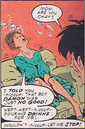
When you've got Carnivorous Humanoid Underground Dwellers in your pants, believe me, you welcome getting kicked in the junk by a hot chick in spiked heels:
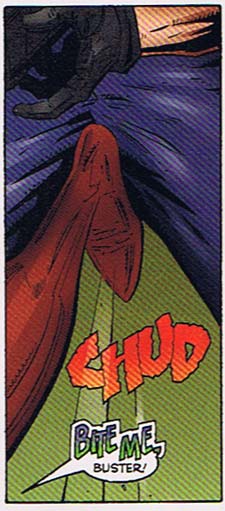
Although given the fact that the underpants carnivores like the taste of human flesh, I think it would have been more polite for her not to mention biting. But that's just me.
OnomontoPOWia -- it saves lives, my friends.
Comments Off on CHUD
Posted in OnomontoPOWia
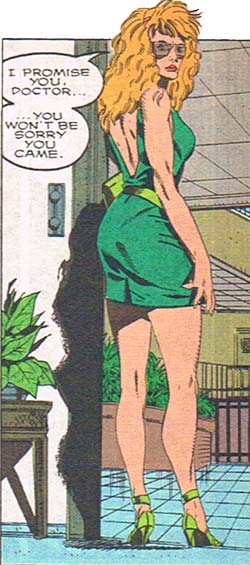
Comments Off on Random Panel: More attractive than YOU, upside-down-mouth 'fro man ….
Posted in Daily Random Panel
I'm about 70% done rewriting the HeroMachine code from the ground up for the series of "Minis" I've talked about before. These are intended to be rapid-development applications like the Rock Star Edition or the Real Life Edition, which won't have the sheer volume of items in the full 2.5 but instead will focus on more of a "niche" type of area. I needed to have actual items to test the code on, so I had to choose one of the "Mini" varieties we've discussed to get started with. I settled on the Face Maker, because it seemed like it would benefit the most from the new features I wanted to include like line coloring, scaling, moving, etc. Keep in mind, the whole idea here is that once I get the code base finished, filling new versions with new and different items should be a breeze. I'm hoping to put out at least one a month when ready, maybe two if I can really get it down to a science.
Anyway, even though I only have two items in each slot so far, I think it's showing promise. Here's a screen capture of what I've done to date. I should be finished up with the basic code early next week, at which point I'll begin really pumping out the items. Note that the colors and the look of the interface is just a shell, to be "prettied up" once everything's working.
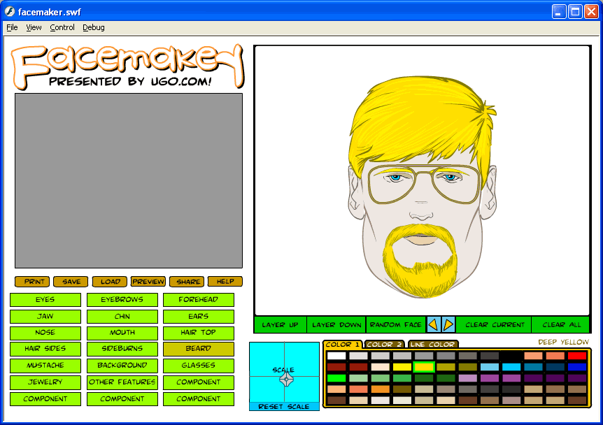
The big-ticket functionality items still to address is the layering, the printing, and the saving/loading stuff. All of that's pretty close to the current code so I don't think they'll be very hard to do. I was most worried about the scaling and moving the items around, and that's worked out pretty well.
Note that the beard and the mustache are actually two separate layers. I was able to shove them together to make it look like an all-in-one Van Dyke kind of thing. That's one of the early, and surprising, benefits to movable item slots -- it's very easy to tweak things around to make new combinations that would not have been possible otherwise.
I've also been very surprised at how much of a difference being able to change the line color makes. I always thought that was kind of a cheesy request, but once again the user community knows far better than I do.
Once all the buttons have at least minimal functionality, I'll probably post a very early beta for you all to play with and critique.
Comments Off on The Facemaker cometh
Posted in Previews
I interrupt today's scheduled OnomontoPOWia post to instead encourage you to head over to Comics Worth Reading to comment on the entries to the "Men of the DC Universe" contest. So far no one like my entry, which is making me sad. Don't you want to see me happy instead? Host Johanna Draper Carlson is going to base her decision partly on the positive comments left there, so go be positive about whichever one you like best!
Comments Off on Men of DC
Posted in Challenges, Super-Hero Stuff
Comments Off on Random Panel: I thought EVERYONE was interested in that!
Posted in Daily Random Panel
When I was looking through my old sketch books for the early HeroMachine designs, I stumbled upon the first comic book concept I worked on as more than a passing fancy. A friend of a friend and I worked through actual story ideas and I came up with a number of conceptual sketches that I remember being fairly proud of at the time. Nothing ever came of those discussions, but I've scanned the drawings in and re-inked them:
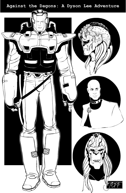
The Dagons were the bad guys, if I recall, and representing the forces of humanity was Dyson Lee, Space Marine. Or Navy SEAL. Or something, we never figured out which. I do remember envisioning that humanity was controlled by a very powerful theocracy, founded on the notion that everyone in the military voluntarily enslaved themselves to the hierarchy for the duration of their service. Hence the chain links as rank insignia on his uniform there.
I also argued that men and women both who were in the military should be bald, since that made the most sense in a helmet-wearing zero-gee environment. Looking back on it that might have been pleasing from a story-telling standpoint, but likely would have been disastrous in terms of marketing.
Sometimes I step back a bit and marvel at the sheer creative energy that geeks like us put out. I mean, I would bet that every person who's reading this has a hard drive full of the remnants of whole worlds they've imagined, whether in the form of a half-baked comic like this one or that great American novel that never quite came together. People describe today's generation as passive consumers, but at least the gamer/geek subculture is anything but. What we love about comics and movies and gaming is that it helps us feel creative. It spurs us to create our own worlds, our own characters, and if, like the Dagons and Dyson Lee, they never make it to print, well that's all right too. At least they live on in our imaginations.
Long live the geeks!
Comments Off on It's good to be a geek
Posted in Cool Characters, Fantasy & Sci-fi
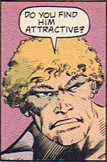
Comments Off on Random Panel: Villain or 'Depends' spokesman?
Posted in Daily Random Panel
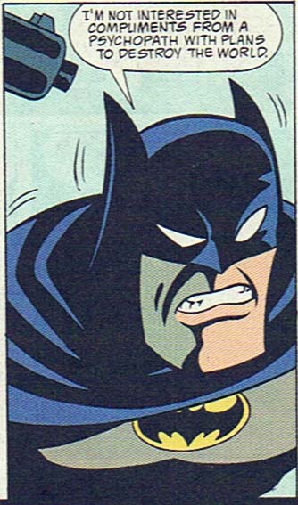
Try to guess what I hate the most about this Batman costume redesign from the pages of "Chain Gang War":
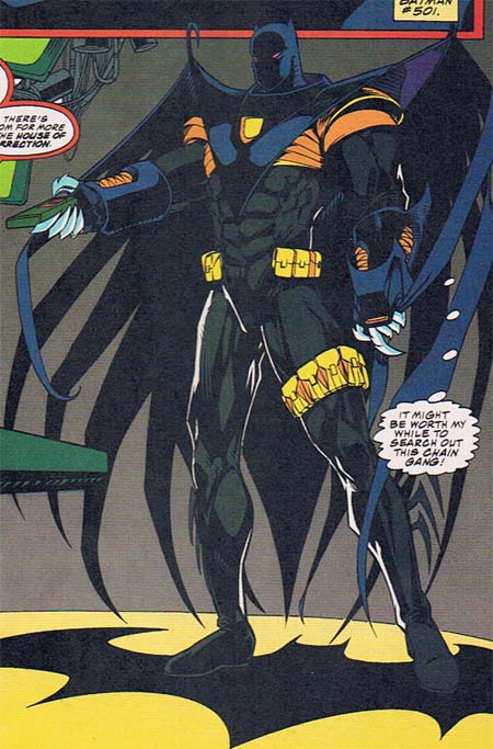
Notice anything missing? How about the most recognizable super-hero logo on the planet. Imagine an iPod with no little apple on it, or a Nike sneaker without the swoosh. What's the point of investing all that time and energy into making your brand instantly recognizable, only to leave it off the product? I know the temptation to tweak legendary characters is powerful, but this effort really blows it.
Besides the lack of a logo, the entire assemblage betrays the essence of Batman. He's supposed to be about speed, agility, stealth, and lethal force delivered with precision, but this costume comes off as bulky and ponderous. From the rigid, hook-tipped wings with long flowing streamers, to the massive gloves and metal fingers (metal freaking fingers?!), this outfit looks like the worst parts of an Iron Man and Spawn love-child. There's very little "Batman" in it, which may be why he's reduced to standing on a giant Bat logo to remind himself of who the heck he's supposed to be.
And just why the heck is Bruce Wayne getting all dressed up to watch TV anyway? You'd think he'd be comfortable enough to take off his mask and kick up his feet in the Batcave, but apparently not. I bet he goes through a lot of remotes, too, as those metallic fingers punch right through the plastic buttons. I also wonder if he required the leg pouches to offset his utility belt's lack of a cinch, buckle, or any other method for actually hooking together. At least he was able to get it in the extra-thick 'Image' size.
I could go on and on about the yellow banded armor under the thick cape front, or the strange blank yellow hole on the chest piece, or the silly fringe on the boots, or the bizarre energy blasters on the gauntlet, or the lack of a mouth-hole in the mask, or the tiny "Catman" style ears, but suffice it to say, I hate this redesign.
Comments Off on Hello, is Batman in there somewhere?
Posted in Bad Super Costumes, Super-Hero Stuff
 Three middle-aged nerds (including yours truly!) review all of the MCU movies in chronological order. Short, funny, and full of good vibes, check it out and let us know what you think!
Nerdmudgeon.com
Three middle-aged nerds (including yours truly!) review all of the MCU movies in chronological order. Short, funny, and full of good vibes, check it out and let us know what you think!
Nerdmudgeon.com