Everyone's been able to enjoy HeroMachine 2 and the expansion for free for quite a while now, thanks entirely to UGO. Because they're both paying the hosting costs and providing my daily bread, I've been able to work on the program full time. And what makes that possible for UGO? Ads.
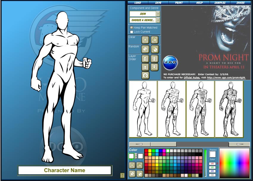
So as you can imagine, good ad placement is pretty much key to making this whole free thing work. As a result, we're trying to come up with a way to include an ad right in the Flash applet itself instead of just placed around it on the page. The proposed interface looks like this (click for a larger version):
Let me know in comments what you think about this change -- is it too much, or alright? I removed the icons for some of the basic functions like loading and saving and moved them to a menu across the top, how do you think that is working? What about the loss of the message window?
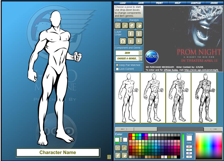
Update: After some discussion on the HeroMachine Yahoo Group, I have submitted this tweaked version for consideration (click for full size version):
I've included a small static text box explaining to the new user what they should do. I also moved the dropdown boxes for component and genre closer to the previews, as that's where most of the activity occurs.
it looks really good. the ad fills its function without intruding on the application too much.
This is a good spot, the message window is kind of useless, but the add is a little big, if you dropped the size a little bit, this would be good. If we click on the adds, does it make you or UGO more money? ‘Cause if it does I’ll click ’em a coupla’ times when I come to hero machine…
well, I guess it would be okay if it would make you happy. Personally, though, I don’t like the idea of cramming everything off to to the side to make room for that add. It very much ruins the feel of the application and, in my humble but accurate opinion, commercializes it a bit *too* much.
“Commercialized it a bit too much”. That is kind of the point. UGO is providing this to the users for ‘free’. If I can use this for free, but have to see an ad (discretely placed of course) I’m in favor of it. The other option could easily be cough up $20 (FYI – in April 2007 that’s exactly what I had to do to get my desktop version – prior to the downloads being free).
The balance between ads and content is a difficult one, and something I think every such site struggles with. The folks on the Yahoo Group have expressed some concern over the size of the ad relative to the content area, and the animated nature of a lot of the UGO ads as they’ll look in the application.
I think everyone has a different threshold of tolerance for ads, to Rick’s point. Some people are perfectly willing to have something for free supported by ads. Others would much rather pay a fee and not be bothered with ads. I don’t know that there is one perfect solution that satisfies everyone.
A subscription model has been suggested, but that involves a lot of infrastructure on the back end (a way to process credit cards, keep track of billing information, provide password and username support, etc.) that UGO doesn’t currently have. At least the user account stuff is available on the forums, but they’re kind of a separate world.
I agree with Doomed Pixel, the ad within the space itself seems a bit much. Are the banners on every site not enough? I know I always notice them when I visit the app page, and if they catch my interest, I click on them. Ugo’s Top 100 video game weapons was definitely one of their best yet, and I’ve noticed and clicked through the ads for movies quite a bit. I don’t think the ad is necessary.
However, altogether, if it can advance the HM project further, I would definitely be comfortable with it just replacing the message window and the rest of the app left as-is.
^That’s what I was going to post yesterday, but I didn’t get a chance. Now that I see this new pic, it’s not so ugly, and I suppose with the way the message window is sized currently in HM, that may be a bit small for the purpose. Therefore, in the spirit of going with the flow, if an add must be added for further and further progress, I would just ask that it not be animated like a regular flash banner. That could become very distracting and particularly make it difficult to focus on colors. I think in this way, it could be programmed to have the same ad on the page as well as in HM, but only one animated to get more info- the HM ad would be more there to grab your attention.
Whatever you and UGO end up working out, I think we just collectively ask that it be plain and simple, the very thing that made us fall in love with Hero Machine itself.