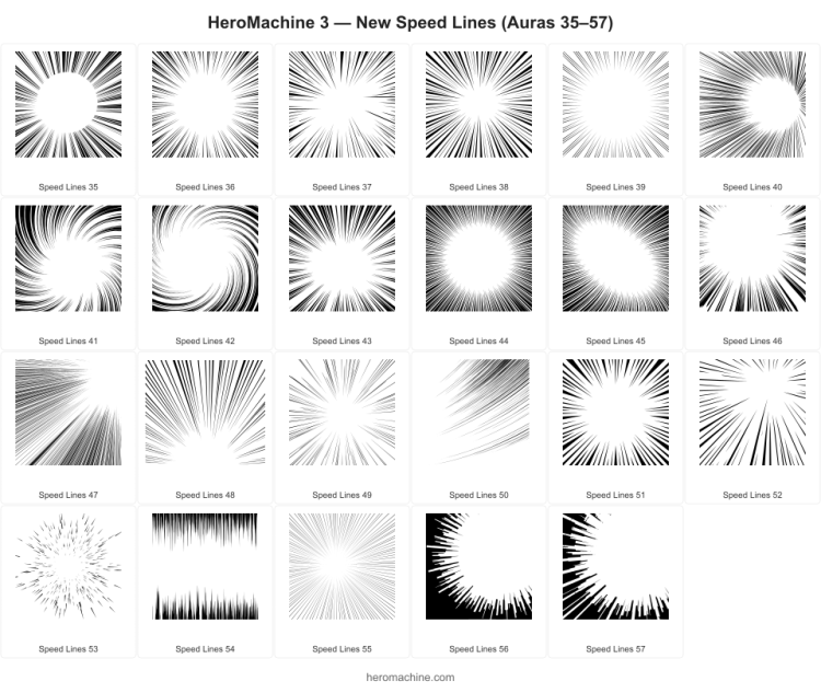
I’ve just released some additional items for the Backplane -> Auro set, more “speed lines” to make your character GO FAST! I hope you like them.

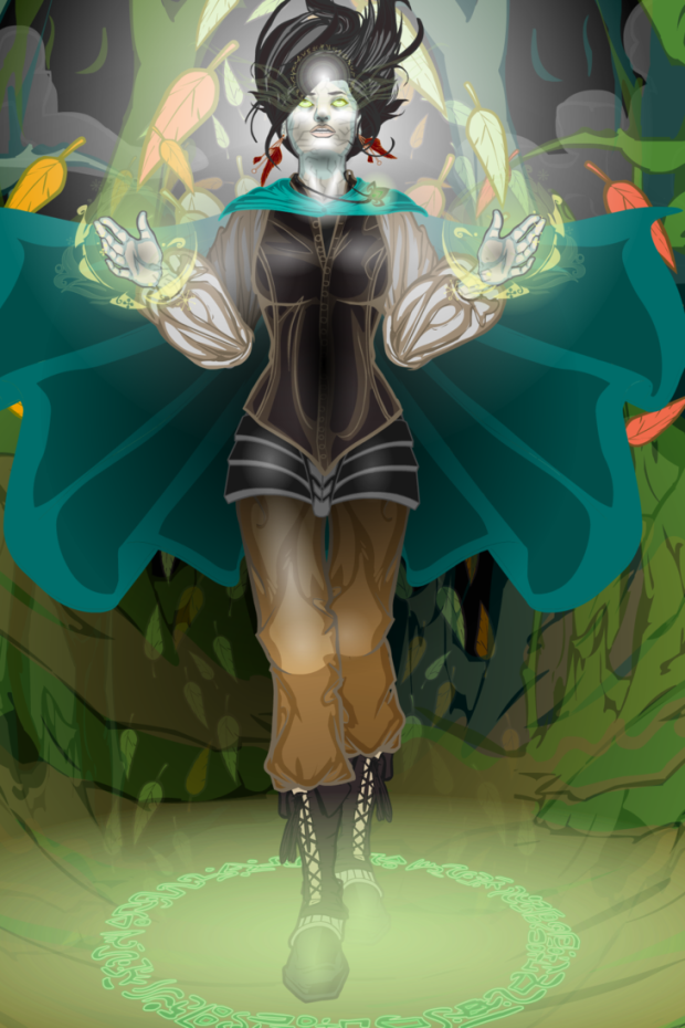
Design custom characters using thousands of mix-and-match art components all hand-drawn in classic comic-book style! Pick a body, add costumes, weapons, backgrounds, and more — no drawing skills required. No Flash required, it all works in your browser and is 100% backwards compatible for any creations you’ve made in the past.
I’ve just released some additional items for the Backplane -> Auro set, more “speed lines” to make your character GO FAST! I hope you like them.
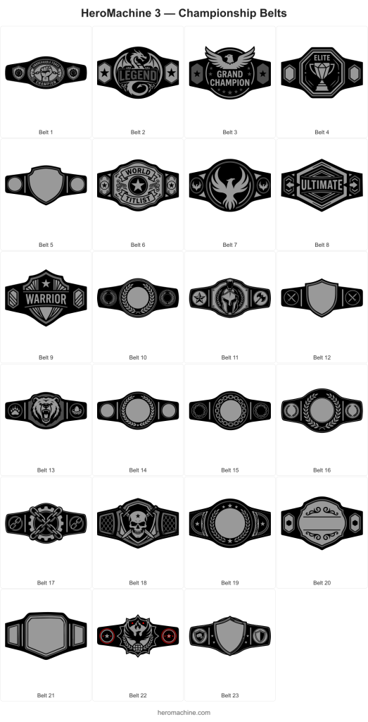
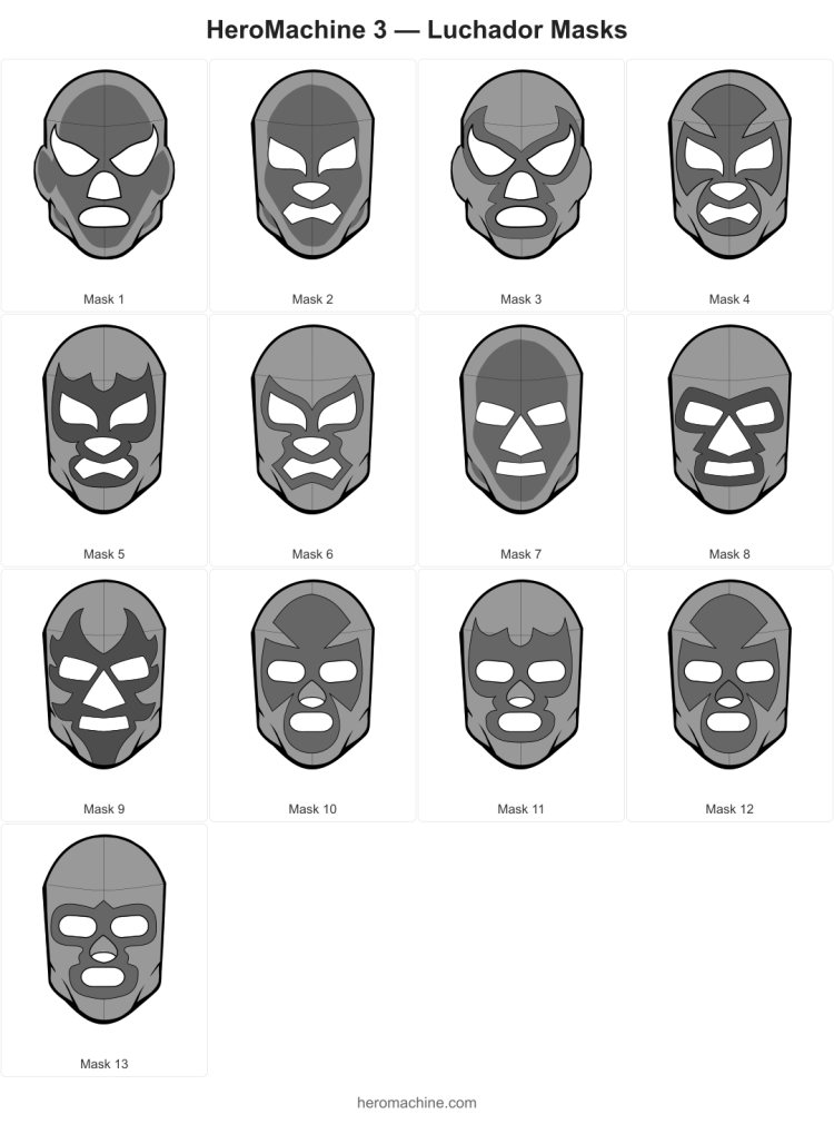
With many thanks to all the folks who’ve requested these kinds of items and who’ve waited patiently for literally years, and especially to AMS and Colby Primeaux for timely reference and guidance, I’m happy to launch two new wrestling-themed sets, Headgear -> Luchador and Belt -> Championship.
The belts are a little unusual, ones with nothing in the big center area have the itemMask set to that shape, so you can position Insignia or other items to fill it without the edges bleeding over.
On the masks, this is just a basic starter set. I don’t know the world of wrestling all that well, but I included a few blank masks with the eyes/nose/mouth holes cut out so you can mask other items onto it to get the custom look you want, hopefully.
Enjoy!
I’m working on the Luchador masks lots of folks have requested over the years and I’m struggling a bit because I don’t know that world at all. Here’s what I have so far, what direction should I go from here?
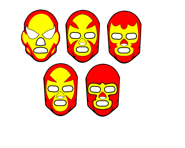
Should I be adding seams to make them more realistic? Come up with a set of x patterns (the yellow area shapes) that get repeated across different eye/nose/mouth shapes? Make a blank overall head/mask pattern, then add individual eye/nose/mouth shapes that you could apply the skin color to, then mask eyes/noses/mouths to from their sets? Add shading for that interior head color on all items (the yellow area on that first example)? Ears or no ears?! I’m floundering!
I really don’t know where to go from here. I also haven’t found a great image reference for these so I don’t know what kinds of designs are useful.
Help?
Dblade continues to impress, this time with two new helmets that are built with 3 individual items each. 6 Items total. Here’s a preview of the individual Items along with a preview of them placed together for the full effect.
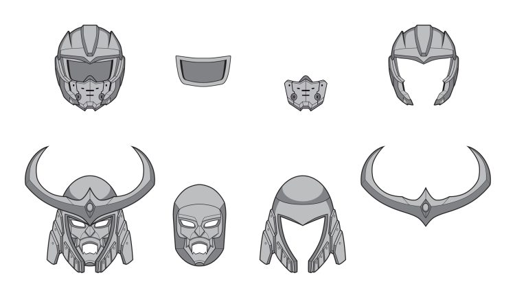
These were based on some requests from Yuri Lucia, so shoutout to both him and Dblade!
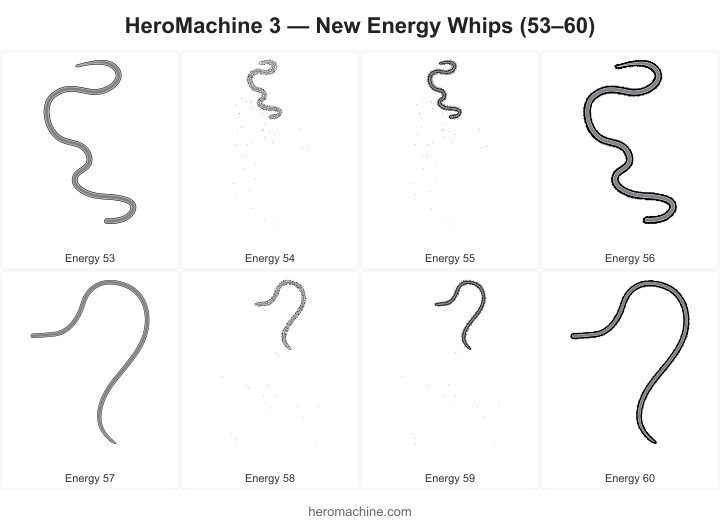
Cracking good artist Dblade has whipped up a great set of new Item Right/Left -> Energy for all your sci-fi Indiana Jones needs. Please thank him in the comments for his ongoing excellent work!
 Three middle-aged nerds (including yours truly!) review all of the MCU movies in chronological order. Short, funny, and full of good vibes, check it out and let us know what you think!
Nerdmudgeon.com
Three middle-aged nerds (including yours truly!) review all of the MCU movies in chronological order. Short, funny, and full of good vibes, check it out and let us know what you think!
Nerdmudgeon.com