
Sometimes, the pics I feature in these posts don't jump out at me first time round and I have to go back and look through galleries again to find something. It's not because there's anything wrong with them, it's just you sometimes have to take that second look to truly appreciate some things. Things like this weeks COTW, for example.
I think the reason I only really looked at this one properly second time round was because of the fact that it was only uploaded as an attachment to the post on Vipers forum thread, so the picture size was smaller than it really needed to be for the design to really come across properly. But when I did view it in full size, there was something special going on.
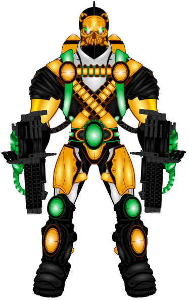
Let's start off with the colour scheme, which is…. vibrant, yeah, that's a good word. You have a lovely layering effect with the colours on the costume (much like with DeleriousAl's picture last week), where you have two foreground colours that do most of the work, being eye-catching and bright (which they are a lot of both) and then you have the calmer, more grown up and refined background colours, which hold the whole thing down. Think of it like a band, the black and white aspects are like the drums and bass, providing the rhythm/ backdrop for the singer and guitarist (the orange and green aspects) to really shine. If you took them away it would be a complete mess, with two star aspects vying for attention and clashing horribly, but with them there, it's a tight and streamlined outfit that works well together.
The fantastic colour scheme is then further bolstered by some pretty damn fine shading. It is really hard to get highlighting with white to work, but it does here, probably because it is mixed with colour highlighting, white for the green and white parts, yellow/ golden orange for the orange and grey/ silver for the black. It just mixes well. I also light the attention Viper has put into the shading, which you can see on the shoulders, the slight highlight around the rim of the neck and the dark orange shading on the arm, all of which make the character really pop off the screen.
Finally, we have a bit of an oddity. The body shape of the character is very disproportionate. I don't know if the Bruce Timm style male body was used at all, but that's the vibe I'm getting. The shoulders are far to wide, the legs are tiny compared to the arms and the head is massive. It's wonderful. It's cartoonish, outlandish and if you add the vibrant colour-scheme and the bright highlighting, it just makes the character seem special. I like it.
Vipers Forum Gallery Thread- Viper's Multiverse
(Thanks to RobM for the idea to link the featuree's gallery , feel free to shout at me in the comments when I inevitably forget to do it next week).
