
I thought you might be interested to see how an illustration goes from concept to final product. The client wishes to remain anonymous so I'll be leaving out their name and identifying characteristics of the characters.
It all begins with a description and, ideally, some sort of visual concept of what the principals look like. Here's the art spec I was given:
I would like to draw two characters ... They are a duo of paranormal investigators. XXXXX is a detective with psychic abilities. He works with a talented amateur, XXXXX, martial artist and sharpshooter. They are loosely based on Steed and Mrs Peel. I'd like to see them fighting off glowing presence of a supernatural creature.
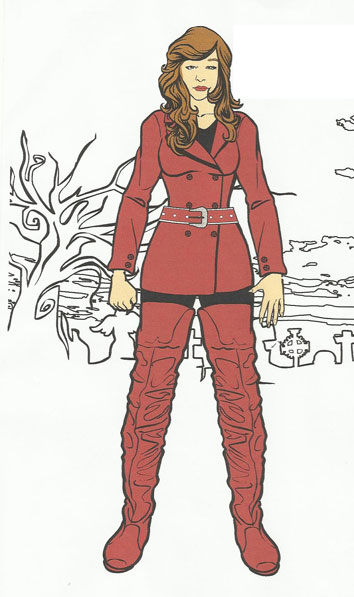
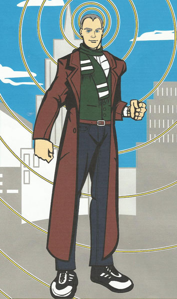
That's nice and clear -- I immediately know that it'll be at least three figures in the final illustration, and that it should have some action. I need to get across the idea that one of the principals has mental powers and the other is a woman of action. The hardest part of these is usually getting the look of the main characters right, but in this case I lucked out and also received a couple of HeroMachine-created concepts:
Armed with those and the description, I put together three rough thumbnail layouts for the client to choose from. The goal at this stage is not to get all the details right, but to keep everything loose and general, trying to get the general placement and theme right.
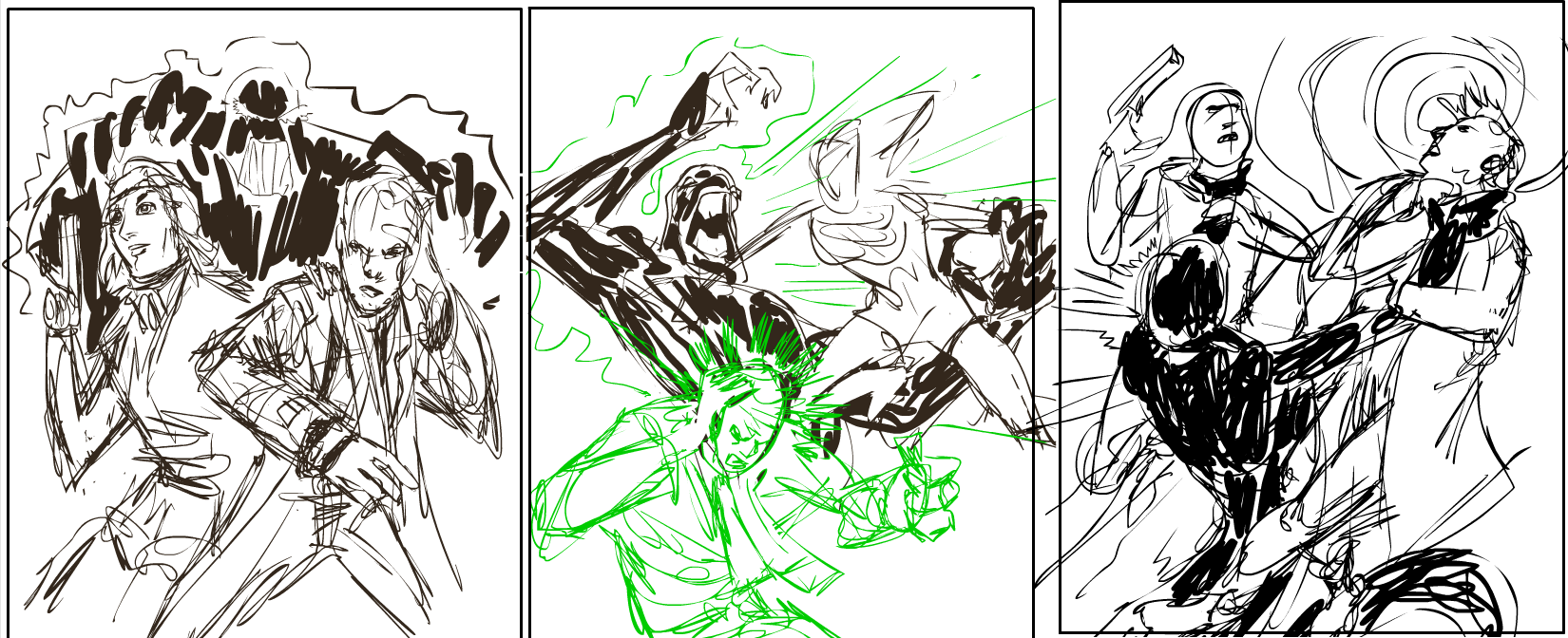
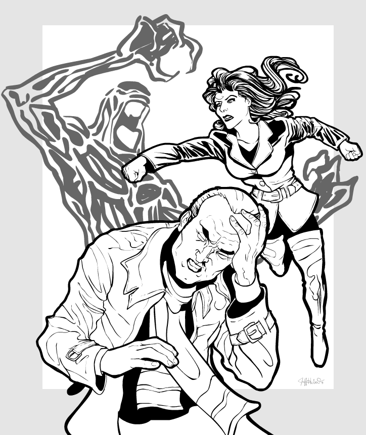
They liked all three but preferred the middle one, since it showed more of the characters' design and had a bit more action than the others. So with that as my rough, I did the first complete "pencil" sketch. Since I draw directly into the computer with my Wacom tablet, I'm basically inking the illustration at this point as well. Typically each figure or element takes a couple of iterations to get right, each one building on the layer below it until the final one is polished.
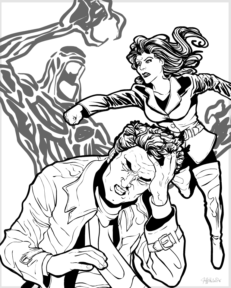
Everything passed muster except the male character's hair -- it was too long and made him look a bit too young. So I gave him a shorter cut and added a bit of aging in the face:
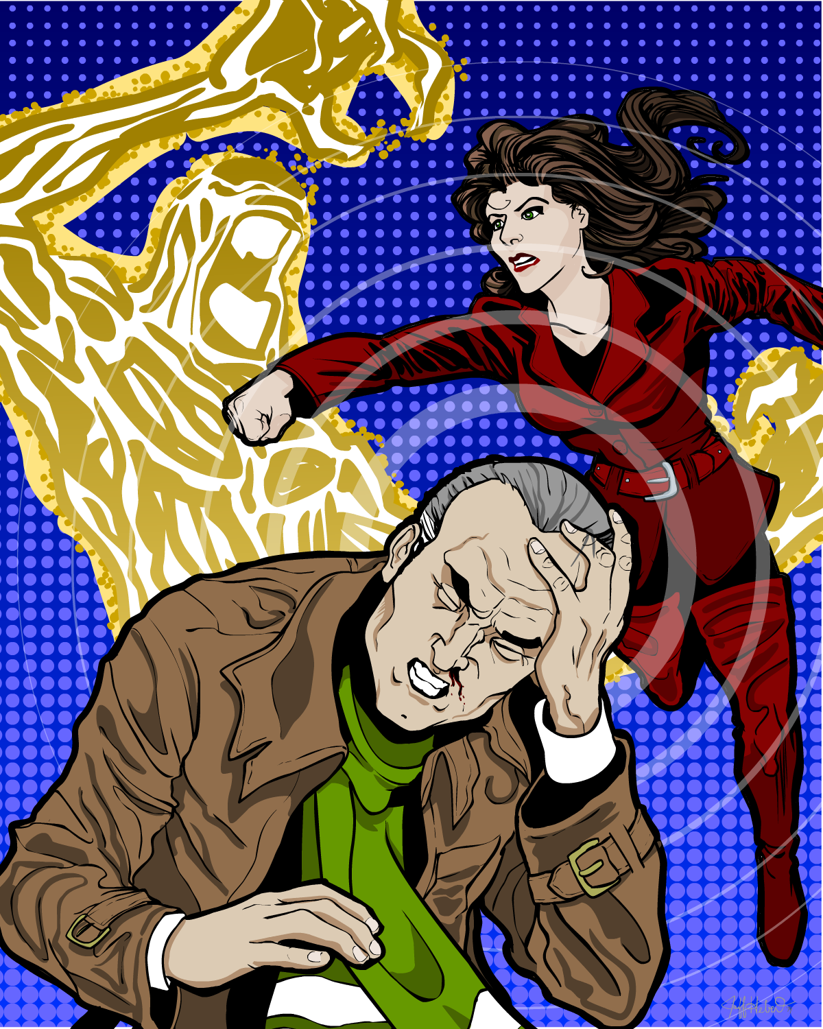
With that, we were a go on the line art and could move right into color!
On a technical note, each figure or element is three separate layers -- the black line art, a completely white fill just below that, and a color layer in the middle. That way the black line art is always available and clean, and overlays the colored bits. I can color over the lines, in other words, and since the black line layer is always on top you can't see the scribbles that bleed over a bit.
Anyway, my first attempt was a bit of a cheeky treatment for the background that I figured probably wouldn't get accepted, but it was too fun not to do. The whole thing has a sort of "Avengers" (the old TV show, not the comics characters) feel to it so I wanted something vaguely Sixties:
Sure enough, the client wanted to go in a different direction. Luckily, since I work in Flash and everything is on its own layer, it was an easy change to make:
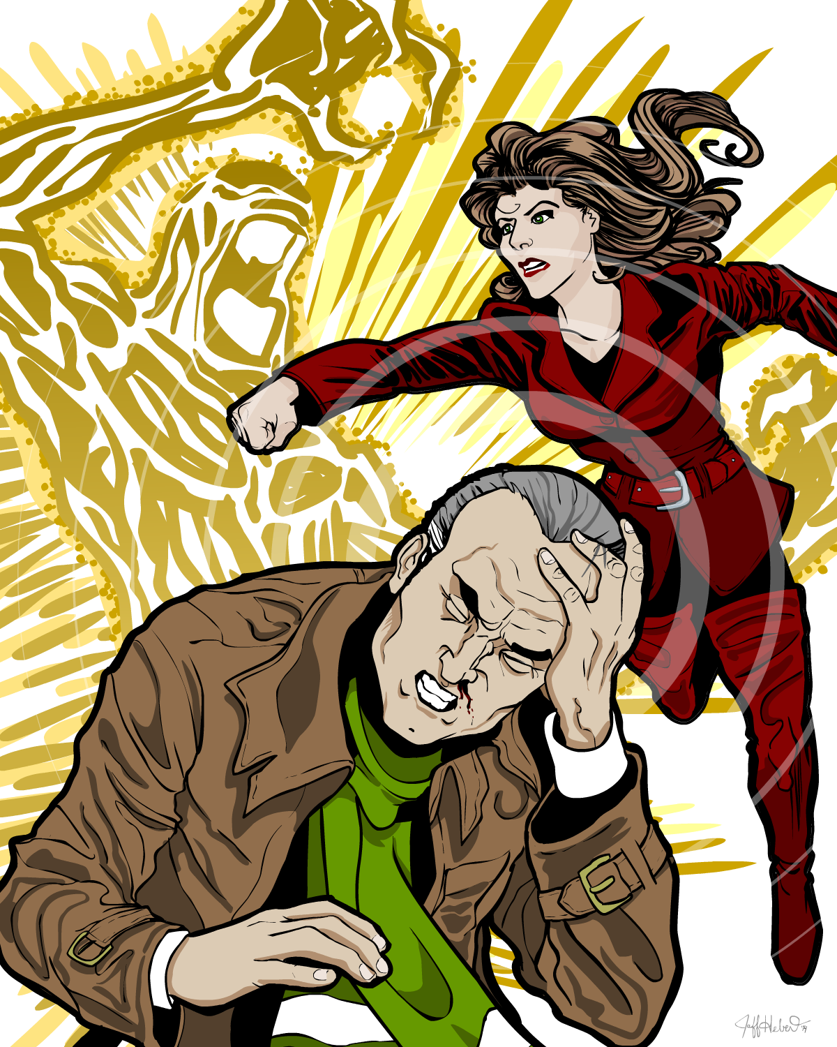
I actually think this works better both for the layout and the color selection. The yellow works well with the brown in his coat and helps sell the idea of the creature "glowing" per the original spec.
After this was approved, I added a nice banner and title treatment, but since that has the name of the main character on it I can't show it to you.
I hope you enjoyed this brief look into the process of making a custom illustration!
