I'm working my way through a great usability study Mark Shute did (for which he got an outstanding A+ in a 700 level course -- woot Mark!). Before I actually hack up the code, I wanted to present the basic layout and concept here for your input and feedback.
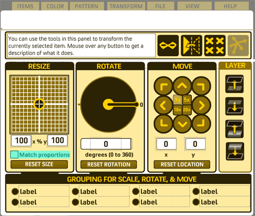
One of the key recommendations arising from the study was the need for better explanation of the tools, and to put more of them in dedicated tabs. Here are the proposed changes for the Transform tab:

I've introduced a text field at the top left that will change as you mouse over each function, explaining in more detail what it does. The main impetus for this is the Mask tool, which confuses lots of people. I don't know if this will be enough space to explain what needs to be done, though. Mark recommended putting Mask onto its own tab, but then that seems to be MORE space than I would know what to do with.
Other changes here include renaming Scale to Resize, as there was some confusion over what Scale is supposed to mean. I also did away with the lock button for the Resize control, since some folks expressed an expectation that a lock meant you wouldn't be able to change the values at all, not that the proportions would be locked. So I moved that down to its own line and made a check box labeled "Match proportions", hoping that would be more intuitive. Finally, I did away with the brown "go triangle" buttons, as no one got what that was supposed to mean at all. Instead simply hitting ENTER or removing focus (i.e. clicking on anything else) will set the value as entered.
I also moved the Mask, Flip, Clear All, and Random buttons here as they seemed more Transformative. The goal is to remove all of the control buttons from the area between the ad and the character window and instead put them in the appropriate tabbed area. At present the tabs would be Items, Color, Pattern, Transform, File, View, and Help.
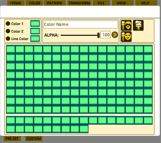
You might notice that the three separate color tabs would be consolidated into just one. Mark found that people were confused by having them separated, but that radio buttons were much easier for them to grasp. So now all the colors are set in the same place. The "Color all Skin", "Color all Hair", and "Paintbrush" tool buttons are also relocated here. Eventually I'll probably have a "Clear all colors" type of button here too:

I've had requests to bring back the "swap colors" and "apply color1 to color2" types of buttons, but I honestly don't know how to implement that, layout-wise, for three colors instead of two.
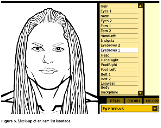
Finally, the most ambitious (and hardest) of the suggestions Mark made was to take the now-clear area between the ad and the character to put a constantly updated list of items currently on the character, like this:

Ideally, each item on the list would be stackable by dragging it to the level you wanted. That's going to be really hard to program.
Anyway, there you have it, the major changes I am undertaking to the interface. Please let me know what you think of these, as well as any other major things you can think of that you would like to change.

