HM3 Journal: Like an onion

Onions have layers and make you cry, which is exactly what HM3 has been all about the last few days. I've been working on getting the layering stuff all worked out, which has been more challenging than I anticipated. Unlike the Minis, in HM3 all items are in the same "bucket". All of the "Headgear" items were in the Headgear bucket, so if you wanted to move a particular Headgear item on top of, say, a Mask, while leaving all the other Headgear items below it, well, too bad. You can't do it.

But in HM3 all the items and the layers they are on stay in the same bucket, so you can put any item on any layer you like. Which is good. But by default, I want it all to layer as you'd expect, with hair on top of the head and belts on top of pants and footwear on top of the feet they're supposed to go on, etc. My goal is, for anyone who wants to just use it with the basic defaults in place, it'll function just like HM2.x, more or less. I thought that would be easy to pull off, but it wasn't.

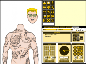
I finally got the layering stuff working today, though, and to show you the fruits of my labor, here's the latest screen shot:

Notice that I also am about to get "grouping" working, so you can move, scale, and rotate nested items together. In other words, you can move the Hair with the Headgear and the FacialHair and the Mask and the Head all at once, or make them all the same size at once, etc. Pretty neat. It doesn't actually work yet but it will. I swear it!

Anyway, let me know if you see anything hinky or if you think of something it'd be cool to have.

Oh yeah! I forgot I also got a primitive "Zoom" feature working so you can get up close on the head for more of a classic "portrait" sort of look. I need to make it more fully-featured, but the basic idea is there.

18 Responses to HM3 Journal: Like an onion

  1. Violodion says:

    Ahh, the joy of programming! Funnest part has always been troubleshooting. Grouping, layers, and styles has been where the big illustration programs shine. One wonders how the folks making Inkscape pulled through it. 😀

  2. Ballin' Boy says:

    Glad to see those layer all the way up or down buttons. The rapid clicking on the minis were starting to become a problem for my index finger.

    Wondering what is going into that white bar under the flip, delete, and outline buttons?

    I was thinking what if you moved the save to file/disk/make jpg buttons to a tab or something since you only need them once. Then you could add more buttons over there. And hope the delete and random buttons all get moved to either the top row or bottom row so it’s less likely to accidentally click on them.

    Last thing I notice it says bodies and zombies in the tabs, which indicates there’s more bodies. Is this the case, and if you do have different ones I hope the Modern Warrior pose is in there too, I’ve recently discovered nice things I can do with it in the mini. Plus the broad shoulder look is nicer than the skinny shoulders.

    That is all, we know how hard you’re working and I speak for myself when I say I appreciative the fact you’re not half a**ing it. (excuse my french) And are going all out. I’m sure this would have put down a lesser man by now.

  3. Jeff Hebert says:

    Thanks for the feedback, guys.

    The space between the canvas and the ad, currently full of the big brown and yellow buttons, will be changing. The buttons there now are being moved to various places, I’m not sure where everything will end up to be honest with you.

    Currently the “Body” slot does have the Warrior stuff in there, but it doesn’t quite fit. I need to resize it. I’m thinking there will be different styles of bodies available. Currently I have mostly Zombie stuff because all the items are already sized and coded properly, I just have to rename a few things and they’re good to go. It makes for good testing.

  4. Kaldath says:

    If it were possible, I’d like to see the canvas about 50% wider, or at least a Photo Mode where it drops all the contols and the ad centering the character in the window so anything the does fit into the regular window with the controls up can be completely visible when takeing screen shoots or using the save ( to JPG ) feature.

  5. Tracy says:

    This is looking great! Keep at it, I can’t wait.

  6. Danny Beaty says:

    Will there be Brick and Teen poses? Just kidding.

  7. Scorpidius says:

    Lol @ Danny!!!

    It’s coming on a treat Jeff!!

    I agree with Kaldath about the canvas size. To be able to have your character in full detail instead of cutting parts off your fine artwork (eg wings huge swords etc) would be a big plus!

    Scorp

  8. Jeff Hebert says:

    @Kaldath: Yep, a “Preview Mode” like you describe is already on “The List” of things to do before too long.

  9. Eric says:

    “you can move the Hair with the Headgear and the FacialHair and the Mask and the Head all at once, or make them all the same size at once”
    That’s going to be a useful feature.

  10. Damien says:

    Will you be, at some point, redrawing the earlier items so that they match the newer designs? just curious. Also, a “cape clasp” in Capefronts come to mind

  11. Ballin' Boy says:

    Question about the quote in Eric’s comment. I agree it will be useful, but will it move all the items from a slot or just the ones in a single area? You know just in case a headpiece, or something gets used somewhere else on the body?

  12. Jeff Hebert says:

    @Damien: I don’t know how I’m going to go about deciding which items go into the final, to be honest with you. Redrawing the same ones is possible, but … I dunno.

    @Ballin’ Boy: It’s done by slot type. So if it started out as a LeftHand item it’ll be part of the “Current Item Only”, “All ‘LeftHand’ Items”, “LeftForearm”, “LeftArm”, “UpperBody”, and “All” groupings even if it’s currently being used as part of, say, a boot or something.

  13. Ballin' Boy says:

    Why not make the modern warrior the default and have the zombie and horror stuff as the additional pieces? Cause the zombie pose is not my favorite to be honest.

  14. Ragdoll. says:

    but make sure there’s more girl hair.
    and bettie page bangs, pour moi.<3

  15. Damien says:

    Have to agree with Ragdoll, I’m afraid. Not just girlie hair, either. Can we get some guy hair that doesn’t resemble premature baldness?

  16. J says:

    Your minis look really good aside from the windows being too small. As far as the layering goes though I’d love to have more control. Not just an up or down arrow. They are definately a step (or several) in the right direction though.

  17. J. Tester says:

    Lookin’ good, man. Keep up the good work!