I've been called out before for saying Rob Liefeld's early Nineties Image work was lazy. To belie such baseless and scurrilous refutations, I present just one piece of evidence out of the dozens I could have chosen from the Liefeld written/created/pencilled/inked "Youngblood" number 2:
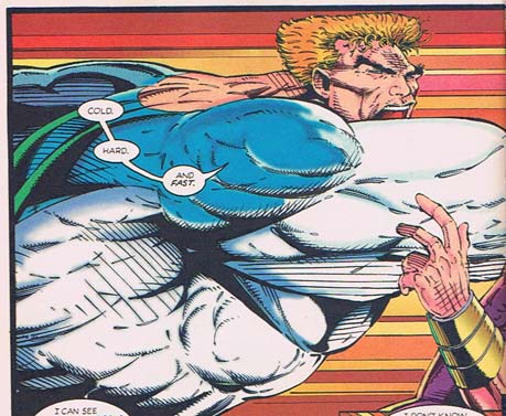
That's "Brama" (get it? like the bull? genius!) throwing a punch at Prophet so big it spans two entire pages. A punch so big it has transformed the background into a Star Wars hyperdrive-like expanse of horizontal lines. A punch so big it has apparently severed Brama's own head, simultaneously squashing it flat and propelling it forward a good foot.
Seriously, look at his head. Notice how flat the top is -- usually you've got about as much space above the eyeline as you do below it. And look where it's positioned on the neck in relation to the torso. It ought to be back about two inches and about an inch higher, if this were an actual human figure being represented.
One explanation might be the aforementioned self-decapitation due to force-of-blow. But I think we all know that's BS.
Another explanation might be that Rob Liefeld is a genius who is dynamically reinterpreting human anatomy to reinforce the awesome action being portrayed. But I think we all know that's BS too.
The simple answer is, Rob Liefeld ran out of room to fit the figure into the panel. He roughed out where the torso and arm and punch were, and didn't notice that he hadn't left enough space to squeeze the head in at the top.
So rather than resketch the layout, he just decided to squash that sucker in there wherever and however it fit, anatomy be damned.
And that, my friends, is just flat out-and-out lazy.
(Note: I'm renaming this category "Reasons I Hate Rob Liefeld's Art", with Reason #1 being "He doesn't understand human feet face different directions". These reasons are not in order of how much they make me hate his art, they're just kind of random. And I didn't name it "I hate Rob Liefeld" because I don't even know him; he might be a swell guy. I just hate his art.)
(Image and characters © Rob Liefeld, 1992, from "Youngblood" #2.)
I’m so in love with Fridays. Looking at this so-called “art” is indeed the perfect excuse for getting comfortably numb before bedtime!
That, and before crawling under my blanket, I can recite the prayer “Oh thank gods 90s are over!” over and over again.
Rob’s total disregard for all things anatomical becomes farcical very quickly. Allow me to add an additional observation:
To what *&^%ing origin point is that massive pectoral attaching? Good grief, Rob, I’ll lend you one of my anatomy books. Really. I will. Or I’ll buy you a subscription to Muscle & Fitness magazine. You’re so *&^%ing lazy, you can’t be bothered to realize that from that angle, the *&^%ing pec would angle down from shoulder to sternum. Based upon the rotation of the torso, with the arm up at that angle, we’d be seeing mostly RIB CAGE, with maybe a little bit of pec. The pec would be seen from behind.
But no, Rob, you’re so *&^%ing lazy, so *&^%ing stupid, you show us a pec in profile, attached, inexplicably, to the latissimus dorsi. The latissimus dorsi is that big muscle ON YOUR BACK, Rob. Repeat after me; the pectoralis major DOES NOT attach to the latissumus dorsi. Say it again, Rob. And again. And again.
And again.
You know, I think Rob Liefeld is true inspiration…
No seriously, hear me out. I’ve always had low self esteem about my sketching abilities (really, they’re bad), which is exactly why I exploit Jeff’s own far superior skills to bring my creations to life. But now I’m looking at a *PROFESSIONAL* artist: One who gets paid (!With money!) for his artwork… and I know more about human anatomy than him… It makes me think, “Hey, maybe I don’t suck so much after all”.
True that, Jester.
jeff, i just had an idea for another contest using the HM minis that i find hilarious: since the mini lets you move the limbs and stuff around, you should have a contest to find out who can make the best (or worst, i guess) Liefeldian characters.
I was reading through some old integrative arts stuff (http://www.psu.edu/dept/inart10_110/inart10/cmbk10gimmick.html) and found a bit that made me literally laugh out loud: “[Image] would take the industry by storm with high-quality artwork that had never been seen in a comic book.”
Liefeld…high quality art…AH-hahahaha! Oh, my. Just let me catch my breath.
All right, to be fair, Liefeld *is* the absolute worst of the Image founders. Todd McFarlane’s the next-worst, as far as art goes (his characters lacked spine…or at least several important bones, in order to bend as they did), and he’s miles and miles above Liefeld.
It’s important to note, the author realizes that Image is firmly planted in (as he himself calls it) the Gimmick Age, but apparently doesn’t realize that most of Image’s titles were *all*-gimmick.
Anyway, the article continues praising Image: “Another improvement to the comic art was a thing called computerized color separation. This new technology would enhance the art several times over.” (Because, clearly, only Image had the new technology.) Y’know, I’d hate to see the *un*enhanced version of some of those muddled, no-background, over-lined, what-the-hell-is-going-on panels we’ve seen.
Yeesh.
(It’s unrelated, but I can’t help sharing this last bit of unintentional giggles, where the author highly recommends Maxx: “This is one of the most consistently done, exellent pieces of work in existance, with every issue done tediously by its creator, Sam Keith.”)