JR thanks for the input.. I have to agree the cape just is not working and the boots do not belong with the overall feel of the suit . i did some reworking which while not yet perfect I think is better I also know elements of this will show up else where [URL=http://s421.photobucket.com/user/leemccree/media/Royal-1_zpsr5mbhkxo.png.html][IMG]http://i421.photobucket.com/albums/pp299/leemccree/Royal-1_zpsr5mbhkxo.png[/IMG][/URL]
[rapid scuttle through lair with worried expression, types “allow for isostasy” into automated graph keyboard set into wall, awaits answer for ten seconds, reads, releases large swath of bubbles]
. . . what’s ‘irrelevant factor to current calculations’ mean? [irritated mumble, heads for dictionary]
@JR
1. Here’s a closeup of the actual thing and the pieces I used:

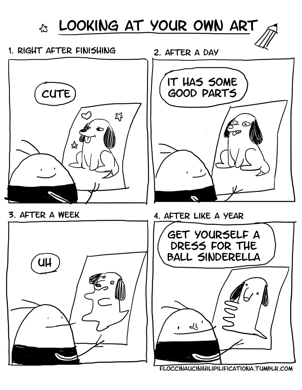
2. For every piece I actually finish, there are ten that never see the light of day, so that’s why. Understandably, only the ones I really like get shaded. I also refer to this comic.
3. I’m glad 😀 This one has been sitting half-finished in my box since the last time I was around.
The meaning is: Outdoors is MANLY!
Seriously, though, that’s awesome. Usually when is see abstract stuff like that, you can seespecific, recognizable parts from heromachine, but this is very well done.
Dude. That, that is awesome.
Two questions? 1. How did you do the right hand? It looks soooooo cool. And 2. How can you be so consistently amazing?
Oh and 3. Why is this now my favourite picture of yours? I must ascertain if this is indeed true by studying your gallery very very closely.
Ok, few things. 1. The face looks very menacing, I like how emotionless it looks. 2. I like how you’ve done the thigh armour, it add continuity from the arms, considering there’s no similar leg item to those gloves. 3. Not sure that the boots fit the overall style of the rest of the costume (the items shading is different and the line art is a different style), but it isn’t that big of a problem to detract from the rest of the design. 4. I can’t say I like the cape, it looks messy. I understand what you were going for, but having the cape you masked on to not have an outline makes the masked cape look weirdly broken, especially on the green version. Plus obviously you don’t have an upper outline for the sides of the cape up near the arms. But overall, good design.
[quote=137172]wow, extremly original team detected! (+1 intensifies) the “&” name shall win name of the year award, i am 100% sure about it (+1) simply wonderful! (big +1 for you) [/quote]
Why, thank you! I was going for one of those during-credit montages that they wind up using a still from to bridge the dead air between show and commercials. “and” as a character name is something I’ve done before in writing. It was originally supposed to be an excuse to use no capital letter at the beginning of a sentence, but hey, it turned out to be indicative of an inability to just do one thing. Supertaskers are practically speed demons, right?
********
“Thoth Startled Hearing Smashing Stone Tablets”
I had a thought about this one. Somewhere or another, be it an external dimension or a distant planet, the being thought of as Thoth might have been listening in while tapping at a relief when humans started being irreverent toward aliens or supernatural beings even greater than himself by smashing the Ten Commandments’ stone tablets. He goes into an ibis’ pose as a defensive reflex, he turns and hunches to defend himself with the hammer, popping the hidden Book Of Thoth unpasted from his headwrap which goes flying into a corner. Dust settles a bit. Silence.
Then he blurts out, “FINE! Humans. Awwwk!”
http://i1067.photobucket.com/albums/u438/jamais5/2015hm/HerrD-ThothStartledHearingSmashingStoneTablets_zpsdofnasrn.png
*WLAE
P.S. I forgot to mention, his loincloth makes a reference to how he ‘enabled’ five lives to be created in his thrice great craftiness, and so ruined the perfect year . . .
psychically checking a clone? how . . . unethical! Why can’t people just leave clones in peace?


 Three middle-aged nerds (including yours truly!) review all of the MCU movies in chronological order. Short, funny, and full of good vibes, check it out and let us know what you think!
Nerdmudgeon.com
Three middle-aged nerds (including yours truly!) review all of the MCU movies in chronological order. Short, funny, and full of good vibes, check it out and let us know what you think!
Nerdmudgeon.com