Here’s my first entry into the “30 Characters in 30 Days” challenge, Von Goetz, ruthless Aerostadt Commandant of the Fatherland Imperium:

By all means, feel free to post links to your own submissions here as well!

Here’s my first entry into the “30 Characters in 30 Days” challenge, Von Goetz, ruthless Aerostadt Commandant of the Fatherland Imperium:
By all means, feel free to post links to your own submissions here as well!
Posted in 30 Characters Challenge
This video features three of my favorite things: Adam Savage (from “Mythbusters”), Patton Oswalt, and comic books. Enjoy!
Posted in Bad Super Costumes, Super-Hero Stuff, Things I Like
Sometimes a super hero costume is so bad, it leaps off the page and slaps you upside the head with its hairy thighs. OK, ew. But because it’s a drawing you can sort of let it slide. As a case in point, I present to you the classic Superman villain, Vartox:

Note the leather Speedo, the always-repulsive male thigh-boots, open vest with no shirt (the better to gaze upon the hirsute majesty of his manscape), and of course the Bert Reynolds Memorial Mustache, without which no homage to macho would be complete. Yes, this looks like your worst “My Dad dressed up for Halloween” nightmare, because it is. At least, if you’re Sean Connery’s kid, because this wretched bit of sartorial madness originated in his movie “Zardoz“:

And here you see the reality that as bad as something might look as an illustration, reality can be far, far worse. In no universe, ever, have gun belt suspenders holding up orange diapers over thigh-high leather boots been a Good Look for a man. Like, ever. Cap it off with a receding hairline and long pony tail combo and you, my friend, have achieved epic levels of bad costuming.
So on Halloween, please, I beg you, do NOT go out dressed like this. Or on any other date. Or planet.
Posted in Bad Super Costumes

(From “Cat-Man Comics” number 2, 1942.)
Posted in Daily Random Panel
It looks like we are up, at least for the moment. Hooray! Only four days … Geez. I am really sorry for all the hassle, aggravation, and down time. This is certainly the longest and worst outage I’ve had in the five years or so I’ve been with DreamHost, but hopefully we’re here to stay for now. Let me know if there is any weirdness going forward. I apologize again.
To make up for it, here is Yoda versus a Balrog. Because I don’t know if you’re aware, but Disney just bought Lucasfilm and the “Star Wars” franchise for $4 billion, announcing that they will be releasing Episode VII in 2015.

Posted in Meta
By: Andrew Hines
 With the end of the current series fast approaching, Peter Parker is in for what may be one of the craziest adventures of his tenure as Spider-Man. We’ve already seen him put the end of the world on the back burner (ba-dum tssss), possibly cure Dr. Connors for good and put the world’s worst sidekick in a permanent time-out. Now, with both his life and identity on the line, two hobgoblins dueling it out and Madame Web seeing visions of a dark future, this is the beginning of the end for our web-headed friend.
Dan Slott has done a fantastic job in the nearly two years since his run on Amazing Spider-Man began back in 2010. The recent partnership with Christos Gage has been a really good one. There are all kinds of great characters in this issue. The story picks up after the events of #695, and the pacing continues steadily. The dialogue is great and in parts I found myself reading it in the voices of the old animated series of the 90s. The story’s good enough and tackles the two-part arc pretty well. The character interaction is pretty good and the ending is just enough of a teaser to keep you interested in the next issue.

This is one of the best single pages of ASM in recent memory. The art team does very well with Giuseppe Camuncoli as the penciller and Dan Green as the inker. Camuncoli’s art works well and Antonio Fabela’s colors are the dominant force in this issue. This page to the right is one of the greatest intro pages I’ve seen in a Spider book for quite some time. The best part is the inclusion of the majority of the issue’s cast. You really see just how dire it is for Spidey at this point. The framing and the scale of the page are just phenomenal.
This get’s an “A-” simply because it’s a little on the nose for Haloween being just around the corner. It’s a good issue and a great middle point in this three-part arc, but the fact that it is the mid point doesn’t help it. Buy this one. At the very least it leads us into the end of ASM. As a piece of that history, it’s worth owning.
Comments Off on Day of the Hobgoblins
Posted in Cool Characters, Super-Hero Stuff
Many thanks for the funny entries for Caption Challenge 132! You were tasked with coming up with the best replacement dialog for this panel:

And I’ve picked out my favorites below:
I think my personal top entry out of those is Dan Gonzalez’, just because I now want to name something in my life “Loki’s Booger”. Band, car, dog, anything, really.
Thanks again for entering, everyone!
Posted in Challenge Favorites
I am not a huge zombie scary stuff fan, but since it IS Halloween, I figured we might as well give it a whirl.
So your challenge this week is:
It could be a shambling zombie or a spooky ghost, a cackling witch or a disgusting pirate. Take a classic kids’ Halloween costume and give it the really scary treatment. I’ll pick my personal favorites when the week is over, with the one I like best being featured in the right column for the week. The rules otherwise are the same as always:
No limit on entries this week, so knock yourselves out. Just make them good!
(ETA: Apparently people hate zombies, so I changed it to a generic Scary Stuff Halloween type challenge.)
Posted in Challenges, Character Design Challenges
All righty, after many hours of server woes, it appears we are back up and almost functional. Wahoo! As a result, here are the entries for our last Pop Quiz, which challenged you to come up with a cool Halloween pumpkin design:
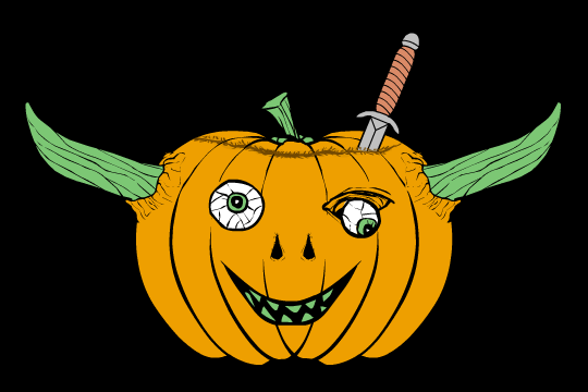
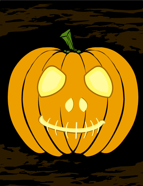
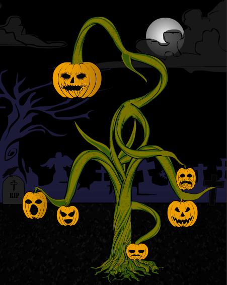
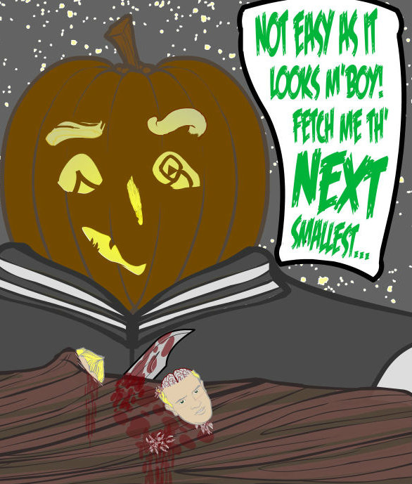
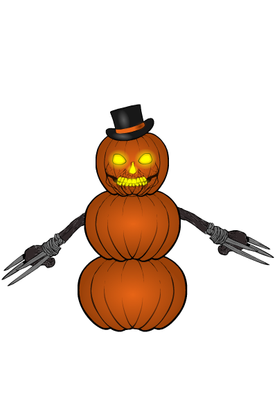
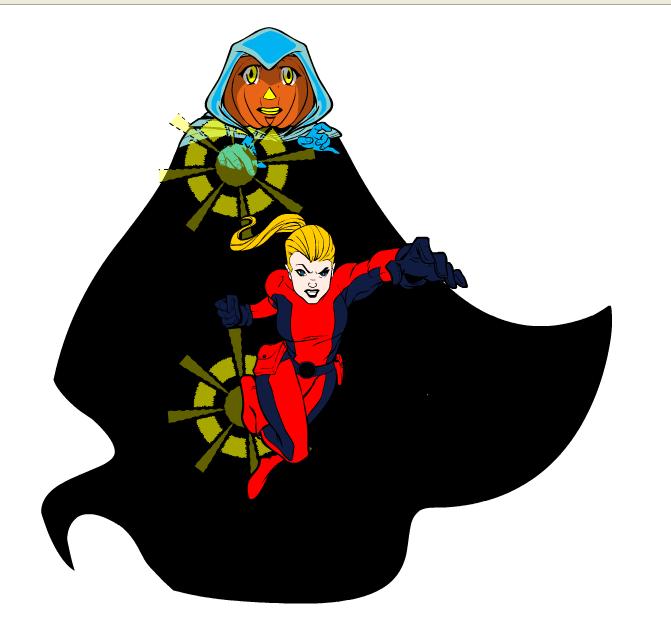
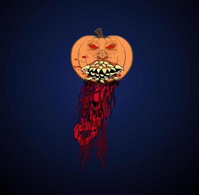
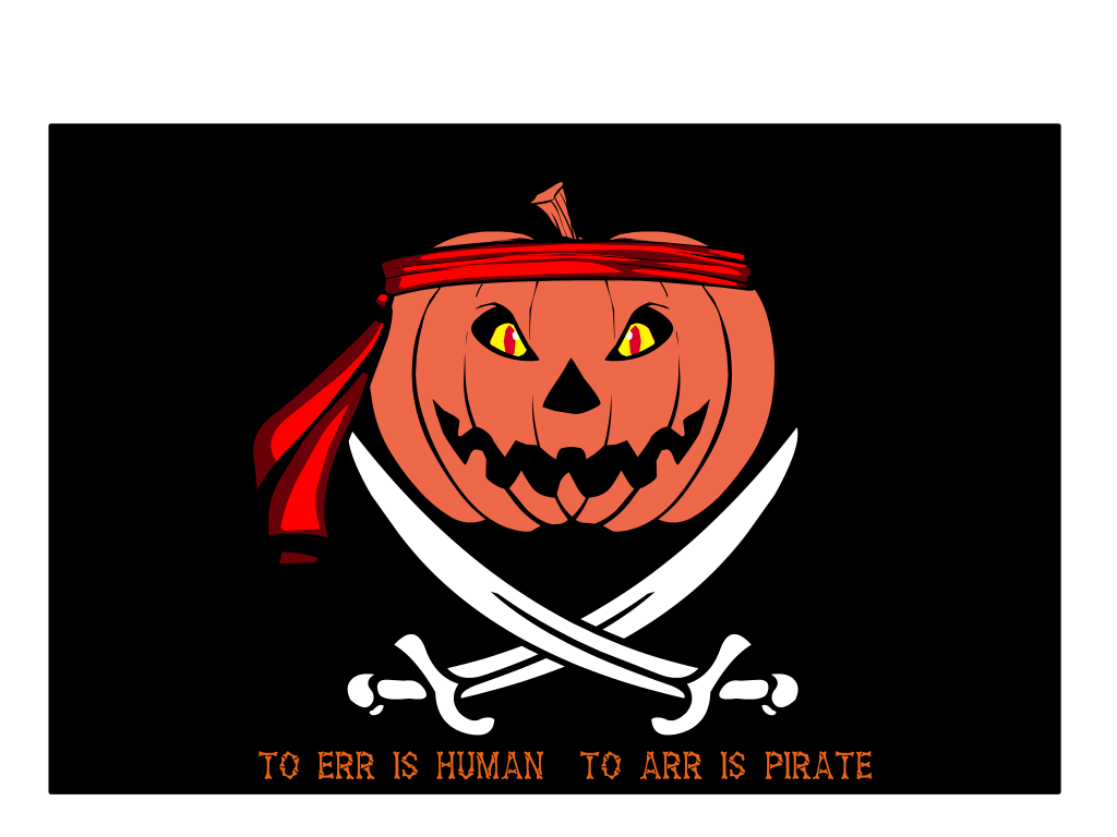
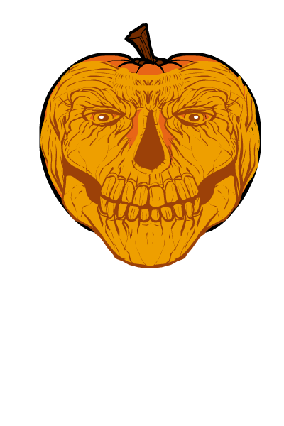
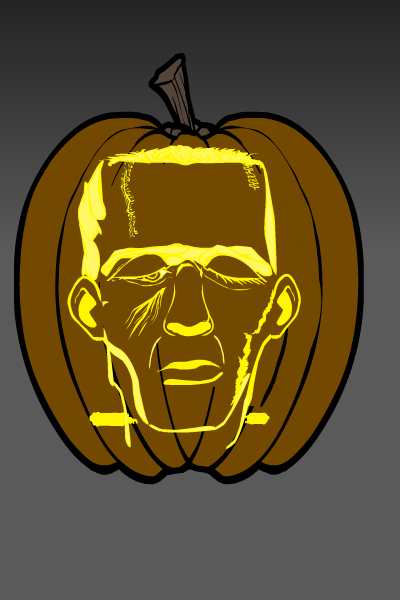
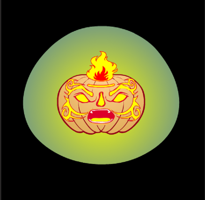
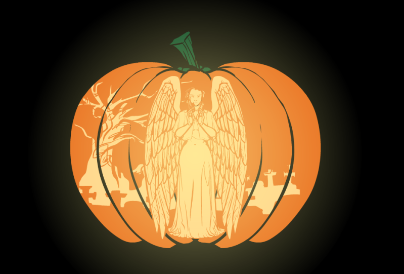
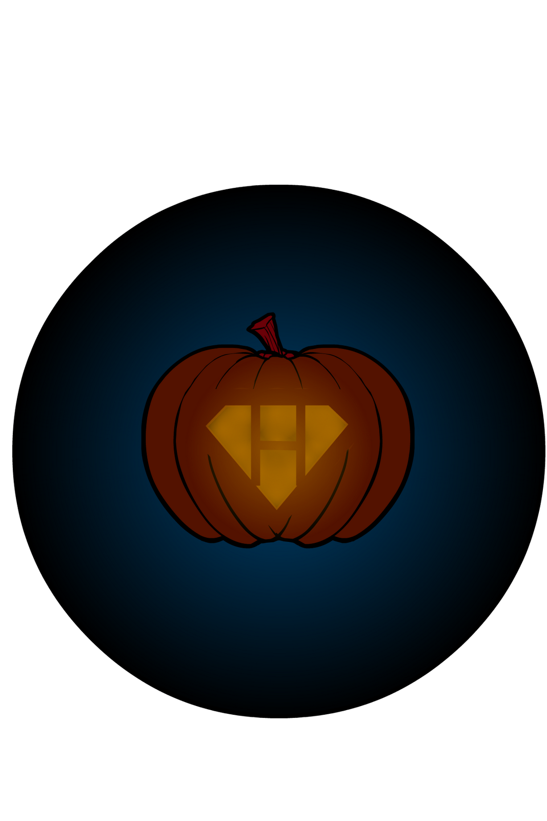
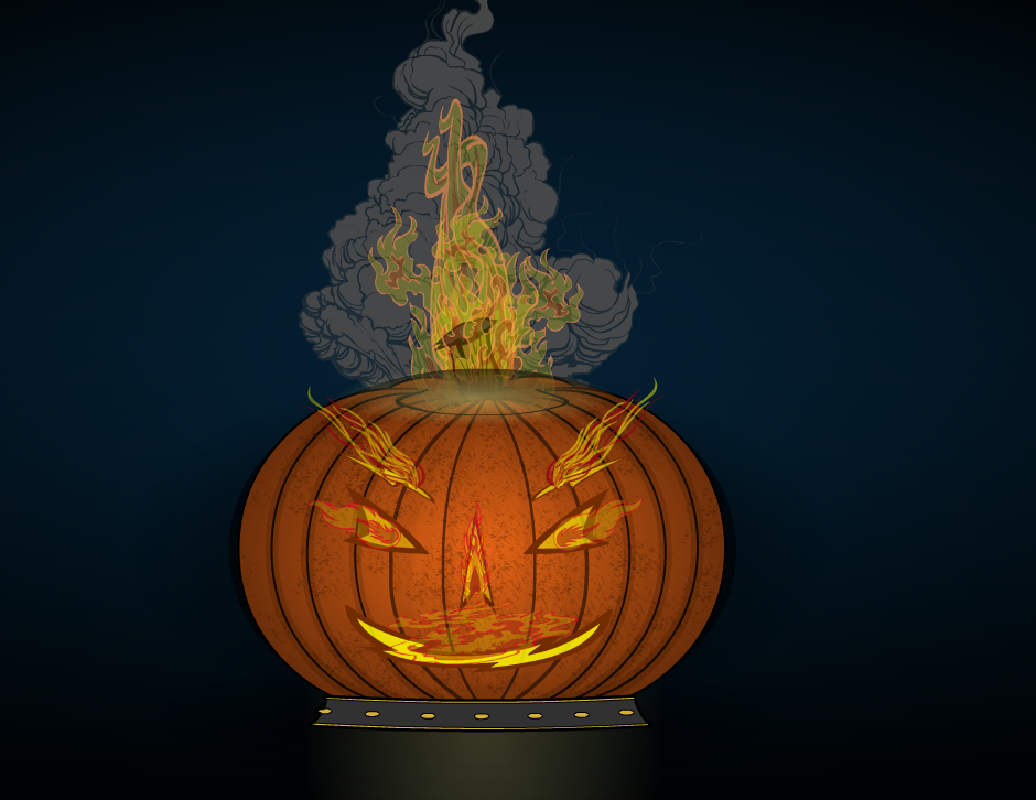
As you can see, there were some fun and cool entries. My personal favorite is Jack’s snowman-style grim homage. It reminds me a bit of what Calvin would get up to, an equal mixture of fun and frightening.
Thanks again to everyone who entered and Happy Halloween!
Posted in Challenge Favorites
 Three middle-aged nerds (including yours truly!) review all of the MCU movies in chronological order. Short, funny, and full of good vibes, check it out and let us know what you think!
Nerdmudgeon.com
Three middle-aged nerds (including yours truly!) review all of the MCU movies in chronological order. Short, funny, and full of good vibes, check it out and let us know what you think!
Nerdmudgeon.com
