
- This topic has 19 replies, 6 voices.
-
AuthorPosts
-
March 20, 2020 at 5:44 am #166544

FantasistParticipantI spend far too much time working on these pictures, and figured people would be interested to see what the program can do with enough dedication. Most of my earlier images were rather straightforward, the typical drag and drop arrangement. My later images are made using a LOT of container layers and gradients for shading.
 March 20, 2020 at 5:55 am #166548
FantasistParticipantApologies, but it appears that the site is not uploading images correctly. I’ll downscale resolution to fit, but I have no idea what the resolution limit actually is.
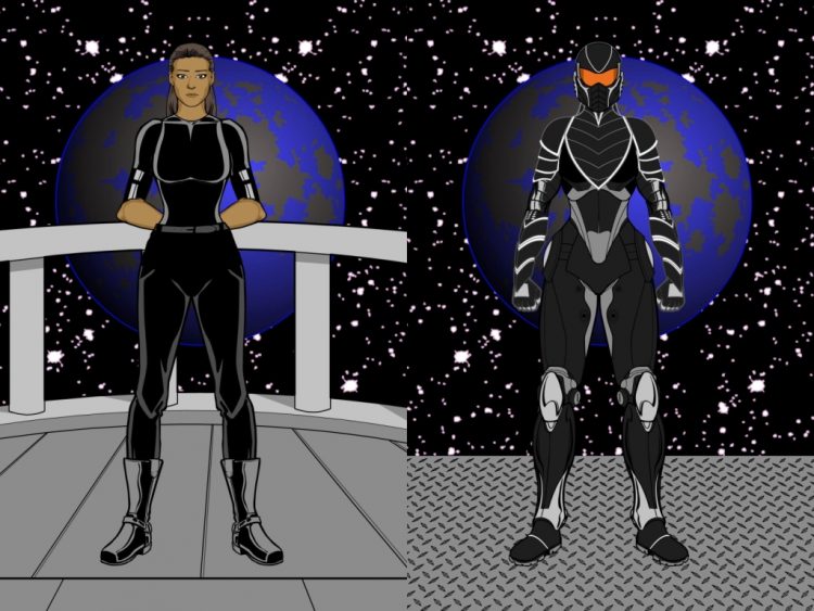
Anyway, the left half was designed as a starting portrait, and the right half had new layers added on top to create the armor. No shading was used.
 March 20, 2020 at 11:23 am #166557
Michael ChiarcosParticipantFantasist,
Nice Work! I like the layering. I like the colour scheme and most importantly I like the fact that you made certain the clothing fit the form of the body with no overlapping edges.
There are a lot of interesting paths you can take this with the transforms tab for opacity, size, shape, etc…
I think you might want to ‘thin the outer border’ of the body or choose a colour that is less contrasting so that it looks more part of the scene.
I look forward to your future endeavors…
Here are a few of my own…
cheers
March 21, 2020 at 5:18 am #166573
FantasistParticipantI’ll keep trying to get the images up, but the site has some sort of error that makes no sense (says the image is “empty” and to try loading a different image).
Again only layering was used, but the second was made completely from scratch.
March 21, 2020 at 5:34 am #166578
FantasistParticipantFor something more recent, this one was made with massive amounts of layered containers (putting one object inside of another), and a LOT of shading elements (gradient circles/squares)
March 21, 2020 at 5:42 am #166580
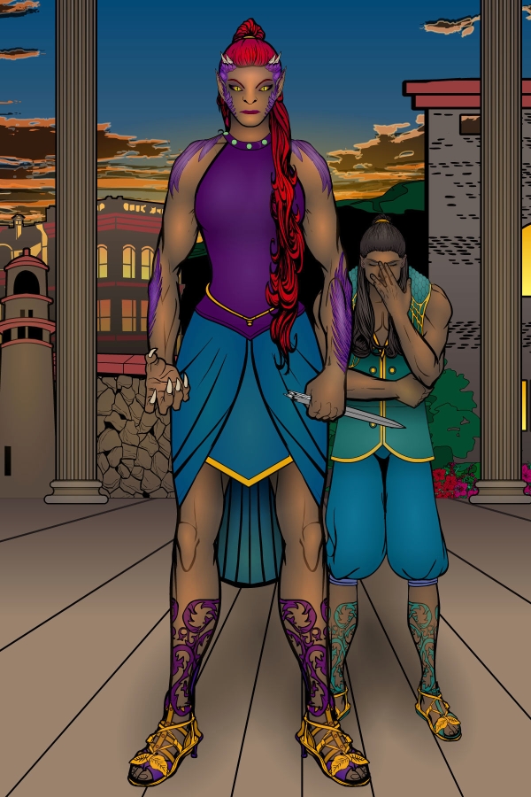
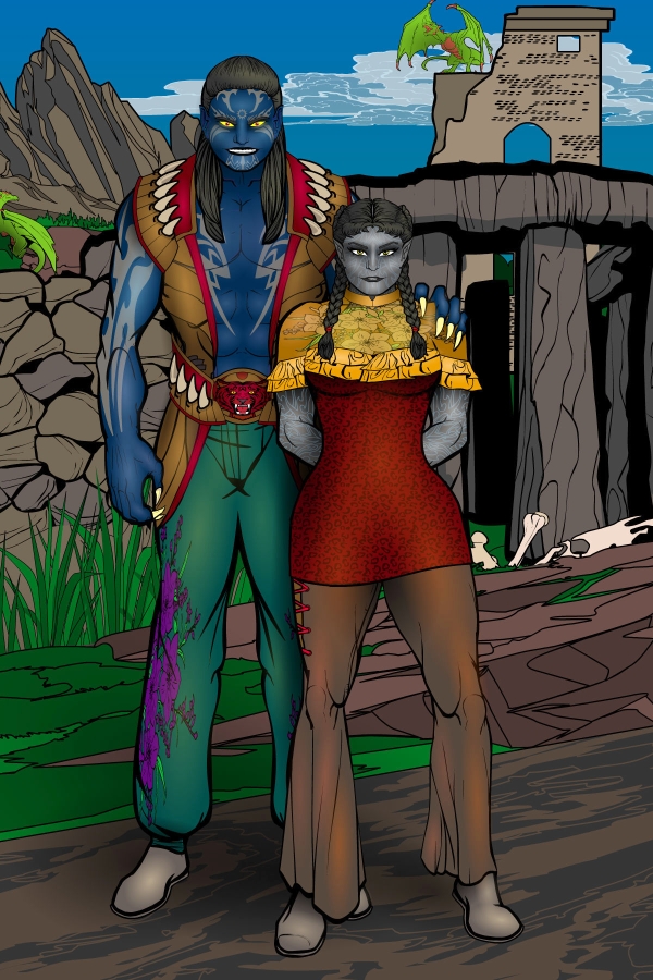
FantasistParticipantWith some planning it is entirely possible to do multiple characters at the same time. This was also an experiment in posing, but I didn’t put as much effort into it as I wanted. The most time consuming was getting the details to layer inside of the silhouette. The biggest issue here is the poor color balance in the shading. Some parts are too bright, others don’t have enough contrast and it needs more shadows to help with volume
March 21, 2020 at 5:45 am #166582
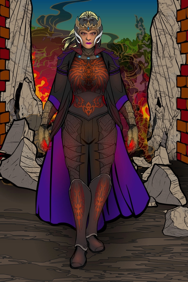
FantasistParticipantGlow effects are the biggest advantage to shading, but getting the color and intensity right can be frustrating. Embellishments that have a different color than their container/background will react differently to the highlight color and can look overly glossy or washed-out.
March 21, 2020 at 5:50 am #166584
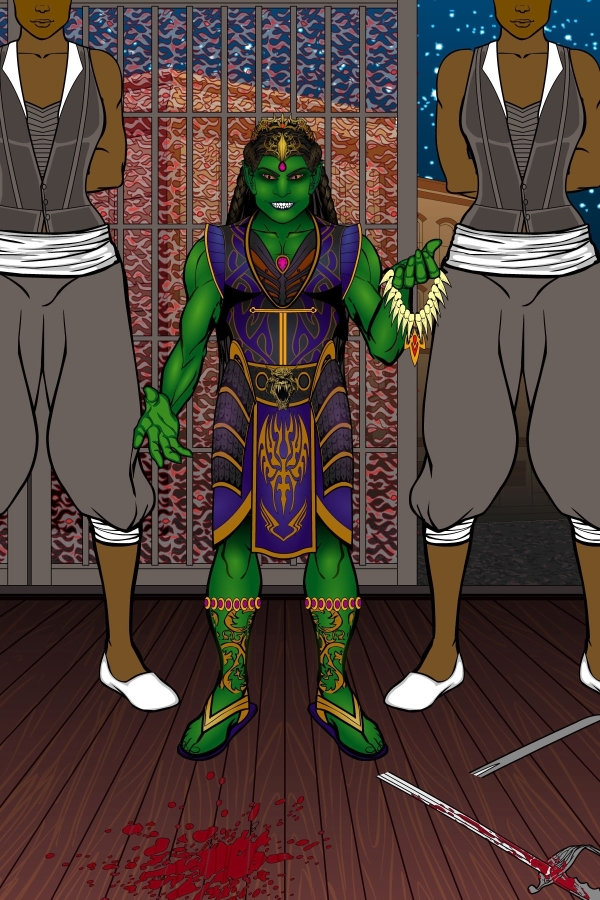
FantasistParticipantTransitions and transformations can be especially challenging. A starting model has to be altered piece by piece to create the illusion that details are changing, not just being mashed together. In some instances well-placed color gradients can blur the transition enough to sell the illusion.
March 21, 2020 at 6:00 am #166586
FantasistParticipantSeemingly complex costumes can be made by putting unusual pieces in unusual places. A bit of shading can also help add depth to the details. My method for this is to start with a darker color (for shadows) and add a brighter color on top (for highlights). The majority of lighting is done subtly, trying to transition from shadows to light in a way that simulates volume. Highlights and glare should be much brighter, but I’ve found that this usually requires extra layers.
March 21, 2020 at 6:16 am #166589
amsParticipantThese are awesome and read your progression to each image is great. Keep the coming. Looking forward to seeing your next concepts. Cheers!
March 21, 2020 at 10:56 am #166590
SulemanParticipantI’m digging these! Your shading is looking great and the characters’ outfit designs and colors really work well.
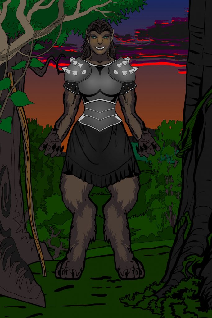
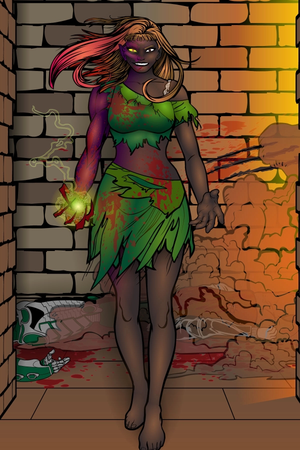
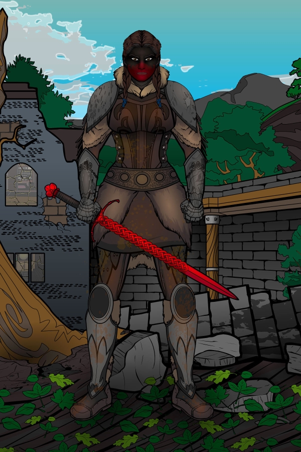
Leetha is probably my favorite, the background with the busted wall is a super cool idea. Also, the designs on her cuirass are great, I love the color choice.
If you’re looking to play around with colors even more, one thing I always recommend is trying out different line colors. It can work especially well if the design has a lot of items with thick outlines, which will stick out less if the line colors are less dark. For instance, I might use a very dark brown instead of black for body items, a very very dark blue for black hair, and a dark grey for metal items. If that sounds like too much work, no worries, these are looking really good as they are.
April 12, 2020 at 10:52 pm #167013
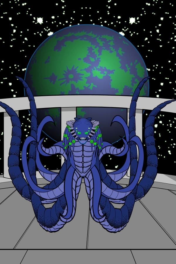
Herr DParticipantGreat blue alien. Grasping is harder . . .
May 1, 2020 at 5:34 am #167382
FantasistParticipantSometimes simple ideas require complex work. Fitting irregular objects between layers of color and lighting may require the use of duplicate containers to make sure that everything remains in the right order and the right shape.
May 1, 2020 at 5:44 am #167384
FantasistParticipantDirt and damage can be challenging. Messy textures have to be placed inside of the appropriate container, which might not actually work like you want. This might be because the texture is flat and diminishes the perceived volume of the image. It might be because the texture’s varied colors imbalances the shading, requiring either careful color selection, or a lot of small shading objects to compensate.
May 1, 2020 at 5:49 am #167386
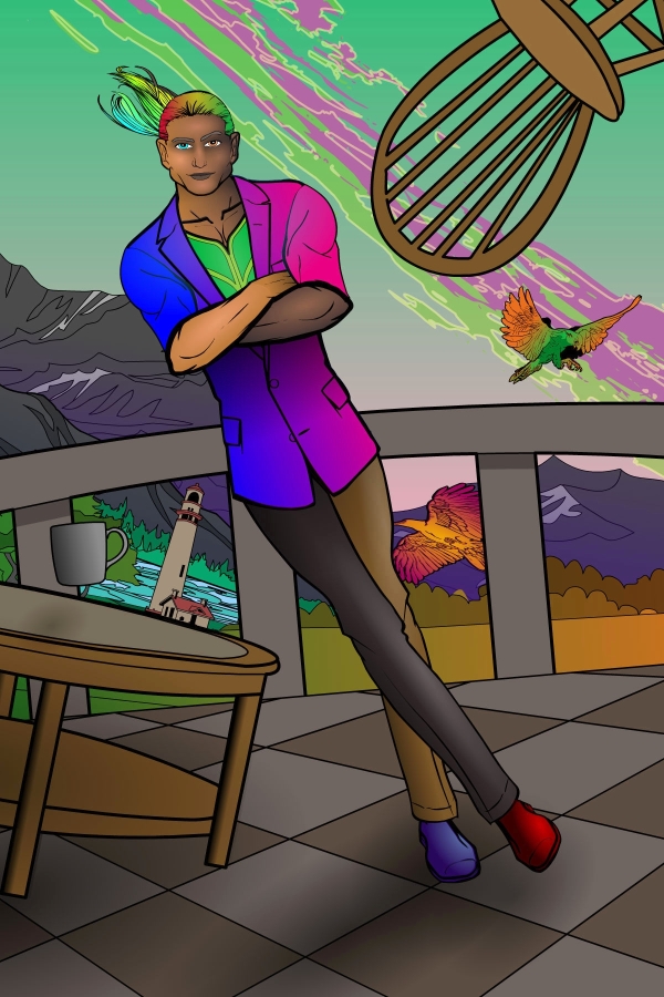
FantasistParticipantColor transitions can create fun details. Contrast can break up symmetry, drawing attention in subtle or glaring ways. Adding visual distortions can create a surreal effect.
-
AuthorPosts
You must be logged in to reply to this topic.
