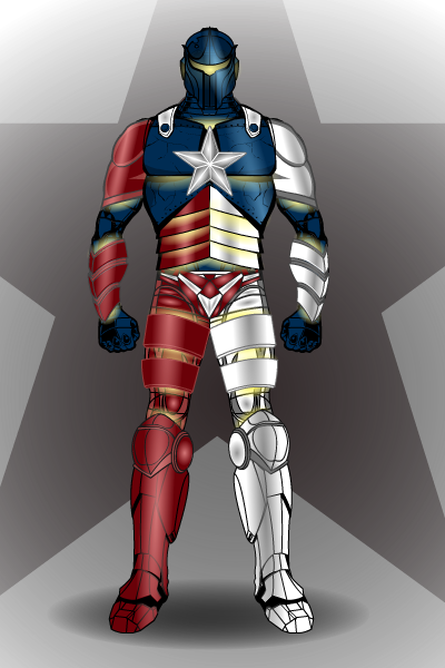
The winner of this weeks poll (getting nearly 50% of the vote I might add) is Can't Draw for his Texan superhero Lone Star

Sponsored Links (which Premium Members will never see):
The winner of this weeks poll (getting nearly 50% of the vote I might add) is Can't Draw for his Texan superhero Lone Star

Comments Off on Character Design Contest ♯30
Posted in Challenge Favorites
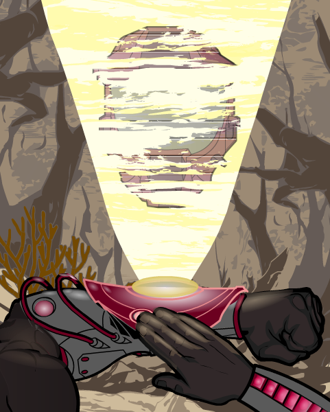
This week, we're going to look at not so much a character, more a scene by the master of Heromachine comic covers; RobM.
Incoming Message

Now, the main thing that attracted me to this piece was the lighting, especially on the wrist projector and the right hand. There are some good hints here on how to get really bold lighting effects, so I asked Rob about how he did them and hopefully he won't mind if I put up here what he said in reply:
"The wrist protector is one item from ItemRight Polearms with one gradient background shape masked to it and another laid on top. The masked gradient background shape has 25% second color and 0% line color. The pink glowing line color on the wrist protector is a result of the 25% darker magenta red gradient combining with the item's 65% gray line color. Then there's a second gradient background shape (the brighter gradient under the yellow disk) at 50% x 20% size laid on top.
The right hand is actually two hands. I masked the bottom portion with the thumb to an insignia so that I could use the darker prime color on the hand's under side. The layer below is a full hand where I used a lighter color for the prime color. Then I laid gradient background shapes over each finger at strategic places with the prime and second colors at 50%. It's tough to do shading on hands because masking works differently for hands than it does for other items."
Whilst these might be the most striking aspects of the picture, it wouldn't be half as good with out some of the finer details, such as the glow on the glove item underneath and to the side of the projection (especially on the wires, which can be very easy to overlook).
Also the projection its self is very well thought out. By a combination of a slightly transparent main focus (the helmet) along with the horizontal line effect and the clouds from the background items (masked to the beam) gives a very good impression of static interferance as usually seen in sci-fi war hologram communications.
Finally we come to the background. The best thing about this is that it doesn't distract attention from the main focus of the piece in the foreground. By using earthy, dull tones and a lighter than black line colour, it contrasts with the clear, bold and precise foreground to give a distinct feeling of depth to the picture and suggest a murky, mysterious and dirty world beyond what we can see.
Very well executed.
Comments Off on Character Of The Week- 13th July
Posted in Character of the Week, Things I Like, Tips & Tricks
This week I'm not going to focus on one particular topic, I'm going to give you guys the front seat, like with the old share days.
So, this week's question is, What was your first comic book experience? Or, what got you into comics in the first place?
Comments Off on The Big Question ♯9
Posted in Uncategorized
For this weeks contest I want you to design something musical. It can be a band, performer, instrument, genre characterisation etc. doesn't matter as long as it has something to do with music.
No limit on entries, good luck and have fun.
Rules for posts, contests, and challenges that I am hosting: Original characters only, no copyrighted characters, no characters based on copyrighted characters, no characters based on RPG’s or other games. The characters must be your own design and not based on any character that might be copyrighted in any way. I have the right to delete any post that I believe crosses this line without warnings. Only post characters that you have either created for this contest specifically or you know for certain have never been entered to a contest before. If you aren’t certain, don’t enter it, because I’m not going to go back through all of the contests and check.
Comments Off on Character Design Contest ♯31- Same Old Song And Dance
Posted in Character Design Challenges
To kick off this new monthly topic (as part of the new Monday rotor), I thought we'd have a look at the king of sci-fi shows.
Inspired by such varied sources as 'Wagon Train' (late 50's tv western series), Napoleonic wars navy based book/ tv/ radio/ film series 'Horatio Hornblower' and 'Gulliver's Travels', the original series only lasted three series and three years, but since it's first showing in 1966, Star Trek has become a cultural phenomenon, the most widely recognised sci-fi series in history (sorry Star Wars fans). It spawned 12 movies, 5 spin off series (animated, next gen, deep space nine, voyager and enterprise), games, toys, novels and comics. There are two prop exhibits that travel the world as museum attractions and for 10 years between 1998 and 2008 there was a Trek themed attraction at the Las vegas Hilton- Star Trek- The Experience. You can't go to a comic convention without bumping into at least a million federation officers, a Vulcan or five and an army of Klingons. My computer didn't even ask to spell check those two, yet it does if I do Dalek or Mon Calimari or Sith. But yet, Star Trek is still considered a cult show, and that is something that has always confused me.
When you think of a cult, you think of small pseudo-religions or mid-70's micro budget comedies, something with a small audience. Star Trek is way beyond that, so why is it still considered a cult.
Maybe it is the geeky image that still clings to Trekkies. Having a Klingon dictionary probably doesn't help. When someone says Trekkie you usually think geek unfortunately. I personally would put this down to dedication to the show, the other criteria as to how a cult is judged. Really, no other show has such dedicated fans. With all the collectables available for Star Trek, you can see how such dedication can be ensured. And people, especially TV executives, realised this very quickly. Which neatly brings me onto the next reason for Star Treks geek cult image. As sickening as it may be, most people now-a-days get their perception of the world from TV, and TV is a caricature of a stereotype from a group of TV executives perception of real life. It's not going to be hugely accurate. Which is why on every TV show there is a super nerd who loves comics and collects Star Trek memorabilia and has the posters of the enterprise on his wall (and it is always HIS, female Trekkies seem to be a very rare breed in TV land, almost deserving of going on the endangered species list). So is bred the image of a socially inept, spotty teen who goes to comics conventions and does the Spock hand V, and people believe it. Therefore they don't really want to associate with that sort of image, so they either steer clear of Star Trek or hide the fact that they like it in fear of being ridiculed. And lo, cult status is lumped on the most successful sic-fi franchise of all time.
When we next come back around to this topic, I'll be looking further at Sci-fi fandom, but in a more broad spectrum that focuses on Conventions and Collections. If you have any ideas for me on that topic or for future subjects for any of the new topics (What Were They Thinking, Sci-Fi Corner, Under-Rated Characters, Screen Spotlight) either PM me on the forums or reply here.
Live long and prosper.
Comments Off on Sci-fi Corner ♯1- Star Trek: The Mainstream Cult
Posted in Fantasy & Sci-fi
Comments Off on Character Design Contest ♯30 Poll
Posted in Challenge Favorites
Run away winner of this week's CDC was Scatman for Catequil. Excellent work from everyone, especially (but not exclusively) our five finalists.

Comments Off on Character Design Contest ♯29- Winner
Posted in Challenge Favorites
So, for this weeks COTW we're going to look at one of the most creative and unique creators still active on the machine, Harlekin (/Harlequin/ Tarkarra/ Tarkabarka). Here's the piece in question.

Now, of course there are many things to talk about here, so we'll focus on a few things.
First off, the perspective. Harlekin is very good at doing weird perspectives, birds eye view is one he's very good at. A very good way of doing unusual perspective/ position parts of limbs (such as thighs and biceps) is to use female-heads and then resize them, as you can see with the biceps here. This can also be used for foreshortened arms and crossed legged thighs.
The bike is very well made, out of numerous different items, a good example of thinking outside the box when using items. In the construction here I can see items from headgear, items-right, body-mech and insignias. I'm not sure about how the front wheel and handlebars line up, but still, it's not that noticeable, and it still works.
The main thing, apart from his posing skill, that is interesting about how Harlekin does characters is how he does faces. The manga/ anime style is very hard to do on heromachine with conventional items. The way this is done is by using insignias to create every aspect of the face (which he shows how to do in this series of tutorials http://www.heromachine.com/forum/tips-tricks-how-tos-and-guides/lick-and-tricks-with-harlequin/).
I'm sure we'll cover Harlekin again, because there are other aspects of his art that aren't best demonstrated in this piece that I'd like to talk about, such as his shading and clothing design, but for now I'll just end with that.
Comments Off on Character Of The Week- 6th July
Posted in Character of the Week, Uncategorized
For this week's big question, I want to discuss ageing in comics books. As we all know certain superheroes have been around in the same continuity since the 50's and 60's (Hal Jordan's Green Lantern, Martian Manhunter, The Fantastic Four, Spider-Man etc.) and some since the 30's and 40's (Captain America, The JSA), yet they don't seem to have aged more than 10 years. So, my question this week is: What is the best way to deal with character ageing in comics?
To start off with, lets look at how it is currently done by the big two. Over at Marvel, they seem to have a delayed progression approach (yup, technical term), which means time in their comics progresses slower than it does in the real world. Now, Spider-Man is the best person to look at to figure out their time scale, because he's the only one to have a definitive dated timeline. He got his powers aged 15 in 1962 (according to Spider-Man: Civil War) so that gives us a starting point. When The Amazing Spider-Man reached its 200th issue, it is mentioned that 5 years have passed since Peter got his powers. So that would make him 20, but the 200th issue was released in 1980, 18 years later. So going by that he should now be around about 30. But he's one of the younger heroes, Captain America was in his twenties in the 40's and even with the super-soldier serum, he'd still be in his late 60's and slowing down a bit by now.
Meanwhile, over at DC, things are a lot more complicated in terms of working out ages, because some characters seem to age (Members of the Teen Titans and other sidekicks) whilst some don't (all the main heroes and their supporting casts). Yet DC do have a more realistic approach to what would happen when a hero is too old to continue, even if they never use it for that reason. By having sidekicks age to adulthood, they can replace the hero with someone the reader already knows and likes (see Wally West and Dick Greyson). But of course, as soon as you're settled in to the new order, DC's screwy continuity comes in and reboots the whole thing, leaving you with the guy they just got rid of, only younger.
It is a really hard one this, because on one hand, you don't want to screw around with a tried and tested formula and end up putting of the fans, but ageing and replacing characters would save having to reintroduce them to a new generation and in some ways would be more interesting, because the hero could grow with the reader. What do you guys think?
(I was originally going to include TV and movie series into this and talk about replacing actors in the Doctor Who way or the James Bond way, but I didn't want to over complicate things too much. If you want you can discuss that as well.)
Comments Off on The Big Question ♯8
Posted in Uncategorized
Apparently, there is a special celebration coming up for you guys across the pond. So, I thought it might be a good time to do a contest that I'm surprised hasn't been done before (just a take a few minutes to let the irony of an Englishman giving you a fourth of july contest sink in).
This week I want you to design a character that represents one of the 50 states that make up America. Doesn't matter what you do, just so long as it is connected to a state in some way. I know a few people have done things along these lines already, so I know this should be good.
There is a limit on entries this week, but I doubt anyone will reach it. You can only do ONE ENTRY PER STATE PER PERSON, so you can only do each state once (so there's a limit of 50 entries, but I'm not expecting you to do them all).
It'd be nice to see every state represented. If we do I'll make a map using my favourites for each state at the end of the week. But anyway, good luck and have fun.
Rules for posts, contests, and challenges that I am hosting: Original characters only, no copyrighted characters, no characters based on copyrighted characters, no characters based on RPG’s or other games. The characters must be your own design and not based on any character that might be copyrighted in any way. I have the right to delete any post that I believe crosses this line without warnings. Only post characters that you have either created for this contest specifically or you know for certain have never been entered to a contest before. If you aren’t certain, don’t enter it, because I’m not going to go back through all of the contests and check.
Comments Off on Character Design Contest ♯30- 50 States Of Play
Posted in Character Design Challenges