
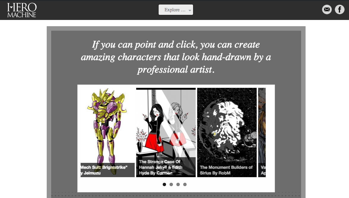
Hello HeroMachiners! As you may have noticed, I’ve just launched a new site design to hopefully make your browsing and creating experience more enjoyable. The home page now looks like this:
The goals of the redesign were:
- Make the site easier and more enjoyable to use by decluttering and toning down the riot of colors in general.
- Get more in line with the design aesthetic of HeroMachine 3.
- Widen the default page layout so you can see more on the screen without getting crowded.
- Give direct and unambiguous access to two key features — downloading HM2 and using HM2 online.
You can still find your favorite links like the forums, the Hall of Fame, and the blog in the one central drop down menu right in the middle at the top, labeled “Explore”.
I hope you enjoy the new look and feel. Please let me know in comments or through the contact form (the envelope in the header) if you have any suggestions or feedback.
Have fun creating!

The new site looks nice and all. But I have a question about the future of HM. With all of the bad press that flash has been getting lately and the growing chorus to kill it are there any plans for a “flash-less” version of Hero Machine. I would hate to see my favorite app go away because of a plugin being no longer supported.
I’m concerned about that, too, Wild Card. I don’t think Flash will completely disappear any time soon, but the end is certainly inevitable at some point. I hope I can get an HTML5 version of HeroMachine built eventually, but it just depends on available time which, honestly, I haven’t had much of the last year or two what with all the job hopping.
You’ve redecorated
….
I don’t like it.
😉
But I’m sure I’ll get used to it.
One thing I will note though is, while I like having the Latest Forum Posts in the sidebar, losing the latest blog posts and blog comments from the sidebar isn’t brilliant. For example, people probably wouldn’t think to look for updates on the blog if they only come to look in the forums. Obviously, people will probably realise that there’s been an update post on the blog due to the layout change but otherwise… I mean I usually check the sidebar to see if any new entries have been posted on the contests, otherwise I wouldn’t usually come to the blog in the mornings.
Same thing that JR… Accessing the forums is easy, accessing the blog took me more time.
But we gotta roll with it!
And yeah, when I read about Flash dying, my first thought was of Hero Machine :-/
the last time the blog was moved to a secondary page unstead of being the main landing page interaction dropped drasticly, I am not a fan of the idea at all!
I like it! Looks classy and more defined, but I understand where people are coming from about the blog not being on the main page. One thought, if you wanted to keep the main page, why not change the ‘explore’ button to an ‘enter’ button that will take you straight to the blog and from there users can ‘explore’. You still advertise HM2 and it’s quicker to get to the blog.
On a similar note, I find the Forums button an the top a little misleading. I would prefer if it just took you to the main forum page rather than make you choose which section you wan’t. I like to use the main forum page to see if other users have posted in any of the sections rather than have to look through each one individually.
Apart from that, I like the new look.
Yikes!
So…ok. Question…I know it’s early, and I’m probably overlooking something really obvious, but how do you find the ad free member version of HM3?
Thanks for catching that, I’ve added them back. I didn’t expect the sidebar to change at all when I did the update, but it did, so I’m having to sort of recreate whatever was there before. Let me know if I missed anything else or you’d like to add something.
That’s certainly a possibility and something I’ll have to keep an eye on. I can’t imagine how fitting in the current posts like it was will work with the new front page. But I could see adding a third button maybe to the highlighted / hall of fame image area.
Good catch, thank you. The “Useful links” section in the side bar is there again.
Awake now! Found it!
Not gonna lie….I dont like it at all and I find it very impractical but I guess it will grow on me…Who knows..
Sorry to hear that, Lef, but thank you for sharing your input.
Not gonna lie, but when I first typed in heromachine after the update, I was super confused and thought I messed up the URL or something 😀
That aside, it does certainly look more professional, and the white and gray variations between the comments are cool. It’ll just take a wee bit of getting used to.
I missed the initial roll-out of the new design. Seems alright but I think Jeff already made the necessary updates. What’s really throwing me off is I am so used to the “blog bar” being on the right side of the screen.
Otherwise, pretty clean and congrats on getting more sponsors!
Hey Jeff, This might just be me and my weird browsing ways, but I miss the links to the previous and following posts on the blog. Browsing the blog without them means having to go back to the blog main page all the time.
I’m going to encourage that HTML5 Flash version. This has been my longest-running non-destructive non-financially-potentially-debilitating hobby/wakefulness-ensuring/creative outlet/sanity ensurer/art therapy/active medium.
Change can be rough, especially for long-timers. . Hope that endpoint is a long way off.
I miss the old icon you know the one with the pegauses
Good catch, Worf, thank you — Those links are now at the top of individual blog posts. They are also at the bottom of things like category and archive pages.
I like this fresh look of site. Yea, it is hard for me to understand where is what, but that’s just temporary problem (i think so).
I like the site better today than I did yesterday, so yay for that! I agree with Outcast though… I miss the logo. First time I seen the new site I thought for sure it got sold. It looks so cooperate and cold. Where is our beacon of comfort and familiarity?!?! If nothing else maybe something like this: LogoHM
I like that, Nug! I’ll give something like that a shot.
Much better! Thank you! 🙂