We had a huge response for Character Contest 44 - Nature, thank you all so much for the inspiring work you put into this! I had a tough time deciding on an overall winner out of the many Finalists that all had something special about them. So without further ado, here they all are, with comments on why I thought each deserved to be in the mix for the win.
If you don't see yours here, it's not that it wasn't good, I just had a lot of great ones and could only pick a handful. So keep trying, I know I speak for everyone else when I say it's a lot of fun seeing each other's work each week.
Abominal401 used shades of blue, shading, and a fantastic energy effect on his "Blue Energy" illustration that really popped. This is one of the best such auras I've seen, really nice work on that.
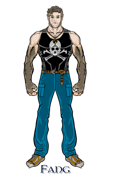
"Fang" by Alex is a simple character in concept, but very well executed. The little touches really make this one, like the feathering at the transition from the hairy arms to the fleshy part, and the claws poking out of his sneakers. It's sometimes the little things that add up to a huge impact, and this is definitely the case with this one.
Atomic Punk's "Smoke" makes great use of a background and a pattern to sell the effect.
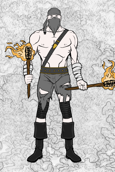
I liked how BenK22 set the scene in his "Ivy":
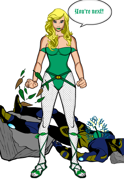
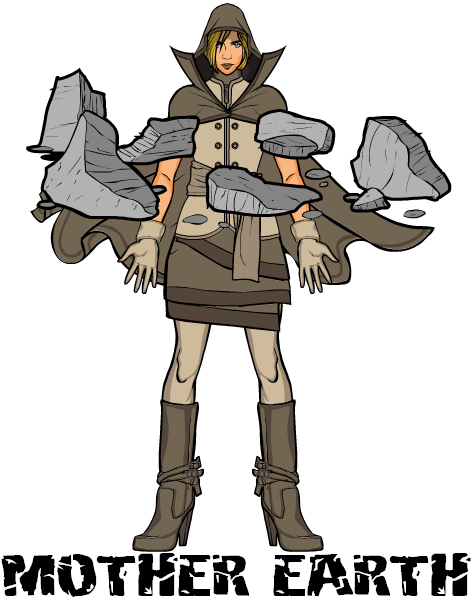
Blue Blazer had a number of great entries this week, including "Mother Earth". The pose, the clothing, the colors, and the choice of the floating rocks really nail the whole concept. Great job on this.
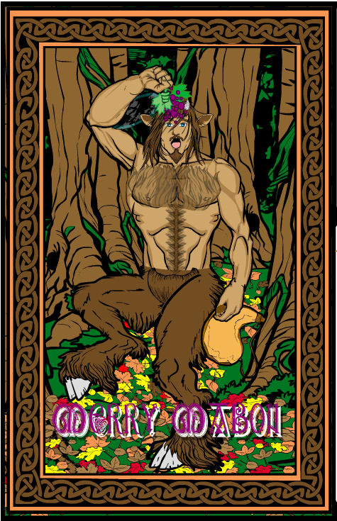
Cliff had a lot of quality entries this week as well. I picked his "Merry Mabon 2010" as a representative sample. The idea of making a card, and the way he put the image together, works very well.
I think "Wake" is a great name for a super-powered character, and CPrime put together a fun image for the idea.
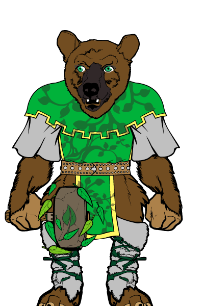
I hope I don't offend the guy, as clearly he's quite ferocious, but "Druid Bear" by Dawn is downright cute. I'd run up and give him a hug, whereupon I'm sure he'd smite me or turn me into a newt or something.
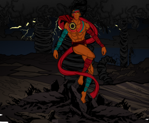
I don't often get surprised by a pose any more, but DiCicatriz pulled it off with "Hurakan". Everything works to convey the idea of movement and motion, caught up in a swirling torrent of wind. All of the supporting elements show a high degree of thought and care to make an extremely effective illustration.
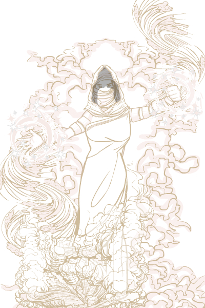
Gargoyle323 also put in a lot of exceptional entries, but I picked "Smoke" for the great "sketch" effect it achieves. Hopefully he'll explain in the comments how it was achieved, it's totally cool.
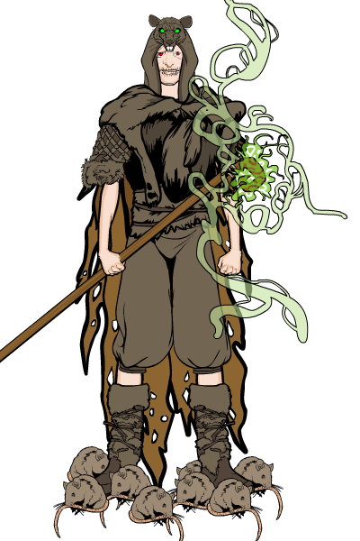
Haxxx gives us "Rat Swarm". Again, the little details make this one, from the sickly green miasma on the staff to the emaciated arms to the rat hat.
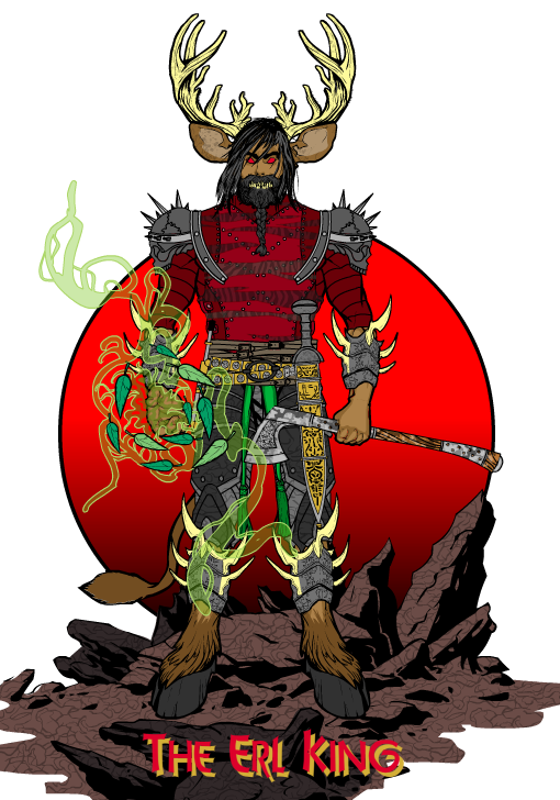
Imp comes through again with "Erl King". As usual, all of the item and color choices are spot-on to make a powerful image.
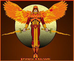
Kaldath's "Pyro Hawk" works largely due to the great fire-wing effect. I like that a lot.
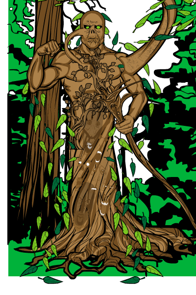
Mindless' "Soul Elm" caught my eye due to the faded-in screaming heads caught in the trunk. It's a neat concept and very well executed here.
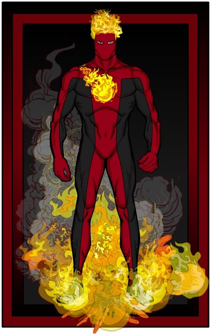
Me Myself and I is another one with multiple great entries, one of which is "Fireball". I can't say the actual outfit design excited me all that much, but the fireball and smoke effects are simply outstanding. The hair and chest logo also work really well. Awesome use of special effects on this one.
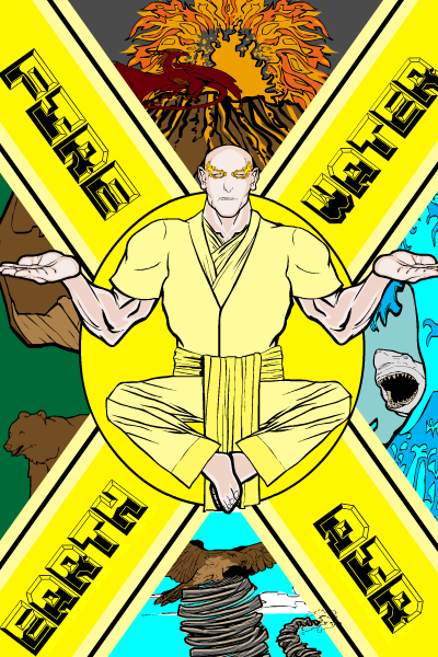
Solander had only one entry but it was a really good one, titled "Master of the Elements". He did a great job putting together the disparate pieces of the poster into a pleasing and effective whole. Nice job!
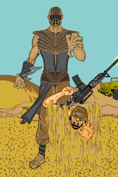
Watson Bradshaw's "Quicksand" was probably the only one that made me go "Cool!" out loud when I saw it. Of course I thought Quicksand was actually melting the soldier, which is an awesome effect, but then I thought about it and realized he was probably just dropping him into quicksand. Still cool, though.
I liked each of those very much; I mean, they're Finalists for a reason. But when I sat down to go through all the Finalists to pick the winners, there were three that, for me, stood out and deserved a win. The problem is in deciding between them. So I'm not going to -- you are!
Here they are, then, the three Final Finalists for you to vote on; the winner as of the start of Monday Night Football tonight gets the overall victory and the artist's choice of a) any item, b) a portrait, or c) a "Sketch of the Week" request for a black and white illustration (like the Ms. Marvel I did for the Pop Quiz winner). Good luck!
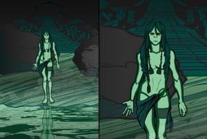
First up (in no particular order) is Morzan's "Lady of the Lake". I love the decidedly gloomy take on the traditional myth, and the actual illustration amply supports the high concept. I love the lake reflection, colors, character design, and overall impression. Just a great illustration top to bottom.
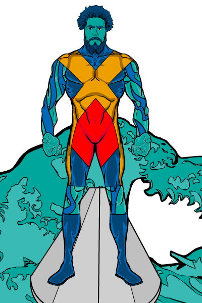
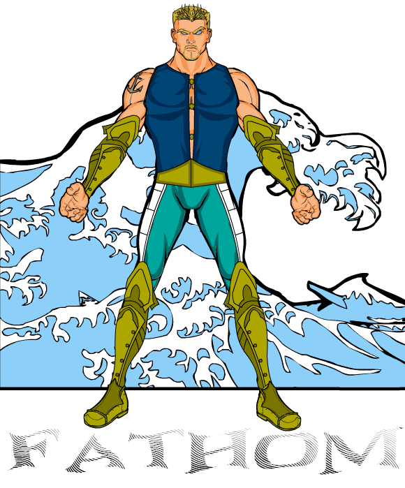
Next is Blue Blazer's "Fathom". I kind of wanted to take points off due to the non-HM font -- if that's been added in Photoshop, what else has been done? -- but it doesn't look like anything else was adjusted, plus Blue Blazer's a stand-up kind of guy, so I'm letting it slide. Plus the character's awesome. I think this would be a great Aquaman redo.
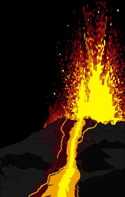
Finally is one that's not a character at all, but rather simply a fantastic illustration of a nature scene. "Volcano" by Me, Myself, and I gets better and better the more you look at it. I'd love to hear in comments how he got the fire effect, and how he basically made his own volcano base. A really cool effort that I don't think I've seen before anywhere. Really cool, MMI!
Now vote!
Edited to Add: The results are in -- congratulations to our first-time winner, Morzan! Morzan, let me know what you'd like as your prize, either an item or portrait to go in HM3, or a Sketch of the Day subject (like the recent Ms. Marvel one).
Great job for the 3 finalists and the other people for their creations!I shall now vote!
I tell you what Jeff, in order to answer your inquiry on how I produced the volvano I will put together a bit of a recepe as a demonstration.
There were of course a lot of fire special effects but surprisingly I used the lightning effect a bit as well.
Its funny actually, I knew I was running a risk by not actually placing an actual “character” in the Volcano image. My focus however was in producing a powerful and striking background and I knew that a complete character placed in front would detract from the image.
Personally out of all those finalists I think the top three (with no particular order) should be:
DiCicatriz’s “Hurakan” (amazing character pose and cool background)
Watson Bradshaw’s “Quicksand” (great quicksand effect)
Morzan’s “Lady of the Lake” (love the mirror reflection and the dark environment)
but of course that is only my humble opinion. everyone is to choose their favorites according to their own,personal taste… 🙂
see you next time
Great job everybody! There was a lot of great work done this contest. I am voting for MM+I’s “Volcano” because it is a really strong visual effect. It works so well without any characters. All three are well deserving,though.
Thanks,Jeff for putting “Smoke” in the Honorable Mentions. I created her using white and different shades of gray. The effect turned out much better than I thought it would. There was some trial and error to find the right shades that came across as pencils. It seemed to me that a “smoke-style” character worked better without a hard black outline.
Again,Good luck to the three finalists!
I’d love that, MMI (2)! A volcano recipe would be of interest to a lot of people, I know.
Dude! I got honorable mention! Awesome!
I love the Volcano image. But I just can’t give it my vote since there is no actual character. But that is amazing nonetheless.
Maybe there should be a contest for backgrounds!
It would be awesome!
A very few shout-outs:
Abominal 401- That blue glow effect was really good!
Watson Bradshaw- I loved your quicksand effect with the soldier. Very creative and well executed!
Kaldath- Pryo-Hawk’s fire wings looked great.
Cliff- I think you really showed your creativity in this contest. You had a lot of really great designs. I know there was an issue about “quality/quantity” brought up this week and I believe you handled it with class. I,for one, thank you for sharing you art with us this week!
And to all others,there are just too many to list! These contest get harder to win each week because the talent and skill everybody displays is amazing! Congrats to everyone!!!
Congradulations everyone!
As soon as i saw Volcano I told my wife, Dammit, that’s shoots me out of the water! I definately voted Volcano.
And thanks for the Honerable Mention, I’m glad one of my Satyrs made it … but really thought one of my Poison Ivy’s would be the one picked if I did make an HM. No complaints, just surprised. Glad you like the card concepts. Thanks abain for tools to make them.
Volcano is a good background, but I can’t in all good faith vote for an entry that doesn’t have an actual character in it.
Alan Bates (12) I anticipated that response actually. I guess that’s the risk whenever you try thinking of something outside of the box.
I’m still happy with the result whether it wins or not. Especially considering that the other entries are really good.
You guys are all amazing. I wanted to be a part of this contest really badly, but seeing as my internet here at college SUCKS, I’m forced to just watch. Keep up the good work, everyone!
That volcano is insane! In a good way of course. Cogratulations to everyone.
I love the spooky quality of Lady of the Lake. Ultimately, though, the volcano is just incredible and shows how versatile HM can be.
Thanks for the honorable mention Jeff and congrats to the finalists and everyone else. There were some really good ones this time.
I would have voted for Volcano if it said:
L. RON HUBBARD
DIANETICS
http://www.buydirectworld.com/detail/p_088404632X/Best-deal-Dianetics–The-Modern-Science-of-Mental-Health-onsale.html
http://www.dianetics.org/#/videos
(Congrats to all the winners!)
Here’s a prize that I heartily recommend for all winners and Honorable Mentions: you get to show us all how you did it! That would really raise the bar, I think, for all drawings.
Meanwhile, I’ll vote for “Lady of the Lake,” partly because of my youth as a King Arthur fan, but also because of the cool colors and intricate scene
Ummm… you forgot the other “o” in “good” in the first sentence paragraph 2
God, I’m almost ashamed of my sh***y character compared to everyone else’s. Hurakan is my absolute favorite. I wish I could create amazing backgrounds like that.
Great job everyone, esspecially that volcano. That’s mind blowing.
🙂 Thanks Jeff for putting me into the finalists, and everyone else for all the great responces for Quicksand. There were so many fantastic characters and images created in this contest I am just happy to be in the ranks of such a genuinally creative bunch of people.
Also I hope Volcano takes the gold and gets added as a background (fingers crossed).
Thanks again and I am now really hungry for the next contest.
Don’t be ashamed, krimzon: there’s still stuff here that I can’t do, either. I’ve only just begun to experiment with LineColor, for example and the results are still mixed. I *am* a little hurt, though, that my “Drac Lagoon” pun didn’t merit, at least, a good groan.
Maybe what we need is a combination tutorial/support group space on this blog, where we can put up a picture we’re not happy with, and solicit some advice.
Nick Hentschel (23)
Jeff used to offer his advise on images on Thursday’s but I haven’t seen that for a while. He has probably been rather busy with developement.
Its not a bad idea to have a blog subject where people could ask how to get a certain effect. Then the rest of the community could reply if they have any idea’s.
Maybe WillyPete can chime in, but is there a “help” forum on the UGO boards?
I’ll try to do an Open Critique day this Thursday if not before.
I find that the UGO boards are a bit of an issue when I’m at work. Our security prevents me from viewing them.
I like volcano for its complex simplicity… or is that simple complexity?
Sure I’m a little disappointed not to get a mention myself but hey, it was my first time against a great standard of opposition
Good job, you guys. I was blown away by the quality of entries this week.
Here are a couple of shout outs to those I found particularly entertaining this time around.
Morzan’s “Lady of the Lake” – This one gives me a sense of forboding. Any image that can actually produce emotion in a viewer was well worth its while in creating.
Blue Blazer’s “Fathom” – What I like about this image is the facial expression. Its something that I struggle with in HM3 so I appreciate it when someone pulls it off well.
Cliff’s “Merry Mabon 2010″ – The image portrays a great sense of humor. It is difficult to translate humor to an image without words. Well done.
Alex’s “Fang” – Not really someone I’d want to mess with. I really get a feeling of transition from this character like he’s in the middle of changing into a different form.
Abominal401’s “Blue Energy” – Great contrast and the aura effect certainly draws attention. I didn’t get the feel of nature from this one but it is a great image regardless.
Imp’s “Erl King” – There is a sense of the fey about this character. I wouldn’t be surprised to hear it as the subject of an Arthurian legend.
…
(That’s as close to speechless as a reply can get. Damn fine job to all the contestants.)
@Jeff: Thanks for the honorable mention. Glad you like the background. I was trying the at-the-time brand new “Alpha” color adjustment and patterns. Very pleased with the features! (One minor detail [and don’t even worry about it], the character is “Ash”.) :9
@All: Awesome as always. Too many favorites to list. If I had to pick a favorite. Oh, wait… I get to!
Which makes my vote harder. I’m an Aries, so I’m supposed to be a fire sign. Which is true, I love candles. But my favorite color is blue, which is water. Which can be found in lakes… aaaaahhh!
I’ll let you guys know when the winner is announced. ;9
Wow! That Volcano has to get my vote! I’ve done a few “epic” BGs in heromachine and that is by far one of the best ever!!! Great job Me, Myself, and I!!! Super jobs with some of the others they are just pure awesome!!!!The dude with the hurricanes and stuff is also pure epicness. Glade to see more from DiCicatriz missed his..or her stuff it is always nice to see stuff from Gargoyle232 too.
:p Volcano gets my vote!
Work can block UGO and its sites all together.
Even at the library it blocks StickPage.com and UGO forums….I think for awhile it had HeroMachine.com blocked to…now I think none of it is…
What a confusing topic…..
whoo hoo honorable mention on my first attempt at a contest AWESOME!!
A bunch of entries I really liked:
As I go through them all I note my favorites +, ++, +++, or ++++; I usually include the ++ favs on my list in the comments but I don’t want to hog too much space and there were just so many good ones: so here are my +++ & ++++ favs.
Nanabeo
Aqualina
Pyro-Hawk
The Zodiac
Poison Ivy
Nixie
Fay
Triton
Necrosis
Brimstone
Volcano Dwarf (I may have voted for this over Lady of the Lake, but it would have been close)
Suzume (Simple Elegance)
Huracan
Primus (Kraken Cthulhu versus Primus: Who would win in a Fight? There is only room for one in that trench!)
Shiro ookami
Rhytas
Charlie Horse
Cleric Of Blackwood
Takeshi Ronin
Zimbata
Lady Of The Lake
Mother Nature (Heat Miser & Cold Miser?)
Apollo-Proof Dryad
Naeeb The Ecomancer
My Top 2:
Lord Aquar the Atlantean
Blue Energy