
I think this is a lovely bit of onomontoPOWia, from the pages of the freshly-mocked “Haywire”:
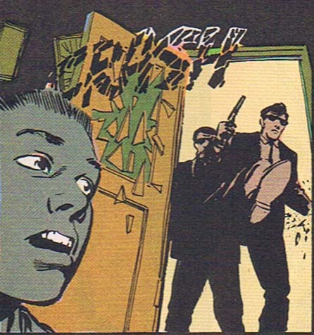
This just goes to show that you don’t need crazy coloring and Photoshopped filters to get a great effect. This scene is part of a flashback the main character is having, and the choices the art team made are really spot-on. The way the black CRASH blends in with the muted palette is perfect, and the breaking-glass jagged lines echoing the door smashing in is great. The sound fits with the room as it would appear in the witness’ memory twenty years later — somewhat muddy (perhaps why he chose that color scheme for his armor?), all blended together, and somber.
I spend more than my share of time making fun of things here, but mostly that’s because the medium has such rich possibilities I hate to see them not taken advantage of. This panel shows, in my opinion, some of the power of comics to convey a mood and set a scene. Very well done.
(Image from “Haywire”, Vol. 1, No. 1, ©1988, DC Comics, Inc. Michael Fleisher, writer; Vince Gerrano, penciller; Kyle Baker, inker; John Costanza, letterer; Bill Wray, colorist.)

Pulp Fiction. This is Pulp Fiction!
It looks like the word crash was already hanging there in the room, and the door swung open and hit it. The word looks like it’s close to the door and it also looks like it’s bent.
On another note, you mention that the guy modeled the color of his costume after that door from his past. That’s like when Bruce Wayne saw a bat fly through his window, so he decided he would call himself Batman.
I’d be lying if I said it doesn’t look a lot like The Clash’s logo.