
Home › Forums › The HeroMachine Art Gallery › Suleman's creations
- This topic has 387 replies, 49 voices, and was last updated 3 years, 3 months ago by
 Suleman.
-
AuthorPosts
-
June 24, 2012 at 6:15 pm #6842

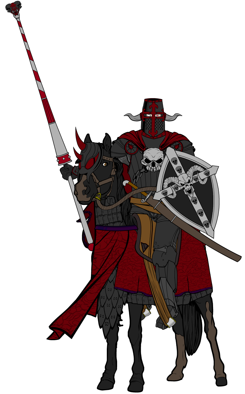
ZerogarthMemberI think the barbarian looks too small to be one (or to be fearsome)… Maybe its just his head… is too big, I think.
And man, the Skull Knight is awesome, and the armor on his horse its great too : D! (nice custom saddle, btw) …just one detail to make it look better, I think his feet are too close to each other… its seems like the horse is too thin… maybe separating the foot that’s on the back a little more… just a thought. Anyway, awesomeness! : )
June 25, 2012 at 3:18 am #6851
SulemanParticipantThe barbarian is intentionally sort of small. I was going for a mongol vibe, since they were riding nomads. There’s no reason why barbarians would have to be terribly big. Anyway, he might not be Arnold, but he’s tough as old leather and has done nothing but ridin’ and fightin’ since he was born, so he’s very, very good at what he does.
Alright, here’s a tweaked version of the Skull Knight. I moved the right foot a bit further away and I changed the lance somewhat.
 June 25, 2012 at 3:17 pm #6780
ZerogarthMemberhehe I guess u’re right about the barbarian, I’m just attached to stereotipes when it comes to medieval/fantasy stuff… a bad habit really : P …’bout the knight, the lance its looking better, and so does the foot… but it still gives me the impression of being too close to the left one… maybe if u try moving the right foot further untill it’s between the horse’s two front legs (the separation should be proportional to the belly of the horse in that perspective for the legs to look right)
EDIT: just noticed your first horseman had the right separation! …that’s how it should be on the knight : ) …u should widen the saddle a little so u can give the left leg a wider angle (again, just like on the first horseman)
October 20, 2012 at 5:47 pm #12662
SulemanParticipantI’m back, at least for a moment.
http://i276.photobucket.com/albums/kk15/Sulemania/Heromachine/Marius5.png
This is a quick sketch of Marius Cloutier, unwilling deserter from the French navy. And no, that is not a period-accurate French navy uniform, but I did look up some historical uniforms.
October 22, 2012 at 8:45 am #12761
DecatonkeilMemberWarriors sure are your thing. You must have a lot of patience to juggle so many elements in HM3.
October 22, 2012 at 5:15 pm #12801
SulemanParticipantYep! I’m not very good with tights and masks, but I looove warriors and weapons and such.
Speaking of which, here’s a new character.
The mysterious Three-Eyes is a deceptive crime lord with a sinister agenda. Deviously intelligent and deadly with the sword, Three-Eyes is not to be trifled with.
Here’s a bunch of different versions. Pick whichever you like best.
http://i276.photobucket.com/albums/kk15/Sulemania/Heromachine/Three-Eyesrobe.pnghttp://i276.photobucket.com/albums/kk15/Sulemania/Heromachine/Three-Eyesarmfree.png
http://i276.photobucket.com/albums/kk15/Sulemania/Heromachine/Three-Eyeseasternhat.png
http://i276.photobucket.com/albums/kk15/Sulemania/Heromachine/Three-Eyeswesternhat.png
October 22, 2012 at 7:06 pm #12807
VampyristParticipantI like the third version of him and good job on all four versions.
October 22, 2012 at 10:31 pm #12815
headlessgeneralMemberI like the third one best, also.
October 23, 2012 at 3:14 am #12823
MyroParticipantI’m in agreement with Vampyrist and headlessgeneral. They all look pretty good, but the third one looks best.
October 23, 2012 at 7:09 am #12830
SulemanParticipantThe audience has spoken. Version three is the one I will be using in any future iteration.
Here is Three-Eyes cloakless, after apparently decapitating some poor guy.
http://i276.photobucket.com/albums/kk15/Sulemania/Heromachine/Three-Eyesarmsfreeblood.png
October 23, 2012 at 7:50 pm #12868
SulemanParticipantHere’s a random little design I made for Blue Blazer’s contest.
http://i276.photobucket.com/albums/kk15/Sulemania/Heromachine/Quest4.png
October 25, 2012 at 12:20 am #12897
WeilynMemberLoving Three-Eyes! Fairly simple, but brutally effective!
And for the record, I agree that number three is the best version
 October 25, 2012 at 6:11 am #12913
VampyristParticipantWeilyn’s right, Three Eyes kicks A**!
October 26, 2012 at 5:37 am #13019
SulemanParticipantThanks! I’m glad you like Three-Eyes. The character is supposed to be a villain in an RPG campaign I’m running, I’m hoping my players will have a similar reaction.
And now for something completely different. An undead monster animated by cursed rope, from Vampyrist’s redesign thread.
http://i276.photobucket.com/albums/kk15/Sulemania/Heromachine/Gallows.png
Huh. Another design with one eye and asymmetrical sleeves. I’m sensing a trend here.
October 26, 2012 at 4:56 pm #13057
SulemanParticipantI started making this for JR19759’s redesign contest, based on his character, the Gold Hawk. In the process, though, I decided to step away from the concept and make my own thing. Here is the American Eagle, a patriotic superhero who is also a human-bald eagle hybrid.
Three versions, with slightly different kilt colors and wings. I’d be glad if you could help me decide the best combination again.
http://i276.photobucket.com/albums/kk15/Sulemania/Heromachine/AmericanEaglefull.png
http://i276.photobucket.com/albums/kk15/Sulemania/Heromachine/AmericanEaglefull2.png
http://i276.photobucket.com/albums/kk15/Sulemania/Heromachine/AmericanEaglefull3.png
Such a shame that this is no longer eligible for the contest, I’m fairly proud of it.
-
AuthorPosts
You must be logged in to reply to this topic.
