
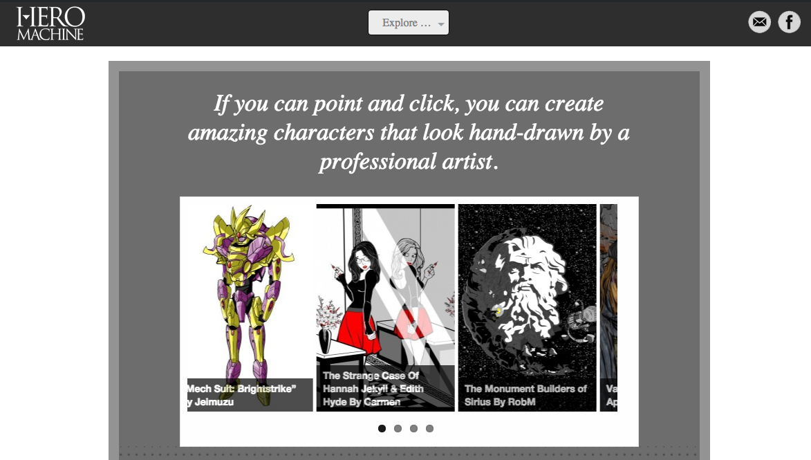
Hello HeroMachiners! As you may have noticed, I've just launched a new site design to hopefully make your browsing and creating experience more enjoyable. The home page now looks like this:
The goals of the redesign were:
- Make the site easier and more enjoyable to use by decluttering and toning down the riot of colors in general.
- Get more in line with the design aesthetic of HeroMachine 3.
- Widen the default page layout so you can see more on the screen without getting crowded.
- Give direct and unambiguous access to two key features -- downloading HM2 and using HM2 online.
You can still find your favorite links like the forums, the Hall of Fame, and the blog in the one central drop down menu right in the middle at the top, labeled "Explore".
I hope you enjoy the new look and feel. Please let me know in comments or through the contact form (the envelope in the header) if you have any suggestions or feedback.
Have fun creating!
