
Your character design challenge for this week is to take a character designed originally in HeroMachine 2 and redesign it using HeroMachine 3. You'll need to explain your concept behind the redesign, why you made the choices you did and why you think they're an improvement. In other words, this isn't just remaking the exact same character's look using a new version of the software, it's taking the concept of the character and updating it with your own vision.
You can choose one of your old designs if you like, or you can choose any one from the HeroMachine Facebook page. Why the Facebook page? Because I am still hell-bent on catching up to UGO's fan numbers, that's why! So if you aren't already a fan of my page there, please take a moment to do so even if you're not using an image from the Photos archive.
Edited to Add:
OK, I think I am not being clear here.
The point of this is not to recreate the character in version 3. The point is to take an existing character and redesign it completely. Like when Iron Man went from the big gray tank armor to the silver and gold. Like when Superman went from the red-and-blues to the blue lightning bolt costume. Like when Spider-Man went from the red-and-blues to the black.
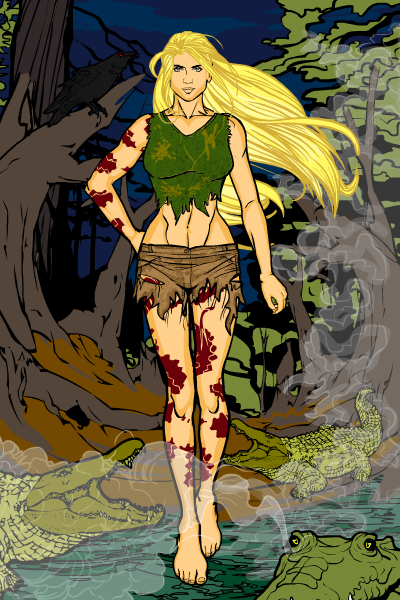
Your mission here is to reimagine a character, as if you were an artist working for DC or Marvel and your editor came to you and said "Hey, we're relaunching 'The Black Terror' but we need to completely redo it. Come up with something cool."
The goal is not to see how close you can get to making something done in HM2 look exactly the same, only done in HM3.
Now, how do you tell if an image is from HeroMachine 2? It's easy -- there's only one pose and it looks like this for the male:

And like this for the female:

They're all three-quarters' view with the left arm tucked up behind the torso and the hand jutting off horizontally.
The contest rules are the same as usual, except in addition to a link to your main entry, I'll also need a link to the 2.0 design you're revising.
- Use only a HeroMachine applet (no PhotoShopping except for basic cropping) to create a PNG or JPG of your entry, named as [your name]-[character name].[file extension]. So DiCicatriz, for instance, would save his "Bayou Belle" character image as DiCicatriz-BayouBelle.png.
- Post the image to a publicly accessible website (ImageShack, PhotoBucket, the UGO Forums, etc.).
- Enter the name of your entry and a link directly to the image in a comment to this post. The image cannot have been used in any previous HeroMachine character design contest.
- The link to your image should go directly to the image (like this) and not to a hosting jump page (like this). If you see "preview" or "rotate" somewhere in the link you're probably doing it wrong.
- I'll choose a winner next Monday, who will receive his or her choice of any item or a portrait to be included in the final HeroMachine 3 program, or a "Sketch of the Week" style black and white illustration (you pick the subject and I draw it up however I like).
No limit on entries this week, so knock yourselves out. Good luck everyone!
