Open Critique Day

Someone mentioned that we haven't had an "Open Critique Day" in quite a while, so here you go.
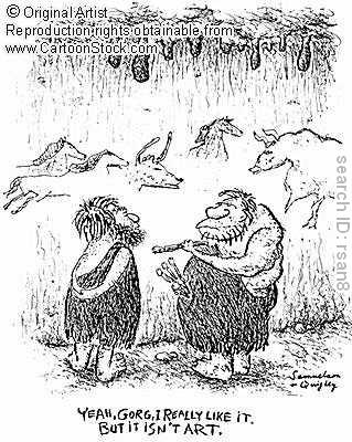
Feel free to post a link to a HeroMachine character (or even just a drawing you've done) that you would like to get a constructive critique about in the comments to this post. Please limit it to one such image per person. I'll do my best to make remarks about each one regarding where it works and where it maybe falls a little short.

The other commenters here should feel free to make their own observations on each one as well, but I do ask that you make your critiques constructive -- don't just say "This sucks", say why specifically you think it isn't working, and if possible how it might be improved. At the end of the day it's not the critic's job to actually figure out how to fix something, but it is the critic's job to make coherent, specific, and constructive observations about a piece's strengths and weaknesses.

I look forward to hopefully helping you out with any illustration you're having trouble getting to the place where you would like it to be.

79 Responses to Open Critique Day

  1. MScat says:

    I actually have a few id like to get critiqed if thats ok. Im going to post them separate though so i can put their stories with them 😉

    http://mscat.deviantart.com/gallery/#/d1e8tf4

    When i was in high school and i had to read Romeo and Juliet i thought of drawing my own comic version of it but never got past the cover. Tell me what you think! 🙂

  2. Jeff Hebert says:

    MScat (2): I’m sorry, but only one per person — please re-read the post guidelines. I just don’t have time to do more than one each.

  3. Aaron says:

    jeff, the second set of leather jackets(3rd page 9th item in male coats) is there any way you can make an opened version of them? another thing the trench coat i like but make a long sleeved version of it please and if possible can you add a short mullet hairdo in hair

  4. Marx says:

    Ok, I have an issue I could use some advice on. A friend is playing Elsbyth, a half-elf paladin. He was quite pleased with the picture I worked up in HM. Then Elsbyth got killed and reincarnated as a dwarf. I modified the original picture to dwarfish proportions, but something just isn’t… right. and I can’t put my finger on it.

    Here is a side-by-side view of Elsbyth as both a half-elf and as a dwarf. Anybody have any thoughts on why the dwarf pic just doesn’t work as well as the half-elf?

    http://www.terpconnect.umd.edu/~mshute/2Elsbyths.png

  5. Kaldath says:

    @Marx: I think the heads porportion is off for the dwarfish look, try making her head a little bigger and I think it will work.

  6. Marx says:

    @Malfar #1 – Overall, I like the picture. I don’t get the alien, but I’ll assume you have a reason for it and move on.

    Good: The consistency of the fur clothing. The color and textures make for a very effective ensemble. The contrasting colors in the background really make the figure stand out.

    Improve: I don’t get why he’s holding the hammer by the strap. It doesn’t look natural. I’d have him holding it by the handle. The lightning in the background is too symmetrical; I’d make it look more random. Also, you’ve got one bit of lightning layer above his right hand that ought to be behind it.

  7. MScat says:

    Heres another:

    Her names Jade my idea was to have a character that had died but some secret organization using advanced technologies brought her back. She would come back stronger, faster, and all around awesomer hahaha.
    http://mscat.deviantart.com/gallery/#/d2j27xm

  8. Fyzza says:

    http://forums.ugo.com/attachment.php?attachmentid=69706&d=1274621386
    This is one I did from ages ago, I’d like some more feedback on how it turned out. 😉

  9. Jeff Hebert says:

    Malfar (1): First of all, I like the old Norse feel of the main figure a lot. I don’t think actual Vikings wore horned helmets, but it’s such an integral part of our current mythos about them that it works well here. I also like the line coloring on the Thor figure’s body, that’s nicely done.

    The main area that could be improved, at least for me, is with the Stargate alien figure. I’m not sure what its relationship to Thor is. The way they’re posed it could be that it’s a Don Blake kind of thing where the alien is the alter ego of the Thor character, or it could be that it’s his child, or they could just be standing in the same space coincidentally, or Thor could be about to smite him. It’s not very clear what exactly is going on there.

    The minor two areas that are not as strong as they could be are in the mask and the background. The mask on Thor’s face should be a darker tone of the skin color, assuming that what you’re going for there is a shadow from the helmet falling across the forehead and eyes. You can achieve that by making the mask colors all black, then changing the alpha on each to something like 30%. Right now it looks like it’s a solid gray just placed behind the eyes/eyebrows/nose and that looks more like a mask.

    If in fact you WANTED a gray mask, ignore all that!

    Finally, I don’t think the setting quite works. The absolutely flat plane of the ground hitting the sky looks artificial and doesn’t really “ground” the figures. Something to break up that horizon line would be good.

    Nice job overall though, thanks for sharing it!

  10. Jeff Hebert says:

    Aaron (4): Any such tweaks are a long ways off — I am doing complete sets of new stuff first. Unless you win a contest, then you can have whatever you want! 🙂

  11. Jeff Hebert says:

    Marx (5): I agree with Kaldath, the illustration’s great and I think the dwarf looks really good. The only tweak I would make would be like Kaldath said, make the head a bit larger and I think you’re golden.

  12. Kaldath says:

    Jeff, Malfar’s Thor is a representation of the character from the Stargate TV series. Read this wiki entry and you will know the relation ship of the “Asgard” Aliens to Thor.

    http://en.wikipedia.org/wiki/Asgard_(Stargate)

  13. Jeff Hebert says:

    MSCat (2): Wow, nice work! I like the composition a lot, with Juliet half hidden by and holding onto the frame, that’s a nice touch. And having Romeo with his back turned works great too. You’ve done a great job with the coloring as well, swapping out the background pink and blue is a wonderful technique and generates a lot of movement, well done.

    The figures work pretty well in terms of posing and anatomy. I like the cyborg arm on Romeo and the overall costume design on him, it’s cool.

    A couple of areas you might want to tweak are on Juliet. The biggie is her hand, the fingers a big bloaty and bendy to look right. It’s important to keep in mind the three separate segments of the fingers so they lay properly. The ring finger on this one is a complete curve with apparently no bones at all, while the middle finger is really puffy at the base. And it seems like in this particular pose, her index finger would be laying along the edge of the frame vertically rather than slipping behind it.

    Second, we should be able to see her left eye peeking out from behind the hair and clipped by the frame, but it’s simply missing.

    Finally, something about the way her dress folds is a bit off-putting, it seems puffy where it ought to be folding back the other way.

    The only other general comment I would make in terms of areas of possible improvement is on the general line work. Every line is the same thickness, which flattens the image out quite a bit. If you’re going for an animation cell look that’s fine (they tend to do that because it’s a lot faster and easier to keep consistent frame to frame), but if it’s supposed to be more of a stand-alone image then it would be good to vary the thickness of the inked lines to reflect areas where light is hitting it, and areas where the line is falling away into shadow or depth.

    But, all of that aside, it’s a very good illustration with a lot of great points to it, I like it!

  14. Jeff Hebert says:

    MScat (8): Sorry, as I said, only one per person, and so I went with the first one you posted. Other folks here should feel free to comment as they like, though, I make no arbitration binding on anyone but myself!

  15. Vampyrist says:

    I would like your opinions on one of my most recent characters. This is Onca, a brazilian werejaguar, who fights off various drugrunners and gunrunners.

    http://s751.photobucket.com/albums/xx155/Vampyrist/My%20Characters/?action=view&current=Onca.png&newest=1

    Be harsh, I want all your opinions, good or bad.

  16. MScat says:

    ok sorry can i just stick with the second one and forget about the first one. Sorry!

  17. MScat says:

    hahahaha you posted the comment as i was posting that last one. Thanks for the critique sorry again for the multiple posts lol

  18. Kaldath says:

    Here’s one I wouldn’t mind getting your opinion on Jeff, I General I am satisified with how she came out, but I wonder if I made it too “busy” adding more detail to the character then was needed ?

    http://forums.ugo.com/attachment.php?attachmentid=70868&d=1278414038

  19. Malfar says:

    Vampyrist, your werejaguar is cool, he reminds me of Marvel`s Black Panther

  20. The Doomed Pixel says:

    Here’s a little bit of fanart I did recently. I don’t usually do this sort of thing, but hey, inspiration comes where it will, I suppose. This is a Redead from the Legend of Zelda. I don’t know how much you know about these things, but I’ve always thought of them as one of the creepiest video game monsters ever. Here it is:

    http://img840.imageshack.us/f/redead.png/

  21. Jeff Hebert says:

    Vampyrist (16): I think the illustration is solid, particularly in terms of the background and setting. The character, if anything, is a bit on the bland side, although I understand how sometimes a concept simply is what it is. But having his skin and the trees all in the same general color family makes him stand out even less, which doesn’t help the lack of distinctiveness.

    The more I look at it, the more I think that’s the main problem — not so much the character design (which is solid if not exactly ground breaking), but rather that the background elements (which are good on their own) take away from, rather than add to, the impact of the main figure. I’d try the same guy with a simple black circle background maybe, kind of like Imp tends to do with his guys, I think that would help it pop a lot.

  22. Jeff Hebert says:

    Kaldath (19): I like the blue and black color scheme a lot, and the tattoo on her leg absolutely rocks. That’s 100% pure awesome. The asymmetrical costume design with the skirt only on one side and the slanted top work great too. Angling the staff behind her like that also adds to the sense of movement and is a great element.

    My main reservations would be with the dark blue background color, combined with the thick blue outside border. They conflict with the smaller oval and oval border, particularly with the varying shades of blue — they end up competing with each other. I’d like to see it without the dark blue background and frame, with just the blue center oval and without a border on that oval.

    I also frankly am not a big fan of that font. That’s more of a personal preference, but it’s so ornate it kind of becomes less readable and more of a design element, and one that again struggles against all the other stuff going on in the illustration.

    But as for the actual figure and character, I love it.

  23. Jeff Hebert says:

    The Doomed Pixel (21): Nice! Very atmospheric and evocative. I actually know nothing at all about the creature or the game, but I think the illustration is really well done.

  24. Jeff Hebert says:

    Rozenstal (24): Wow, I can’t even imagine how much time and effort that took to compose. Really nice work!

    The whole concept is cool, I like the “League of Extraordinary Gentlemen” kind of feel to it. The steampunk Dr. Octopus type guy is probably my favorite, he looks like he has a lot of personality.

    I appreciate the challenges inherent in trying to make a backwards-facing figure with the program, and overall you did an impressive job of it. Unfortunately the feet really don’t work at all, and given the limitations inherent in what you have to work with I don’t know that something more convincing is possible. You might have been better off going full Liefeld on that and just cropping out his feet from the frame.

    Finally, I have GOT to get a steampunk gas mask for our pets. That’s so awesome.

  25. Fyzza says:

    Heres another that I just need to post here 😛
    As Jeff only has time for one per person, this isn’t really aimed for him to comment on.
    http://forums.ugo.com/attachment.php?attachmentid=69798&d=1274823671
    You might notice that the gun in his right hand isn’t masked, but this is because the masking button became unresponsive when I tried to mask it.

  26. Rozenstal says:

    Jeff, it not feelers of dr. Octopus is a steampunk-armchair! Here only a background, here it is visible is better that I wished to make:
    http://s003.radikal.ru/i201/1007/20/326770b7ec1e.png

  27. Marx says:

    @Kaldath(6) & @Jeff(5)
    Hmmm… easier said than done. I don’t think there’s a single element on her face that’s at 100% scale. Enlarging all of those resized items uniformly is going to be tricky. Any tips on determining the current scale of each item so I can do the math to enlarge it?

  28. Fyzza says:

    @Marx (29) If you’ve saved it, you can go back to it, and look at the item’s scale?

  29. Rozenstal says:

    Marx (5), The amulet has turned out very interesting, shoulders in a kind in legvear and signs on a bandage – too.

  30. Marx says:

    @Fyzza(30) I do have it saved, but you can not see the current scale of items–not in numbers. The slider repositions itself to the scale of the current item, but the text numbers remain the same as the last time they were changed.

    @Rozenstal(31) I’m guessing English is not your first language. Unfortunately, I’m not really certain what you’re trying to say here. But thanks for saying it!

  31. Fyzza says:

    @Marx (32)If you move the thing a little to one side and then move it back to that position, that what’s I do when that happens.

  32. Rozenstal says:

    Marx (32), yes, my first language is Russian. And for English language I use the online translator. Which at times gives out nonsenses.))

  33. Jeff Hebert says:

    Mark, can’t you use use the “Group” function on the transform tab to scale all the Head items at once? I know that’s not ideal as it doesn’t position them all the same way but at least it’s a way to do the scaling part all at once.

  34. Aaron says:

    srry for the inconvenience Jeff them there were suggestions to make HM3 better but ill try to win a contest if i can figure out how to save my character to where i can enter it in the next character contest
    thanks anyway

  35. Danny Beaty says:

    Hi gang! A while back, Jeff posted a picture of a Golden Age character called “Captain V” (he was the guy with the big V on his chest). I”m not sure if the V stood for “Victory” or “Valor” or “Vagina”or whatever.I do know that there were Golden Age characters (now in the public domain) called “Captain Victory” and “Captain Valor”. At any rate, going on the premise that the “V” stood for “Victory”, I give you my re-design of Captain Victory. Everyone (including Jeff)please feel free to critique.

    CAPTAIN VICTORY
    http://www.facebook.com/photo.php?pid=469831&l=b569351ea3&id=1815191475

  36. Me, Myself & I says:

    @MScat

    Well done on the Romeo & Juliet image. Have you considered having Romero face towards the center of the picture ratherthan away from Juliet? It almost looks like he’s turning his back on her which is really counter to the tale. Overall, really well done though.

    @Marx
    Really I liked this image a lot; nice composition overall.
    I tend to go all obsesive compulsive on my own images and its hard not to notice the details on others images. Therefore I find I keep going back to the gloves. The wrists stick out from behind the gloves which makes it look like her hands are not attached to the arms. I would consider changing the scaling of the gloves or moving them so the wrists don’t stick out. I think the conversion went really well. Not an easy proportion change going from an elf to a dwarf; well done!

  37. MartianBlue says:

    @Fyzza, that particular hand doesn’t mask sometimes, possibly anytime, what I do when I get that problem, is I use the same hand from the opposite side.

    @Marx, as Fyzza said, if you’ll gently grab and move the scale circle slightly in one direction, then back to it’s original location, it’ll give you your numbers. That’s what I always do, when making custom items and their diagrams.

    The only problem with Jeffs method, is it resizes everything to the same size (100%,50%, whatever of the items). So if you’ve already scaled everything individually, Fyzza’s method is what I suggest.

  38. MartianBlue says:

    Update* Using all items scales everything in it’s individual size, but, as you know it scales everything, not just one section.

  39. Fyzza says:

    @MB (39), It was the itemright masking that was unresponsive, I tried it with the flipped left hand but that didn’t work either.

  40. Me, Myself & I says:

    Jeff, I know you mentioned only one critique per person and I am listing four links below. They are all the same image though. The only difference is the color of the backgrounds. I am open to any critique you may have but the reason I included all four images is I’m wondering which color background looks the best? I am also wondering what you think about the fire?

    http://dl.dropbox.com/u/6781672/Knightmare.bmp
    http://dl.dropbox.com/u/6781672/Knightmare%20Blue.bmp
    http://dl.dropbox.com/u/6781672/Knightmare%20Green.bmp
    http://dl.dropbox.com/u/6781672/Knightmare%20Red.bmp

  41. Oquies says:

    http://i16.photobucket.com/albums/b33/Oquies/Hero%20Machine/Theta.png

    This was a centaress I put together a while ago. I like her but always wonder if there are things that can be done to make it better. Not sure if you can see it but the spear tip is meant to be poisonous.

  42. Jeff Hebert says:

    Danny (37): I like it! Much better than the original, that’s for sure. The helmet and the gold V built in to the neckline are great, really nice job on that.

    I might try changing the boots to something that more closely matches the modern, ribbed look of the helmet. And you might play around with the V, see if you can make it a little thicker on the inside portion, it might be a smidgeon too narrow. But maybe not, too.

    Overall a really nice remake, well done!

  43. Me, Myself & I says:

    @Oquies

    I’ve never seen a purple centaur before. I kind of like it which surprises me.

    If you want the spear tip to be more noticable I would suggest increasing the contrast between it and the trees in the background (lighter green vs. darker green, etc.)

  44. Jeff Hebert says:

    @MMI (42): Love it! The flames are exceptional, that’s an awesome effect. Very, very cool. Or hot, whatever.

    In terms of the background color, I think I like it best without one — just white. But of the colors, I like the red the best. What I don’t think works is the gradient line right down the middle vertically. I think that’s probably either the fault of the gradient pattern, or having two different background squares put together. Either way, if you can get rid of the dividing line so it’s a smooth gradient all the way across, that would help a lot.

  45. Jeff Hebert says:

    Oquies (43): I agree with MMI, purple is surprising but I think it actually works well. A pleasant surprise! Her halter and belt work great, I think having that slanted belt helps transition between the human torso and equine body very well, without looking artificial. The fetlock guards on the horse look cool too. The two background images work great too, making the flat horizontal grassy portion not look too sharp, particularly with the leaning trees. Good job on the color there.

    I think MMI is also right about the spear, if you want it to stand out more I think you need to change the color of the fringe to something different from the background trees. That will in turn make the gray blade more noticeable. Speaking of color, you might also try a lighter/paler blue for the sky, I think that would help her upper torso stand out more.

    Good job, I have always had a soft spot for centaurs. I don’t know why, they’re just cool.

  46. Firecracker says:

    Jeff
    I’ve been playing with the idea of a being completely made of fire. Here’s what I came up with, I would like your opinion.

    http://forums.ugo.com/attachment.php?attachmentid=71398&d=1279820358

  47. Danny Beaty says:

    Thanks Jeff!

  48. Me, Myself & I says:

    Is this what you were thinking? What about the circle in the background? Does it add or subtract from the image?

    http://dl.dropbox.com/u/6781672/Knightmare%20Red%20Revised.bmp

  49. Jeff Hebert says:

    Firecracker (48): I like the idea overall a lot. The head is, I think, the strongest part of what you have so far — it has a cool, flame-like look that is neat.

    I think having the smoke-filled base body is a drawback, it looks too muck like a human body with a flame aura, rather than a being made entirely of flames, to me. Maybe you could try using resized fireballs and such to suggest a body, rather than an actual human one? Not sure on that, hopefully some of the more creative thinkers with the alternate uses of various bits can chime in here.

  50. Jeff Hebert says:

    MMI (50): Yes, that’s exactly what I meant. Personally I still prefer the circle behind it over a white background, but if you’re going to go with a color one, I think the circle still works.

  51. Danny Beaty says:

    @the good Mr. Hebert: About the boots on my remake of Captain Victory, I chose those boots because of the v-shaped cuff. I would have preferred cuffs that match the cuffs on the gloves but there are none, and at the time I wasn’t sure if the glove cuffs would have fitted on the boots. Thanks for your input! I hope we do another PD character remake character contest again soon. I always enjoy those!

  52. MartianBlue says:

    The Black Terror Remake
    http://i104.photobucket.com/albums/m189/acebase_2006/Hero%20Forum/BlackTerror.png

    I made him a couple days ago or so. I tried to modernize the original, and I like him, he’s just not finished yet. I think the skull on his shirt needs a bit more work

  53. Oquies says:

    @Marx #5 to me the dwarf just dosn’t look like she fits in the armor just make her a bit more bulky around the shoulder areas.

    @Fyzza #9 Think his right arm apears to be a little out of proportion maybe scale it down a bit more and possibly add a bit more bend at the elbo. I like that sword thingy he has on his back too.

    @Vampyrist #16 I think he just needs a mouth.

    @Me, Myself & I #42 I would go for the green but I have a strong preference for that color. I also would do a sold back ground color with shading instead of the split in the middle there. But again that is just preference.

  54. Jeff Hebert says:

    MartianBlue (54): Love it!

  55. MartianBlue says:

    Thanks Jeff, I’ve noticed alot of my creations are getting… detailed, so I thought why not try something simple.

    I think, the shirt skull eyes need a tad bit more shape to give more of a terrifying personality.

  56. Gargoyle323 says:

    Here’s one I threw together late one night. I had an idea in my head and it sort of went a different way than I originally planned,so I wanted to see what others thought of it. Any input would be welcomed.

    http://s820.photobucket.com/albums/zz123/gargoyle323/Open%20Critique%20Day/?action=view&current=hm3-beta100.jpg

  57. Me, Myself & I says:

    MartianBlue (54)

    You might want to split the nostrils as well.

    Here are some reference images that may help.
    http://www.scaryforkids.com/pics/evil-skull.jpg
    http://www.digital-clipart.com/images/products/skulls_pdf.gif

  58. Jeff Hebert says:

    Gargoyle323 (58): Neat! Love the Killer Clown himself, the colors and the skull and the dead white skin combined with the lack of pants is truly creepy. And while card-themed villain teams have been done, they work well as support members of the illustration. I even like the font choices and treatment.

    Great job, a very fun image!

  59. Gargoyle323 says:

    Thanks for the kind words,Jeff. The Killer Clown was the main idea when I started,I sort of just threw in the gang. The two women were going to look like twins(not card-themed)and the guys were complete last minute additions. I really didn’t like the way the guys turned out in the end. Again thanks for taking the time to critique the picture. I value your opinion very much.

  60. Brian says:

    my take on the “fire guy” love to know what you think and any ways to make it better

    http://www.flickr.com/photos/bhughes78/4646291936/sizes/o/

  61. Oquies says:

    @Brian #62 I think you need to bring the flame aura up a few layers. It looks like it covers the legs but not the body. Comes a crossed a bit odd to me.

  62. Jeff Hebert says:

    Brian (62): I definitely get the feeling that this is more “guy with flame powers” like the modern era Human Torch, and less “being made out of flames” that I think Firecracker was going for. Having said that, I think he’s a little … I don’t know what the word is, “expected” maybe? I feel like I’ve seen the sort of thing before, you know, with the flame aura and fireballs in the hands and such. The colors are about what you’d expect as well.

    It’s not bad or anything, it just doesn’t really jump off the page for me. I’m struggling to think of suggestions for improvement, but I think it’s more of a general problem with the concept, not so much the execution.

    Wish I could be more helpful 🙁

  63. Jeff Hebert says:

    Kyle (63): I actually really liked this one when I saw it for the Dinomarines contest, and even had it in the Finalists folder. When it came time to post, I’m trying to remember why I didn’t include it then … I think there were just already lots of ones in the group, and I thought they were just a little bit stronger. But this is a very good character, I liked his big Dinosaur head and the cigar and the stance and all. It was definitely in the top tier of submissions and just a hair out of the running for a finalist. Had the time of day been different, or who knows what, it might have made it in, it was that close.

  64. Alex says:

    http://img6.imageshack.us/img6/6714/halfbreed.jpg
    I think of this guy as a cross of two alien species who are complete opposites and are even at war and he doesn’t belong in any of the two worlds and thats why he comes to Earth an becomes a superhero so everybody likes him.

  65. Cliff says:

    Here is Element Lad from the Legion of Super Heroes. I play him in a LSH RPG.
    I used it for a rather fun Hero Machine 3 pic I did
    Source pic:

    http://www.facebook.com/album.php?aid=12289&id=100000780936307&saved#!/photo.php?pid=152074&id=100000780936307

    When I studied the pic of Element Lad to recreate it in HM3, I just HAD to do this one.
    Here is the HM3 I would like comments and suggestions on:

    http://www.facebook.com/album.php?aid=12289&id=100000780936307&saved#!/photo.php?pid=152075&id=100000780936307&fbid=134215813281116

  66. Me, Myself & I says:

    Alex (67)
    The overall effect is pretty cool on this one.

    I don’t think the special effects around the feet add anything though. I think you could get rid of them be make the image simpler without taking any real effect away. Same goes for the Scyth.

    I like the contrast a lot.

  67. Gargoyle323 says:

    MM&I(42)-LOVED,LOVED,LOVED the flame effects on the horse! I have created a few pictures using that effect but have never got mine to turn out as good as yours.Really nice job!

    MScat(2)-The layout of your Romeo&Juliet picture is really well done! The visual is well put together.

    DP(21)-Creepy,yet very nice.Reminds me of a car wreck,in that you want to look away but can’t stop staring at it.Very nicely done!

    MB(54)-Loved your take on The Black Terror.It has a really nice look to it.

  68. Jeff Hebert says:

    Alex (67): I’d agree with Me Myself and I (69) — a good overall look, but I’d lose the scythe and the feet effects. I also am a little confused by the spine showing through — the ribs look like either armor or that his skin is partially invisible, either of which works, but the spine seems to be layered on top of his stomach muscles, which doesn’t work with either scenario really.

    Otherwise, a nice job, particularly the glowing ghost chain. That’s cool.

  69. Jeff Hebert says:

    Cliff (68): That’s just wrong on multiple levels :-p

  70. MartianBlue says:

    Thanks MMI, and Gargoyle323

  71. Cliff says:

    WHAT? It’s summer, its hot, what better than a cold glass of Oramge while lolling away on an innertube, … perfectly covered, he may or may not be wearing 30th century Speedos under that cool H2O? LOL
    Any comments on constrution technique or anything? LOL

  72. Gargoyle323 says:

    Cliff(68)-Although that picture gives me the willies,I think you did a really nice job with the pose of the body. I also like how it feels that we are looking down on your subject.I am already getting ideas on how to use this pose for some of my own creations! Well done,Cliff!
    *(I keep hearing Robin Leech saying”Welcome to the lifestyles of the rich and famous-Super Hero edition!”)

  73. Jeff Hebert says:

    Yeah, what Gargoyle323 said — neat pose, very creative.

    And with that, I am going to bring this edition of Open Critique Day to a close. Thanks for participating everyone, especially those of you who took the time to offer your feedback!

  74. Jigglypuff says:

    What about this character I created?

    Her Profile

    Lesha Deliter
    Age: 16
    Profession:Assassin
    Race: Human

    Lesha Deliter was a daughter of a promient noblity that was massacred 14 years ago during a civil war in the Dalither Kingdom. She was rescued by the Khaliden Conclave of Assassins and trained by them. When she completed her training at age 16, the conclave elder told that it was her destiny to kill Brithner Demerota, the criminal warlord who killed her family.

    Lesha is very quiet and a loner, often prefers to keep her words to a few. She also lacks some social skills because she was isolated for many years since she was two. Also her favorite weapons are the sickles that she carried around.

  75. Jeff Hebert says:

    OK, one more since I didn’t actually close the comments.

    Jigglypuff (77/78): I like the overall concept and the look of her outfit. Where I think it goes wrong a bit is in the coloring. Purple and green are hard to pull off in the same outfit (the Hulk notwithstanding) and here, what with the belt and the dress flaps and the gray sickles all combining in the same area, it all sort of mashes together and becomes hard to differentiate. I would bet the character looked a lot clearer in black and white. The gloves also get lost a bit in the water fall behind her.

    I think the easiest possible fix would be to swap out the purple on the belt and the blue on the gloves with something unexpected, like white, to make for some contrast.

    Finally, I think I’d color the nose the same as the cheeks, the long part of the nose should be in the light but right now it’s darker, which looks off a bit.

    And NOW we’re done!