Damien here with the super-giant post on how to make the head-on views of HeroMachine 3 work in your favor! (Or at least not hold you back too much.) So give a big hand to Violodion for suggesting this...almost a week and a half ago, I think? It's been awhile!
Anyway, when Jeff first unveiled HM3 with the new "full-frontal" view, many people including myself were somewhat disappointed.
"Why the change?" we asked and complained.
Well, to be honest, as I've helped Jeff out for the month-ish I've been working with him, there is one very noticeable flaw in creating HeroMachines: They are a lot of frickin' work. 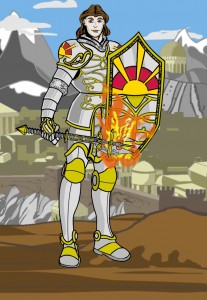
I'm not even talking the code, or the design. I'm talking the sheer unholy number of things he has to draw to make our dreams and wishes come true. With this full-frontal view instead of the traditional 3/4 view, Jeff's work is cut almost in half for each body figure. By giving us the ability to resize, it cuts it further still--we don't have to have to wait for him to come out with Brick parts, we just make our own Brick and resize to fit! By giving us unlimited (depending on your computer and browser...) layers and item multiples, we have more creative control than I did with Photoshop. Since it's generally understood that I know what I'm doing, take a look at this example here from before HM3 was good and tell me I'm wrong! (I'll have to remake him one of these days...This was done as a commission for my good friend James. Meet Kaleb the Cleric.) --->
(No, I don't know why the cleric is carrying a flaming mace. I just know it was fun to make.)
Those very familiar with HM2 might be able to figure out where most of the parts came from, and yes, it is heavily edited. But this whole project took a week, turned out far better than I could have done in HM2 alone, and is a pittance compared to the capabilities of HM3. (Most of the "amazing" things I do in HM3 are just a continuance of tricks I learned doing editing projects like this with HM2, but with HM3 at least 50% of my old tricks come built in!)
And by giving us different body parts, we can experiment with new poses instead of waiting for new ones. Which brings me back to today's post.
There are many people who have mentioned, at one time or another and in almost as many forms, that they with there was more flexibility in posing the characters in some way. So today I'm going to give you several ideas on directions you can take your creation. Please note a few things first, however.
- Most of these examples have resized parts in them. I'm not going to list all the sizes, because that would make this a hugely long and kinda boring entry. So please remember to fiddle until it's correct. The Poses examples down below, however, have as little resizing as possible.)
- These were made to be examples, not artwork. So they do kinda suck, or have little mistakes in them, or one of the parts doesn't line up quite right. Not the point today.
- I've used some of these ideas before, and made others up just for today's post. So if they look funny sometimes, they might just be as new to me as to you. And if you've already done them, or even did them before me, just remember that I'm not the one who sifts through the contest entries, so I might have missed seeing yours. (Besides, who has that kind of time? I mean, besides Jeff, who technically is being PAID to go through them all. No such luck on my end here.)
- I've included some artwork from other artists today to illustrate points. I didn't make them, so I might not know right away how to duplicate them exactly. I will, however, be giving some basic lessons on making easy and simple changes to your artwork that will make worlds of difference in their effectiveness.
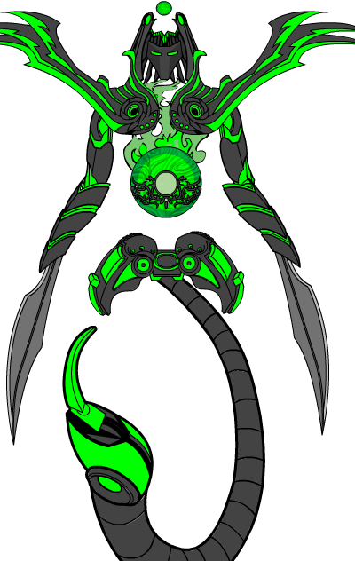 All right! Now that we've got some ground rules covered, let's get started! The first example I wanted to show is the ESPER13, by Artful Dodger. This was his finalist from the You, Robot competition. I included this first for one reason: lack of human form. Just because you have a section called "Body" doesn't mean you're limited to a humanoid frame. This is a perfect example of thinking outside the box, though at this point I think Art was outside the warehouse, somewhere in the parking lot. All normal conventions were broken as far as body, anatomy, being connected in the middle...even having insides! It appears to be hollow in the spaces that actually enclose at all. The only things that approach "normal" are having a head and arms. The point of this was to remind you that this program has the capacity to do almost anything, as long as you stretch your thinking. There is nothing stopping you from doing anything with this program as long as you have time and effort to devote.
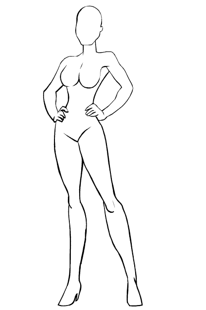
Now, on to more conventional fare. For those of you who are doing a barbarian-type character, this section is for you. There are several styles of arms at your disposal now, and there's no reason not to use them! Featured here are arm positions from BodyStandard, and with a little rotation and positioning you can have an action-filled pose worthy of Conan or another barbarian of choice. These miniatures here are just a few examples that I threw together in about five minutes apiece. Go ahead and open them, save them to your hard drive, whatever. They're yours! 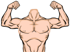
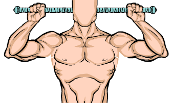
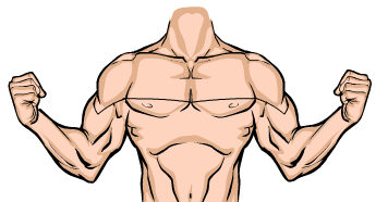
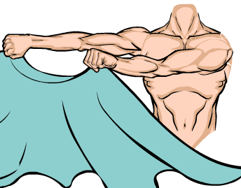
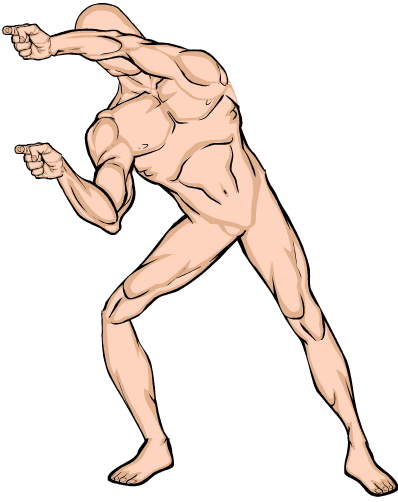
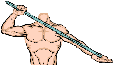
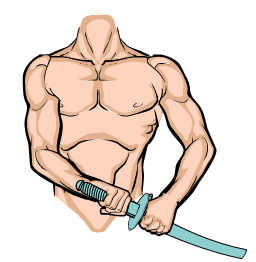
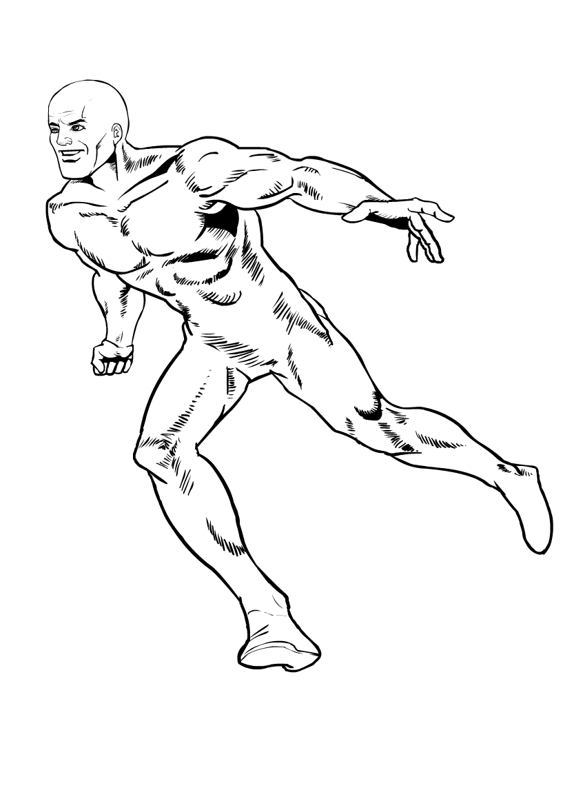
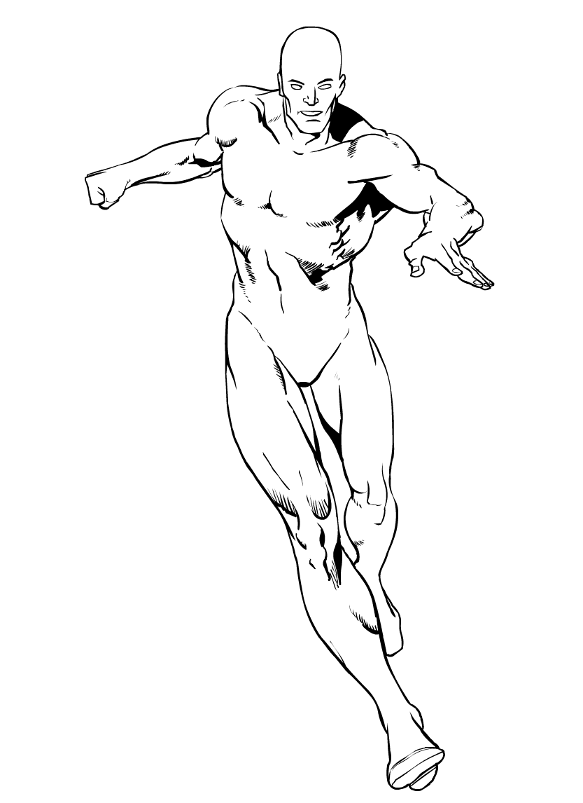
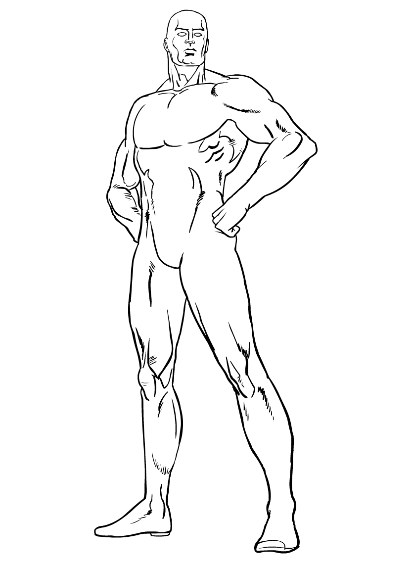
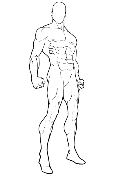
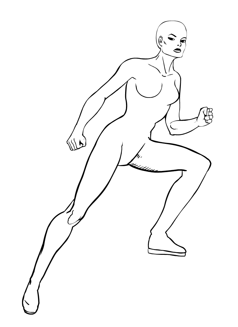
And these are some of Jeff's that I found. You can find most of them in the archives somewhere, or just pick them all up here today! These should be invaluable as positioning aids in creating some new poses. In fact, I do believe some of them were intended for Hero Machine at one point or another.
And the poses above those should get you started on design ideas for poses, or at least give you something to base new characters off of.
Now, to the faces!
To give your character the look of someone not staring vacantly at you through the screen, you need to give him something to look at. This guy is obviously getting ready to pound someone with that carved stick he's got, and that someone is just off to our left. Or he's really mad at his stick. Whatever. Anyway, you need to pick a head from the list that has off-center lines. If you're not sure if the head you've picked is off-center, stare at one line and hit the Flip button a few times. If it moves, it's off-center. Have him look right or left and continue on. (Remember that I've resized the head; my standard head resizing for normal people is 120%. The rest of the features should be sized separately according to your preferences after the following.) 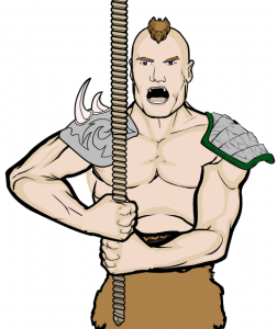
The facial features you choose must be placed off center for this to work. (Use the transform arrows for this part, it simplifies the exercise tremendously.) If you've left everything so far in their default locations, it means that facial features like eyes, nose and mouth need to be moved at least three arrow clicks to one side. (Usually, it doesn't take more than five, but your results may vary. Also, I used a preset face here, at 120%, to keep things simple.) When adding the ears to a side-turned head, remember that one of them is now hidden slightly by the curve of the head. So put one ear behind the head layer, and move it up one arrow click for a slight, natural tilt to the head. Widen the ear on the side facing you also, so you can "see" just a little inside.
I added a tuft of hair on top, but rotated it slightly to appear slightly curved around the skull. Also remember that if you intend for your barbarian (or anyone else, for that matter) to be shouting Liefeld style, you need to increase the vertical size of your head to compensate. Unlike in traditional anime, the chin does actually move when your mouth opens, so be sure to kick your head's vertical sizing up another 3-5% to compensate. Now, a more extreme example of head tricks would be this, a sneak peek at my upcoming entry for the YOUR Character contest this week (if I can get it finished in time!) Here's Mikal Scott! 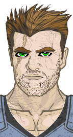
First off, I specifically chose hair that went off to one side to help the illusion of a turned head. But if you look carefully, you'll notice a few other things that make the head stay turned in your mind--
- The left eyebrow is horizontally shorter, "decreasing" its perspective into the distance.
- One eye/eyebrow set is slightly higher than the other, making the head appear slightly tilted.
- His sideburns don't fall in front of the same places on his ears, covering one ear more to show that ear is further away.
- His unshaved stubble was masked several clicks to the left, making one side of his face appear to be facing the camera more.
Also, for a little added realism, I added the neck from TopsSpandex and made the line transparent. By making the neck colors slightly darker than the rest, it give the impression of a shadow, making your character look more 3D all around. Okay, back to the barbarian. You might have noticed a little trick I did with his stick. Does it look a little like a baseball bat to you? Go ahead and scroll back, I'll wait.
...
Back yet? Good. Some of you might have also been wondering how I did that little trick masking the thing in the first place. Don't worry, I will tell all. The entire process can be explained with the help of a small visual aid: -->
The first layer of items you want is the hand, and a stick. (This trick is harder to pull off with swords, but experiment and try anyway!) Using the color chart at the bottom to follow along, you would make both of the colors of this first stick the darker brown (highlighted.)
The second layer of items are the ones that we'll be masking at the end. Place the second hand over top the first, covering the thumb. Then place the second stick with the butt end just inside the contours of the hand. Don't mask yet!Make sure to increase the width by 7-10%, and color it light brown, dark brown.
The third layer is just a stick, but increased another 7-10% over the second. Rotate it 180 degrees from the other two and place it where you will along the second stick, but I placed the end just covering the open spot in the middle. NOW you can mask that second stick into the hand! 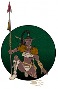
If you've done this correctly, you'll have a stick that's either getting bigger on one end, or is pointing slightly towards the audience. Pointing towards the audience and growing in size like that is called foreshortening. It's a great trick to show movement and action, like this picture of a elf chick tracking something big. Marx was a clear winner in the Fantasy contest. (I thought he'd beaten me, until Jeff judged by separate categories.)
Marx does an excellent job of posing in this piece. (Yes, that really IS him. What, you couldn't tell?) The folded leg with boot behind it, the leg forward, the hand holding the spear, the way her whole body is tilted slightly to one side...this is an excellent example of making the picture look almost alive and jumping off the page at you.
That's foreshortening.
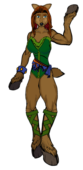 Foreshortening the legs is another step to make your character look more three-dimensional. I did a similar trick with my (overused) example Fierra the Feyrune and this more recent addition, Doe Re Mi, to show legs in different positions, holding body weight differently. I'd envisioned Doe as a combination dancer/martial artist, and so tried to mimic that in her stance. (This was also my attempt at a 3/4 female view, and I think it came off much better than expected.)
The trick to this is simple--size and color. 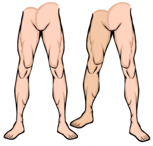 First, you need (OBVIOUSLY) a pair of legs with feet. Actually, that's all you need. (If you're going to do this as a project, remember that you'll have to mask long pant legs individually to rectangles or other shapes for them to fit properly.)
Make the right leg 90% of normal height and 110% of normal width and line the crotch back up. Make the left foot 110% taller, and the right foot 110% wider. Throw a little rotation in with the right foot, no more than about 5 degrees clockwise, to give it a more natural position.
If you want to experiment with this more, try using BodyMilitary parts that allow you to bend the knee slightly for a real martial arts effect. (It also helps if you add in arm positions that allude to real martial arts effects, though. Look back above at the sword-on-hip pose, and try reversing the legs with that in mind.)
And now, we return to the head. Is this because of poor blog planning? Maybe it is, but we're doing it anyway.So there.
This was another great piece by Marx entered in the Spellcaster contest, but he attributed the inspiration to me. 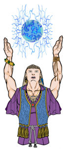
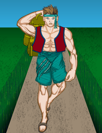
"So anyway, for this contest, I took my inspiration from Damien’s Epic Fail Monk. If Damien can make a character looking down, could I make a character gazing UP?..."
So here they are, with notes and critiques, tears and recriminations to follow! (Yes, Marx, I'm afraid I have to tell them the mistakes we made. But it's okay; we made the exact same ones.)
The first thing I want to note, since this is a post primarily about posing, is the slumped posture of our martial failure. This body was created using the BodyMilitary set, and among those items is a separate chest with no abs. By resizing it a bit and placing it down lower than normal, I gave a strong impression of hunching forward (aided and abetted by darker ab colors.) So an additional resource if you need to, say, cover up the join between arm and shoulder on one side of the body, while leaving the other arm uncovered. I used that technique in the Barbarian Guy earlier in this post, but the effect was covered by the shoulder armor I eventually gave him.
Anyway, to the faces! Both of these pieces do a more than credible job of showing a face tilted away from the viewer. Not only that, but the expressions are spot-on, really giving the impressions they're meant to convey. But, unfortunately, I must deconstruct them now to help you guys make them better than we did. I look at these now, after a great deal of time studying them and pondering why they just didn't have "that right look." The answer is depth.
The faces look pretty flat, like they're billboards. So, first tricks first. Whichever way your face is looking, you need to add some perspective. Big thing first--if you're showing faces at an extreme angle, the eyes, nose and mouth will need to be closer together. "Scrunched up in the middle" is about as accurate as I can get for looking up, and "scrunched together at the bottom" is accurate for looking down. The reasons for this are simple. When you're looking up, you can see the bottom of the chin, and not the top of the head. Looking down means you can barely see the chin, but you now have the whole top view of the head to account for. These examples should make my point for me. Just look at the positions of the facial features: 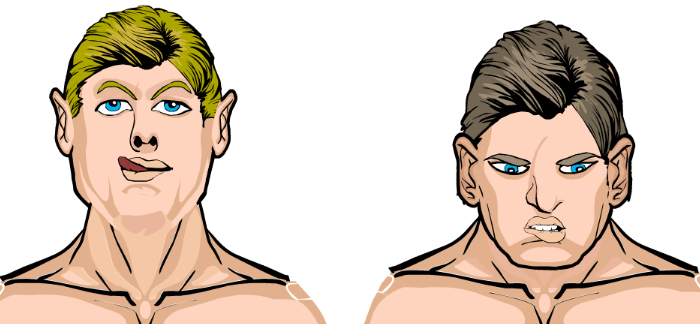
Yes, the one on the right does in fact look like Eric Bana. I don't know how that happened.
If you're looking up, put your eyes a little closer together; looking down, put them further apart. (Adding a little extra shadow with the Eyes and Eyebrows 2nd Colors is also a big help to define the eye socket better.) Same with the mouths--if you're looking up, make it a little wider, down a little narrower. Make the nose longer and pointier--the nose doesn't have the same shape when you're looking up or down, and it stands out from your head! When you're looking up, put the eyebrows higher over your eyes to show the eye socket; when looking down, be sure to put them almost over to of the eyes. When looking up be sure to emphasize the chin and jawline more. (I used the "covered ears" from EarsStandard.)
Well, there you have it, the Super-Sizer Poses Post, courtesy of a suggestion from Violodion! And with a record two dozen pictures! Seven pictures to show you what other people can do, ten pictures showing you how to do some of it, a half-dozen great extras from Jeff, and one sneak peek at what I've been doing when I'm not typing. Sleep well, gamers, knowing I'm finishing that picture of Mikal! Mwahahaha--I mean, I hope that you've all learned something helpful and valuable today. This was a more than twelve-hour job writing this and creating the instruction pictures and poses (and flogging the computer and the Internet until this thing came out like I wanted.) But is good, and strong, and just what someone needed this week to spur them towards a contest entry. So bon voyage!
...
No, I really mean that. I'm gone this weekend, not back until Sunday night, and won't see any of your comments and posts until then. Make sure my inbox is full, and someone PLEASE PLEASE PLEASE give me something to write about next week!

