We already know Liefeld's art is lame, but when attached to his writing or humor, it gets even lamer. "But Jeff," you might say, "that's like saying something is more infinite than infinity or more immovable than the immovable." And you would have a point, O Anonymous Internet Philosopher Who Sounds An Awful Lot Like The Voices In My Head, but this is no ordinary art we're talking about. This crap's transcendent.
Witness the following one-panel, "Far Side"-style "humor" panels Liefeld produced in 2001. Be warned:
Not For The Weak.
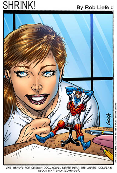
Ponder for a moment the profound un-funniness of this cartoon. No, really -- would you find this good even in middle school? Because that's about the last time in my life I can imagine that joke being amusing.
Then there's the art.
Why is Captain Overcompensation tilted sideways in his chair when he's supposed to be leaning back? He's going to fall over on his left side in a moment, which sadly will be too late to rescue this tragically lame foray into Humorland. Seriously, his left and right feet (bonus points for drawing the feet at all, of course) are not both on that desk.
And why is the shrink staring not at her appalling, boorish client who has, in a disturbing psychoreactive fit, spray-painted his enormous schlong with white latex, but rather directly out at the viewer? And why is she grinning in skull-like pleasure instead of recoiling in horror?
Finally, however much Latex Penis Guy is paying her, it's too much, because she hasn't taken a single note, despite the large pen, pencil, and pink sex toy on her desk.
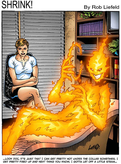
What therapist wears a shirt and skirt like that? One who buys stainless steel counseling couches, that's who.
This is a great example of how adding incredibly stupid jokes to bad art actually makes the art worse. It's the magic of comics, kids!
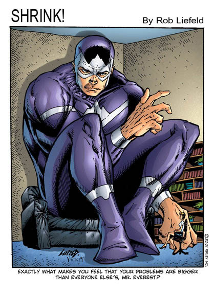
Why is our therapist staring at her client's ankle?
Why did our therapist buy a couch that's ten sizes too large for any normal human, and yet ten sizes too small for her size-changing patient?
Why does our therapist own an office with eighty-foot-tall ceilings?
How has Mr. Everest managed to warp space-time in such a way that the bookshelves are getting sucked into an alternate perspective dimension?
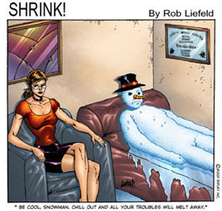
Why is our counselor one of the undead, sitting there in the throes of advanced rigor mortis, somehow throwing her voice without opening her mouth? Or was she perhaps frozen there by Frosty the Lame-o.
Why has she wrapped all of her furniture and artwork in cellophane? Is she secretly my grandmother?
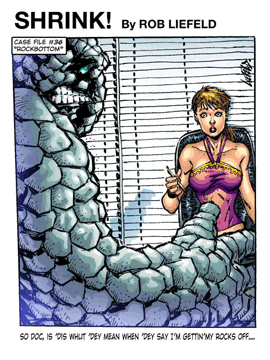
Again, what professional wears an outfit like that? Did she just stumble out of bed?
Has Thing Rip-Off Guy literally taken off his "rocks" and dropped them on the floor, thus explaining the look of horror on her face?
Why is his mouth on the side of his face?
The only force in the universe that can compete with the suckiness of Liefeld's art is the suckiness of his writing. Add "humor" to the mix and you've managed to tear the space-time continuum itself, pulling the entire universe into an alternate reality where work like this makes millions of dollars and sets an entire beloved industry back to elementary school-level garbage.
And that is reason number eight I hate Rob Liefeld's art.
(Images and characters © Ripley, Inc. and Rob Liefeld.)

