Hello, is Batman in there somewhere?
Try to guess what I hate the most about this Batman costume redesign from the pages of “Chain Gang War”:

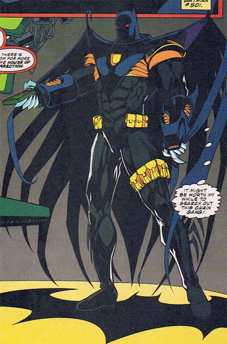
Notice anything missing? How about the most recognizable super-hero logo on the planet. Imagine an iPod with no little apple on it, or a Nike sneaker without the swoosh. What’s the point of investing all that time and energy into making your brand instantly recognizable, only to leave it off the product? I know the temptation to tweak legendary characters is powerful, but this effort really blows it.
Besides the lack of a logo, the entire assemblage betrays the essence of Batman. He’s supposed to be about speed, agility, stealth, and lethal force delivered with precision, but this costume comes off as bulky and ponderous. From the rigid, hook-tipped wings with long flowing streamers, to the massive gloves and metal fingers (metal freaking fingers?!), this outfit looks like the worst parts of an Iron Man and Spawn love-child. There’s very little “Batman” in it, which may be why he’s reduced to standing on a giant Bat logo to remind himself of who the heck he’s supposed to be.
And just why the heck is Bruce Wayne getting all dressed up to watch TV anyway? You’d think he’d be comfortable enough to take off his mask and kick up his feet in the Batcave, but apparently not. I bet he goes through a lot of remotes, too, as those metallic fingers punch right through the plastic buttons. I also wonder if he required the leg pouches to offset his utility belt’s lack of a cinch, buckle, or any other method for actually hooking together. At least he was able to get it in the extra-thick ‘Image’ size.
I could go on and on about the yellow banded armor under the thick cape front, or the strange blank yellow hole on the chest piece, or the silly fringe on the boots, or the bizarre energy blasters on the gauntlet, or the lack of a mouth-hole in the mask, or the tiny “Catman” style ears, but suffice it to say, I hate this redesign.


May 14th, 2008 at 1:01 pm
Oh. My. God. That is a hell of a bastardization of Batman… if it even is Batman. Aside from the logo he’s standing on, it’s kinda hard to tell. As a matter of fact, I think I’m glad that the logo on the uniform is missing, because if it were there, it would be an even worse insult. I am quite sure that if Stan Lee were dead, this would’ve made him roll over in his grave. Who the hell messed up THIS bad?
May 14th, 2008 at 4:03 pm
Dennis O’Neil and Joe Quesada came up with the character who decided to don this abomination of science and art…I blame them.
May 14th, 2008 at 4:12 pm
I couldn’t tell from the issue I had, is that one of the substitute Batmen who filled in for Bruce Wayne when he broke his back or whatever? Or is that actually Bruce?
May 14th, 2008 at 5:35 pm
Hey, Jeff. It wasn’t Bruce. It was Jean-Paul Valley: http://en.wikipedia.org/wiki/Azrael_%28comics%29
I agree that the costume got away from the core of Batman, but to the creators’ credit, that was kind of the point. After Batman’s back was broken, Jean-Paul took over the costume and gradually changed it, becoming more and more the kind of 90s-style hero you saw in Image Comics. When Bruce returned as Batman, it was kind of a step back to the classic character, maybe demonstrating that the classic approach is better.
May 14th, 2008 at 7:14 pm
Cool, thanks Rob. I skipped that whole deal, good to know what the heck was going on.
I still hate the outfit, but at least it wasn’t the real Batman.
May 14th, 2008 at 8:18 pm
Yeah that wasn’t Batman, he was just filling in while Bruce recovered from his back injuries. Furthermore, this guy was all about strength and force not the agility or grace that the real Batman had, which would explain his version of the costume and also why in the end Bruce had to fight him for the title of Batman again.
May 14th, 2008 at 10:40 pm
Obviously, Jean-Paul Van Damme got a phone call from the King of Komix, Rob Liefeld, before putting together his awesomely terrifying uniform of justice. Just what *is* a substitute Dark Knight to do without a ridiculous thigh-band-pouch-thing? I’d love to see someone try to run with that inflatable beach floatie tied to their leg. What a joke.
May 15th, 2008 at 2:14 pm
I feel bad that the costume shrunk his head. I mean seriously, look at the size of that boy’s noggin — the inflatable beach floatie (as John so aptly describes it) tied to his leg is bigger than his entire melon!
Sweet Moses smell the roses, but I hate that outfit.
May 15th, 2008 at 5:45 pm
i think that the cotume is perfect for jean paul valley as batman he didnt have the same code as bruce and wasnt exactly playing with a whole team on board if you get my meaning…and who knows with batman r.i.p coming up we might see something crazy from whoever takes overpossibly a dick grayson batman/nightwing combo or jason todd with a red hood take on the batsuit…
May 16th, 2008 at 12:08 pm
I love the costume for someone other then Batman. It has a dash of Black Panther(mask) and Mr. Sinister (cape). The costume looks like it would be good for someone with more psychic/ranged attacks and the metal hands are for close hand to hand.
May 16th, 2008 at 6:41 pm
Horrible. Insult to batman
July 9th, 2008 at 12:49 pm
jeff remember this was just one of the suits jpv was wearing during the final knight thing he started out with the neal adams grey yellow and blue suit bruce wore