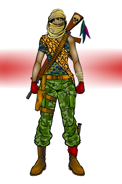
There’s a reason why cloning humans remains illegal. Not the least of which is that “Dr. Fax” showed how poor results could still be grandly disastrous. Told to wear cutoffs, many of them cut ONE leg off of their good jeans instead of putting on their cutoffs. Despite not having enough coordination to put on a shirt or buckle a belt, some of them managed to learn a granny knot. None of them could bend to put shoes on without snapping their spines. Their skin was pretty bad, due to shortcuts in their mummy-style wrappings during skin fastening. Not to be outdone by their low quality, "Dr. Fax" sold the clones in the 7800 and 7900 group to a terrorist group. He warned his client of their limitations.
Not to be outdone at the clones total failure to learn to aim a gun FORWARD, the group gave them all lit dynamite and told the only command they could follow besides ‘eat.’ That command was ‘run.’
Casualties were kept to a minimum by sheer dumb luck and the fact that anyone not slamming a door between themselves and the ill-fated clones tended to scream out ‘RUN!’ This generally caused them to run in the opposite direction, and so the parking garage where they were released was the only structure completely destroyed. It was also successfully evacuated in the panic.
23 dead, 3518 injured, less than 200 critically.
*Lackey contest winner.
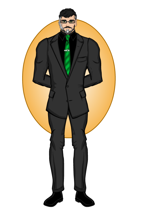
Here is Banker, the money man for the criminal underworld.

Ok. We'll see if it's anything on our end and try to work it out from there.
Entry for the Henchmen CDC....
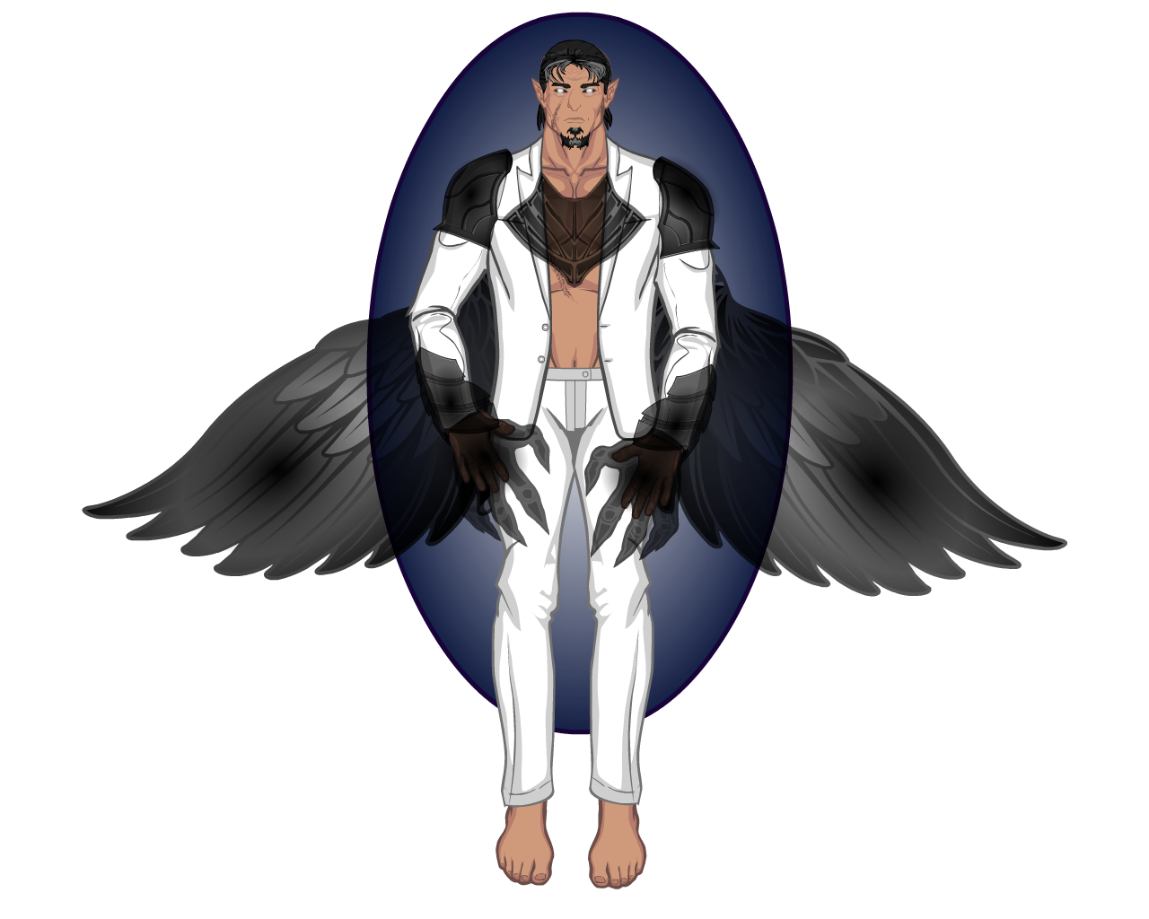
Here is Samyaza, leader of the Grigori. The Grigori are fallen angels who can control corrupted holy light. They are not evil beings, but have been known to pick fights with both sides of the holy conflict.

CDC Prize for Meniukas...


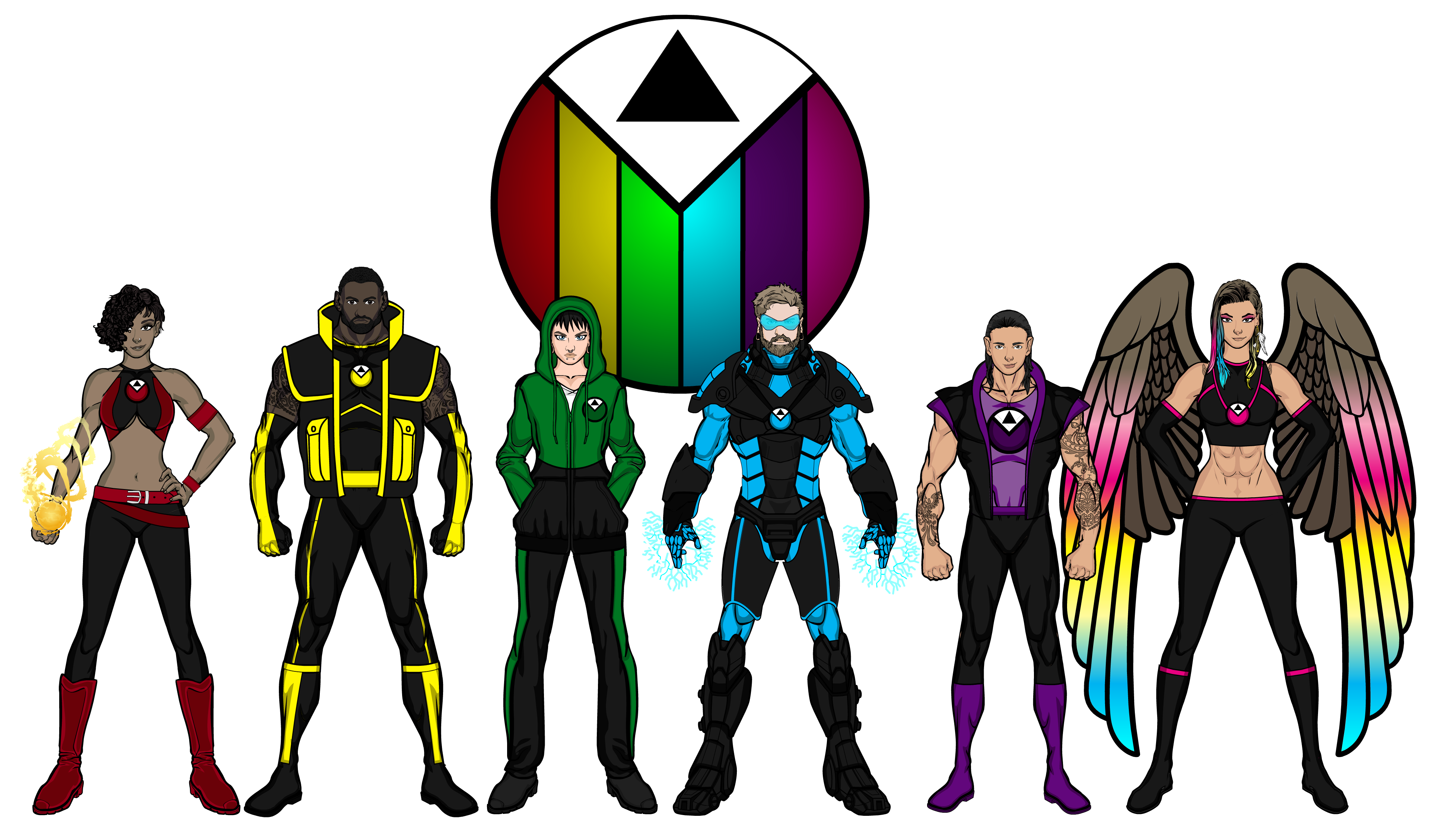
Right then. Big difference from the Pride team that we saw in my last set of designs back in 2017. So, what happened. Well, I tried to write a Pride comic and it made me realise a lot of things about the team. 1- Too many members. Pride back in 2017 had 10 members (and that's not including the two people that made up one of the members). I cut out 2 members and still ended up basically ignoring one character entirely for the 1 issue I wrote (now, obviously I could have worked around this if I had staggered introducing team members, but the problem still would have remained). 2- The powers most characters had originally just didn't work from a story telling perspective, for example White Lie. Way too overpowered.
So, we've had a rejig. I've condensed 4 characters into 2 characters, got rid of one character (which is a shame because they were a cool concept, if unwieldy, but I salvaged the costume), changed everyone's powers (with only one exception, I think)/ codenames and, of course, moved Manara over to The Protectors, because there just wasn't room for her. We've also had a switch around of colours and of sexualities/ gender identities, but that's a story for later.
Loving what you've done so far.
Keep up the good work
Telling stories with pictures can be broken down into two trains of thought. The information that you reveal, and the questions that you inspire. Pictures can provide quick explanations that would otherwise require lengthy descriptions, which is why we put pictures on the cover of books, to inform potential readers of what they can expect inside. But context changes the details, and what you see is not necessarily what you get.


