Category Archives: Cool Characters

Neat characters submitted by HeroMachine fans.

Enter the Man of Green

Enter the Man of Green

By: Andrew Hines

The annuals are still coming along. The great thing about this one is that involves a new villain that we've never seen before with a very personal grudge against the Man of Steel. Then there's the return appearances of Lex Luthor, General Lane, and John Henry Irons. This seems to be one of those "return of the supporting character" issues. It's fun to see all of these characters in the same place, just over a year after the introduction of the New 52. This may be one of the few annual issues that acts as both a standalone comic and a continuation of  events in Action Comics.

Sholly Fisch (yes, that's his real name) has penned a great annual issue here. Introducing a new version of the old and fairly obscure Kryptonite Man, he also brings in some old favorite supporting characters, as previously mentioned. Being as it's an annual issue with more pages than a regular, there was more room to be creative and write a great issue. That seems to have been more or less accomplished. You get a lot more for your money here. There's a better intro for the villain and with references to the first eight issues of the title. The dialogue is decent and the panel/page transitions are pretty good. Honestly, the greatest part of this issue was the tie-in to the original Action Comics #1 back in 1938, in Superman's original debut.

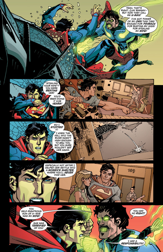
The art from Cully Hamner is good, for the most part. I actually like Hamner's art quite a bit. He was the concept artist for many of the New 52 costume designs. The art is great and somewhat simplistic due to Hamner pulling an artistic hat trick (triple-threat, trifecta, whatever) by putting up the pencils, inks and colors. As you can see at right, there are some great flashback moments here. The art is ink-heavy, but not in an off-putting way. The colors are rich and vibrant in the right places. Honestly, I still think John Henry Irons' (aka the hero formerly known as Steel) suit is a little odd. Not movie version "odd" but still. That design is probably the only artistic problem of this issue.

This comic has some great elements, both in the writing and the art. Therefore, it deserves an "A-". This could have been a little better, but not my too much. I definitely recommend that you buy this if you're a Superman fan or a completist.

P.S. I also recommend viewing the silent backup story here written by Max Landis and illustrated by Ryan Sook. We see a classic Superman villain being "born". He'll be quite interesting to see in later issues.

Day of the Hobgoblins

Day of the Hobgoblins

By: Andrew Hines

With the end of the current series fast approaching, Peter Parker is in for what may be one of the craziest adventures of his tenure as Spider-Man. We've already seen him put the end of the world on the back burner (ba-dum tssss), possibly cure Dr. Connors for good and put the world's worst sidekick in a permanent time-out. Now, with both his life and identity on the line, two hobgoblins dueling it out and Madame Web seeing visions of a dark future, this is the beginning of the end for our web-headed friend.

Dan Slott has done a fantastic job in the nearly two years since his run on Amazing Spider-Man began back in 2010. The recent partnership with Christos Gage has been a really good one. There are all kinds of great characters in this issue. The story picks up after the events of #695, and the pacing continues steadily. The dialogue is great and in parts I found myself reading it in the voices of the old animated series of the 90s. The story's good enough and tackles the two-part arc pretty well. The character interaction is pretty good and the ending is just enough of a teaser to keep you interested in the next issue.

This is one of the best single pages of ASM in recent memory. The art team does very well with Giuseppe Camuncoli as the penciller and Dan Green as the inker. Camuncoli's art works well and Antonio Fabela's colors are the dominant force in this issue. This page to the right is one of the greatest intro pages I've seen in a Spider book for quite some time. The best part is the inclusion of the majority of the issue's cast. You really see just how dire it is for Spidey at this point. The framing and the scale of the page are just phenomenal.

This get's an "A-" simply because it's a little on the nose for Haloween being just around the corner. It's a good issue and a great middle point in this three-part arc, but the fact that it is the mid point doesn't help it. Buy this one. At the very least it leads us into the end of ASM. As a piece of that history, it's worth owning.

Avengers vs Punisher

Avengers vs Punisher

By: Andrew Hines

We've seen a lot of the Punisher over the last decade or so. He's had major resurgence after being little more than a rage outlet for close to 40 years when he was introduced in the pages of Amazing Spider-Man #129. He's evolved as a character, somewhat, but his intentions have never wavered. He's still a killing machine and I don't believe that will ever change. That's where we are now. The heroes are at the ends of their collective ropes, Spider-Man especially. He enlists the help of the Avengers to stop Frank Castle once and for all. That's as much as I can say here. Now, on with the review.

Greg Rucka has penned a possible masterwork in the first issue of this five-part limited series. The best part of it is the attention to the story itself rather than simply making it another shoot-anything-that-moves Punisher comic. Whether you've been following Punisher since your momma let you read the big boy comics or if this is your first venture into Frank Castle's world, it's a great place to start. The pacing is fabulous. The dialogue is amazing and character specific. Rucka doesn't give Spidey his usual fight one-liners or witty banter, though there are a few little niblets of that. You can definitely tell that he's had enough. I know I say this from time to time, but the character interaction, particularly with Spider-Man and the Avengers, is phenomenal.

The art by Carmine Di Giandomenico is awesome. I mean, really. It's dark, both in terms of style and lighting. It's just so incredibly fitting that it's awesome to see. I mean that in the truest sense of the word. I am in total awe of the pages. They may not be the most crisp, clean lines anyone's ever seen but they're exactly what the story needs. The inks are heavy in al of the right places, adding more to the necessary shadows. Matt Hollingsworth's colors are great. Again, they're dark, the shading is great and the lighting is just magic. These two combine to make something stunning. I mean, it's sort of hard to see it from just this page, but it's the most I could show without a spoiler or three.

For all of that and more, this comic get's the rather unusual "A+" grade. The writing, the art and the characters themselves make this a can't-miss series if you are a fan of the Punisher, Spider-Man or the Avengers. To give you more incentive, it's even a dollar less than the usual Marvel stuff with its price tag of $2.99. What are you waiting for? Go out and get it.

A Change Is Gonna Come…Right About Now

A Change Is Gonna Come...Right About Now

By: Andrew Hines

If you've read Superman in the last year, you know Big Blue's been through a lot. Let's review. He's faced a being made of fire, an invisible alien monster, a being made of ice and face-off with Helspont. Then there was the whole "visitor from another dimension thing and another run-in with Helspont, which really didn't go too well. To top it off, Lois is in a relationship. That one sort of worked out well, though. After all, it made him available for Wonder Woman.

Scott Lobdell's giving us good writing here. The intro we've seen in all the other comics this week and last is a good start to the issue and brings us a few new developments to the character. The pacing is good, considering the event it's leading into. The dialogue is good and yes, there's a lot of it. Not as much as a Georg Perez script, but still a bit. This shouldn't be surprising though, given that Clark Kent is a newspaper reporter. He's got a lot to say and not just on paper. The writing overall is good, better than Superman's been in a long time.

The art is as good as any Kenneth Rocafort has ever done. As both artist and inker, he does a great job. The designs of Dr. Shay Veritas' suit (right) looks pretty cool. He brings his great eye for costuming to this issue. Then there's all the machinery in the first few pages which is pretty complicated. There's even the panel layouts that are sort of cool. The colors from Blond are pretty good too. He seems to have a unique style that he brings. There's not a lot of really deep color, but you can definitely tell where the light really hits. Some parts are rich and the appropriate areas are more muted. The only really bright parts on the intro pages are her hair and the "shield" on his chest. There's even a little bit of shine in his hair that we don't generally see. The art here really is just that good. These frequent collaborators do a great job on one of the most hit-or-miss books in the New 52.

The end result is one of the best issue of Superman since the reboot. I gig it an "A-", based on the writing and the art working so well together. As with all of Rocafort's work, it's consistent and portrays exactly what the writer seems to want it to. I can say there'll be a big change to the Superman status quo in this issue, but I can't reveal more than that without a pretty massive spoiler. With that being said, go pick this one up or read it online.

End of the Starfire

End Of The Starfire

By: Andrew Hines

This has been  good book from the start. I mean, I know we were all shocked by the way Kori was dressed in the first few issues, but thankfully that's been changed in the last few issues. There's a great team dynamic here in the fact that while nobody but Roy would admit it, they really do need each other in order to stay focused and grounded. There've certainly been some changes in their relationships with the Bat-Family and even their own, but the new normal is starting to grow on me. It just all seems to work much better now.

Scott Lobdell's been doing a great job on the writing since the first issue. I wasn't sure where it was going at first, but it looks like the only origin story left to tackle is Roy's. Again, character interaction and their relationships with the others on the "team" is interesting. I like the way they're headed with Starfire's story. Hopefully we get to see more of Tamaran in the future. The pacing has been good in this issue and it ends on a sort of bittersweet note. It doesn't seem at all clichéd, which is a rarity these days. The dialogue is good as is Roy's narrative intro. We don't see as much of Jason this time, though, which makes me sort of sad. That's really the only thing wrong with the writing here. Not enough Jason, but then this was intended to be a very Kori-centric issue, so I'll allow it.

Timothy Green II's artwork, combined with Blond's colors is pretty good, as you can see at right. The whole thing looks quite similar to Kenneth Rocafort's style, if slightly heavy on inks. This is one of the few titles where there isn't an additional name to work on inks. It's just the artist and the colorist, who work well together. This first page is a good example of that, at least in my opinion. The shadows are a nice effect here and the lighting is great throughout the issue. The effects in general are pretty impressive. I'd love to keep going on this, but if you can see what i'm talking about, just in the first page, do I really need to?

This gets an "A-", primarily because the cover's quite misleading. Well, there's that and I know that with "Death of the Family" around the corner, it's gonna be a whole lot better.

And Now For Something Completely Different

And Now For Something Completely Different

By: Andrew Hines

The great thing about DCU Presents is that you can just pick out the few with a storyline and characters that grab your attention. It's perfect for the picky completist in all of us comic geeks. This one in particular gives us two cool bench warmer heroes in one great starter issue. Blue Devil and Black Lightning have been relative unknowns for a while, with the exception of the latter's appearance in Final Crisis. I really can't recall much about Blue Devil, save for the fact that I always loved the idea of him. He was mentioned a bit in Infinite Crisis, but hasn't had a starring role in quite a while. Anyway, this might be the time to learn more about him.

Marc Andreyko's writing here is very good. The pacing is great as are the character introductions, both in and out of "costume". The setting of Los Angeles is really cool and not something we've seen yet in the New 52. Then there's the inclusion of what looks like both Spanish and Portuguese. That alone is more than other writers have done in a long time. The interaction between Daniel Cassidy (Blue Devil) and Jefferson Pierce (Black Lightning) is about what you'd expect when a new superhero meets someone dressed like the devil. It ain't pretty. Again, gotta say that the pacing is pretty good for a four-part story arc such as this.

The art team is awesome as well. The pencils from Robson Rocha are pretty damn good. The interior page on the right should be all the proof you need. Every other interior page follows this level of awesomeness. As you can see, Oclair Albert's inks work very well with Rocha's art. There's almost exactly the amount of shading you'd expect from late night in L.A. Gabe Eltaeb's colors sort of pull everything together. Even better than this creative team, I think, are the costume designs themselves and the effects that the team has given us. Danny's suit in particular is just a huge step up from the old days. The same can be said for most of Jefferson's costume, with the exception of the Booster Gold-style headgear/glasses.

This ends up just being a great issue and a wonderful start to what could be the best DC Universe Presents storyline so far. This get's a straight "A".

Return of Lady Shiva

Return of Lady Shiva

By: Andrew Hines

There's been a lot going on in Dick's life since #1. His old "home" came back to town. (The dude grew up in the circus. It's complicated.) His old buddy came back from the dead, became a freelance assassin and came after Dick. Then, Mr. Grayson got handed ownership of Haly's Circus. He wants to employ everyone in a concrete location at the old amusement park of Gotham. Add to that someone framing Nightwing/Dick Grayson for a double homicide. That's where things get tricky. He's thwarted that and now two of his deadliest enemies have returned to Gotham.

Let's have a moment of silence for Kyle Higgins leaving Nightwing for this issue and the next. . . . Okay, now let's deal with Tom DeFalco's writing. Suffice it to say, it's average. Better than even the writing of Liefeld, but then again, it's Liefeld. DeFalco gives us some interesting pages, but it's not the best pacing. The dialogue is alright, but only really shines in a few panels. The action sequences are written well, but then we're partly back to the issue of pacing. Then there's the fact that the issue is supposed to be about Lady Shivabeing back in Gotham. She's only there for a page or two and has absolutely no lines. The writing could be a lot better, so here's me looking forward to issue 15.

Andres Guinaldo's art is pretty good and feels pretty consistent from issue to issue. the pencils are great and the different angles don't really change the look of the character much. For some artists, this is a problem, but Guinaldo, as I said, is quite consistent. Mark Irwin's inks lend themselves nicely to the nourish setting of Gotham. It pulls the pencils and colds together pretty well. This leads me to Rod Reis' colors, which are superb as usual. The dude rarely misses a beat. He really puts his all into it as is shown in the lighting on the page shown at right.

All things considered, this issue earns a "B-", which is probably the lowest grade I've given an issue of Nightwing to date. I say buy it if you're a completist or for the artwork, not the writing.


A Force to be Reckoned With

A Force To Be Reckoned With

By: Andrew Hines

I've been an Image/Top Cow fan for a long while. I'm talking since the beginning of The Darkness, back in '96 and WildC.A.T.s before that in '92. The former is also the length of time I've been a Marc Silvestri fan. They'vd always managed to have really dark sic-fi type characters. Cyber Force is no different, save for the fact that it's one of the very few teams in the Top Cow universe. I'm especially a fan of characters like Aphrodite V, Cyblade and Ripclaw. The fact that this first issue is free certainly doesn't hurt anything. Yeah, that's right. FREE. Rethinking whether to pick it up now, huh?

The writing by Silvestri and Matt Hawkins is a good start for anyone who's not all that familiar with the team. The pacing is good and it introduces most of the characters in one fell swoop. I like that it keeps a more suspenseful tone in the beginning, but gives way to more of an action-adventure/fantasy tale. For including nearly everyone in the first issue, it does a good job of not straying too far from the core elements of the story. The dialogue isn't the greatest I've ever seen, but it does the trick. There's slightly more expository dialogue than necessary, but at least it's not George Perez' Superman scripts. Thankfully the narrators do a great job of setting up what we'll be seeing in the future.

The art by Khoi Pham is pretty damned good. Not Silvestri good, but close enough. He gets the different looks of the characters down, with the necessary updates as required. Sal Regla's inks aren't nearly as heavy as what you might see in darker titles, such as Darkness and Witchblade, but it's actually pretty balanced. Sunny Gho's colors are really good, as he keeps the effects specific to each character. Where Heatwave and Impact seem much more battle damaged, Cyblade and Ares prime appear fairly polished. I mean, just look at the dome on that dude. It's somewhat similar to Silvestri's work without really looking as though he's copying it. I really like the character designs the backgrounds too.  I haven't really said much about those, because this is the first time I can't see the characters any other way.

This is a good start to a promising series. I give it an "A-", based solely on the fact that I know something better is just around the corner. It's a great jumping-on point for anyone who was ever curious about Cyber Force.

Sweet Car, Bro

Sweet Car, Bro

By: Andrew Hines

He's actually doing better than ever in this issue, which is awesome. We see Kate Bishop again, which always makes for an interesting comic. Clint seems to still be acting as Kate's "superhero big brother", despite no such program existing. This issue seems to revolve around a 1970 Dodge Challenger, a redhead and the, I'm quoting Clint here, "Tracksuit Draculas" from the first issue, bro. See what I did there? Probably the best part of this issue, okay, there are 2: the car and the trick arrows. If you can find anything better than that, let me know.


Matt Fraction is still writing this awesome piece of comic literature. It feels like an action movie in almost every way. Not just an action movie but the classic Steve McQueen Bullitt-type action movie. The narration is really good and seems to fit Clint's personality really well. Bringing Kate back on this one seemed to help the story quote a bit. The dialogue was good and rather fitting for each character. The pacing works, as does the Sunset Boulevard flashback-style intro. It's also cool to see the bad guys from the first issue too.

David Aja and Matt Hollingsworth are still bringing their signature styles. Aja's artwork is still great and fitting of the story being told. This is just great artwork and coloring. Period. There was no panel out of place or anything of the sort. It was as close as anyone could get to perfect interior artwork. Even the cover was phenomenal. It feels like the stylized intro to a James Bond movie, which works for the sort of stories we've had in the last two issues.

This is possibly the best comic I've read in along time, partly because each one feels like a standalone issue. I give this a rare "A+" simply because it's fully deserved.

MacGyver Returns…Sort Of

MacGyver Returns...Sort Of

By: Andrew Hines

I'm a huge MacGyver fan, born two years into the show's amazing 7 year run. Part of why I'm such a fan is because Mac always struck me as being a sort of Batman without the cape and tights. He's the everyman with a lot of know-how and more than a few aces up his rolled-up sleeves. I've been waiting for 20 years for anyone to do the series justice, though it never occurred to me to do it as a comic mini-series. Oh and I should mention, 20 imaginary points for anyone who can give me Mac's name plus the season and episode it was first mentioned.

The two writers for this piece of literary history are  longtime Doctor Who comics author, Tony Lee and a man who needs no introduction, Lee David Zlotoff, the creator of MacGyver way back in 1987. The writing is wonderful and starts off with the same narration as every episode in the television series. The dialogue is wonderful, the pacing fits and the recipes for "MacGyverisms" are pretty much exactly as they were in the series. Yeah, "MacGyverism," it's a real thing. The writing makes it feel just like the series I grew up watching.

The art from Will Sliney, who covers everything from pencils to the colors, isn't bad. Well, mostly not bad. Ciaran Lucas' cover captures Mac's look well enough, but doesn't get him looking close enough to Richard Dean Anderson as I'd like him to. That's pretty much what's wrong with Sliney's work. They've got everything around him looking great, even the hair and the stubble, but the face just isn't quite right. The effects look good, but they're not the star of the show.

In all, this ranks as a "B+." The script is fantastic and I can't wait to see where it takes us, but without the art to fully help it along, it doesn't live up to its full potential. If the face were "right", it'd be an "A+," 100%, out-of-the-park home-run. It's a good book, but just not a great book.