Home › Forums › The HeroMachine Art Gallery › Opinions Wanted
- This topic has 11 replies, 7 voices.
-
AuthorPosts
-
December 6, 2013 at 3:13 am #878
ArbiterParticipantThis was my first try at an actual character in Heromachine (the rest were just made whilst fooling around).
This isn’t probably going to be nearly as good as some other content on this site, but I would still like to know what you guys think and how I could improve my warrior (and any future projects). Thanks!
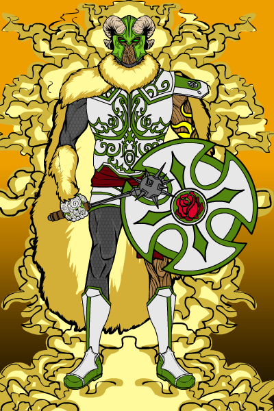
WARRIOR OF THE ROSECULT
 December 6, 2013 at 3:34 am #34186
JR19759KeymasterWelcome Arbiter.
The first thing that I picked up on when I looked at Warrior of the Rose is that the helmet colours don’t match any of the other colours you’ve used elsewhere in the pic (much lighter shade of green, skin tone horns). Whilst this does draw attention to the face (which looks quite good, just having the eyes doesn’t detract here at all, it gives him a lot of expression), it does jar a bit against the rest of the image. My next critique would be the colour layering. If you look at where you’ve placed certain items and how you’ve coloured them, some of them are getting lost by being immediately next to something of exactly the same colour, i.e. the right glove, the cape and background aura. I’d suggest changing the colour of one of these (maybe make the cape red?) or removing one altogether (personally I don’t think the aura adds that much to the overall image). Lastly, I always say this, but don’t use to many different colours, all the best costumes have 4 tops. In this pic you’ve got (excluding the brown body colour), dark grey/ black, silver, two different greens, red, cream/ peach and three different shades of yellow. I think that maybe keeping the armour as it is would be the way to go here, as it looks quite good, change the helmet to match the armour, make the cape red, the right glove green maybe, and keep the under armour dark grey/ black. But that’s up to you, it’s all about experimenting until you find something you’re happy with.
Apart from that, not bad. I’m sure other people will have different ideas to me, so don’t worry if you don’t like my suggestions.
Anyway, as moderator I have to ask you to make sure you read the forum rules, but apart from that, welcome and have fun posting.December 6, 2013 at 5:02 am #34190
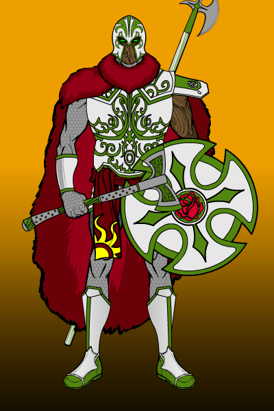
ArbiterParticipantThanks JR19759, really helpful feedback! I’ve reduced the colour palette and tweaked the helmet and background, and WOW does it look better! Thanks a heap!
 December 6, 2013 at 10:27 am #34196
HammerknightParticipantWelcome to the forums, I hope you have a great time with HM.
December 6, 2013 at 10:38 am #34197
dbladeParticipantWelcome, Arbiter! Keep them coming.
December 6, 2013 at 12:36 pm #34206
Herr DParticipant1. Following up JR’s suggestion, you may want to make the aura partially transparent. (With item selected, type or slide Alpha value for each color.) It may mute the contrasting color a bit, but it might also give the character a bit of weight.
2. Not knowing your intent, it strikes me that if the gray, scaly body parts are armor, you might match them a bit more to the shield. If they are supposed to be his flesh, you might make them green and just slightly darker than obvious. I like that explanation better, btw; living rose warriors = .December 6, 2013 at 7:17 pm #34223
ArbiterParticipantThanks all for your kind welcomes!

Herr D, the grey scale-like limbs are meant to be chainmail, but I will follow up on your advice and tweak their colour. As for the Aura, I think I might just get rid of it entirely. But thanks again for your criticism, everything helps!December 8, 2013 at 2:41 am #34292
ArbiterParticipantI’ve been tweaking my Warrior and, as a result, came up with this new and improved version:
WARRIOR OF THE ROSE

Thanks to all for putting up with me!
 December 8, 2013 at 6:21 am #34294
Kaylin88100ParticipantWow! That’s a much better image. It’s simpler, easier to understand at a glance and it’s much more powerful. Great collaboration, guys!
 December 8, 2013 at 11:00 am #34302
hawk007ParticipantYou want my opinion? It is an AMAZING start. Very cool and creative.
December 10, 2013 at 1:53 am #34390
ArbiterParticipantThanks for the kind words Kaylin88100 and hawk007! Means a lot from you two!
 December 10, 2013 at 2:17 am #34393
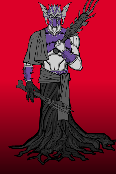
ArbiterParticipantWhilst I have this thread I thought I might as well post some other creations on here from time to time. That way, you guys get to correct me more! Yay..?
LIGNUM HELLSPAWN

Again, all suggestions, improvements and comments are welcome. Please, it helps me a lot when I make future projects!

-
AuthorPosts
You must be logged in to reply to this topic.


 .
.

