
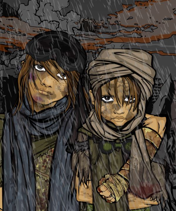
I’m sure the results of this weeks poll will come as a surprise to absolutely no-one. Once again it was one of those white-wash polls where the winner got more votes than everyone else combined, and this time out I can’t say I’m surprised (not to demean the other finalists in any way). But anyway, this weeks winner was Valyndril for Post Apocalyptic Children. Congrats Valyndril, please make sure you speak to dblade about your prize, and well done to everyone who entered.

This is amazing! I love seeing the evolution of artwork coming out of the Heromachine. Jeff must truly be proud to see his baby growing up before his eyes…
That is amazing quality, really good posing, and just plain awesome realistic! But, if I dare to say it, I don’t know if it was the best to win this particular contest. It just seems in these contests, people are just starting to choose the one with the best quality, no matter how much it fits the themes. Now, I’m not saying anything bad against this. It’s amazing. But I think there were others that best fit the themes. I mean, this could easily just be in the past after some war, or just some random kids, where as others could only be apocalyptic. Now, as I said, there is nothing wrong with this at all. It is a really good picture. But just because it’s good quality doesn’t mean it should win.
Still though, congrats, Valyndril.
Did I forget to praise this? I get more senile every day. Yah. VERY good.
@hawk007- I thought it always was the idea to pick the best quality as the winner? I mean, when Jeff did the contests there was no poll, so it was even more based on the best quality, or in many cases just Jeff’s preference. So to say that the votes are becoming more about choosing the best quality is a bit silly really, that’s what they’ve always been since the beginning. If I was doing it like Jeff it’d be biased as hell, which is why we do the polls, because I like good quality artwork. And as for the point about it not fitting the theme as well as some other entries, you may be right. BUT, it was sufficiently suited to the theme for a) Valyndril to consider entering it and b) for me to accept it as an entry and put it in the poll as one of the finalists. In the end I’m the judge of if something is suitable or not and this was for me.
Not to sound like I’ve got sour grapes, but I have to agree with Hawk007. An EXCELLENT picture, of very fine quality, but it’s a scene that you can see by going into the bad part of town of any major city in the world today. Nothing in it says post-apocalypse.
Congratulation, Valyndril! Awesome image. Really captures the spirit of a post-apocalyptic setting.
Choose your item! Head on over to the Whiz Bang Dispenser thread and put in your request.
https://www.heromachine.com/forum/the-heromachine-art-gallery/dblades-whiz-bang-item-dispenser/
Gotta disagree with SkyBandit here. I’ve been to the bad parts of many cities and have never seen anything close to that. Not even in Detroit.
I actually think this piece is perfectly post-apocalyptic if one considers more realistic portrayals like the settings of The Road or Threads. There’s much more to the genre than Mad Max.
The principle of this picture was that in a post-apocalyptic world, there are more normal people trying to survive too. Not everyone can become a cyborg or a mutant…and the badasses out there started as young urchins 🙂
Thank you all! ^-^
Congrats, Valyndril. I voted for you; I find your picture to be both beautifully executed and appropriate for the theme of the contest.
So, while I agree in principle with hawk007 that I prefer winners that capture the spirit of the theme, even if they are less artfully rendered than other pictures, I think JR has done a good job of selecting finalists that capture the theme. And, for me, part of the fun of these contests is to see how different people interpret often abstract concepts as concrete character designs. I always have a moment where I think “I wouldn’t have thought of that,” or “That’s an innovative, interesting angle.”
JR, I think that something with the best quality should win. But, let me give an example. The contest is for a sci-fi character. Someone submits an amazing quality character that looks pretty much like a knight. But when asked about it, he says that it’s actually sci-fi armor that just looks like knight armor. Then someone submits a sort of good quality picture of a guy who is very obviously sci-fi. Then, the knight one wins, because it is better quality, and the creator claims that it’s sci-fi. Would that really seem fair to you. Know, remember, this is amazing quality, and I really like it. I do think it was the best quality. But it could just as easily be some people after some war as it could be Apocalyptic. I’m just saying.
And Valyndril, I’m not saying that everyone has to be cyborgs and robots, and if they’re normal, they can’t be post-apocalyptic. I’m just saying that while this could be, it could also be something else, where as others could only be post-apocalyptic.
I think hawk007 has a very narrow view of what is “post-apocalyptic.” Earlier I mentioned The Road and Threads – two undeniably post-apocalyptic films. Look at these and tell me her picture couldn’t be slightly out-of-frame for these shots:
http://www.beyondhollywood.com/the-road-2008-movie-images-gallery/
http://www.bbc.co.uk/southyorkshire/content/image_galleries/threads_gallery.shtml?1 (pictures 5 and up)
The “knight-sci-fi” analogy doesn’t apply here – if said knight was clearly a robot cast like a night, OK, because that’d be science-fiction and not fantasy and potentially awesome. Those kids in the winning picture fit better into the grittier, more realistic visions of post-apocalyptic fiction more than any other setting – definitely more than poverty (I challenge anyone to disagrees to post a similar image in a modern city) or post-war refugees. And the little details – the plastic goggles – indicate this is clearly post-WWII (for WWII urban destruction with children, watch “Hope and Glory” – no plastic or goggles) and the bleak expressions convey a message of despair instead of hope.
If I’m wrong, please tell me where else this picture could fit. I posted stylistic references to make my point, so I’d thank you to do the same.
I hope this ends here. Otherwise, we’ll risk putting boundaries on what is meant to be a very creative process purely because some people have different definitions of “post-apocalyptic” than others. Valyndril made a beautiful piece of art with an interesting take on a common trope. I don’t see why there should be criticism because it doesn’t follow cliches.
@hawk007- Do you want to do the CDC’s from now on then, because you obviously have a much better idea of how to run them than I do. Obviously I’ve been doing the job wrong for the last, oh let me see, it’s almost a year now isn’t it so that’d be, lets just go and look at my records, 50 contests (plus the COTY contest). I would like to remind you that it’s chosen by you lot out there, you all vote for the winners, so what exactly is the problem. As TheNate said, your example is irrelevant, as it is an extremely unlikely scenario (plus the fact you’re assuming I would put something up for the poll that I didn’t think fitted the category). So please pipe down and just enjoy the art work.