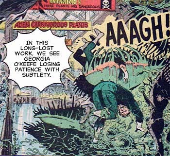
And the winner of Caption Contest 12 is ... xStacy! I always love a good famous-artist reference, and this one made me literally laugh out loud. Well done! Here's the revised panel:
Many thanks to everyone who entered, and best of luck next time.

Sponsored Links (which Premium Members will never see):
And the winner of Caption Contest 12 is ... xStacy! I always love a good famous-artist reference, and this one made me literally laugh out loud. Well done! Here's the revised panel:
Many thanks to everyone who entered, and best of luck next time.
Comments Off on Caption Contest 12 Winner!
Posted in Challenge Favorites, Challenges
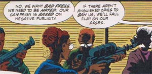
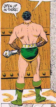
Comments Off on Random Panel: Presidential campaign strategy session footage
Posted in Daily Random Panel
Have you ever wondered what super-heroes do when they retire? In this week's edition of the Monday Mashup -- where I attempt to create a coherent story using one and only one panel from each of ten randomly selected comic books -- we seek to answer that question.
Continue reading
Comments Off on Monday Mashup: The perils of super-hero retirees
Posted in Mashups
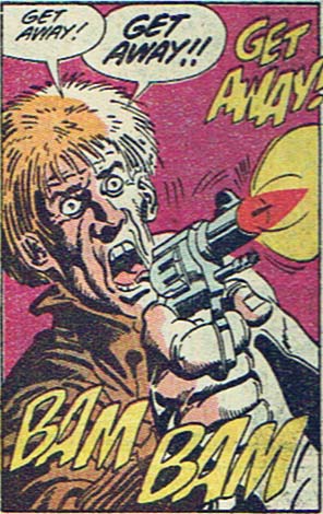
Comments Off on Random Panel: Reactions to my asking someone for a date
Posted in Daily Random Panel
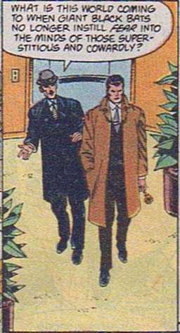
Comments Off on Random Panel: What indeed, Alfred. What indeed.
Posted in Daily Random Panel
Comments Off on Random Panel: Please God tell me that's just a mace …
Posted in Daily Random Panel
His animation makes me weep, but "Jonny Quest" the comic book cheered me up at once thanks to this stellar cover for issue number three:
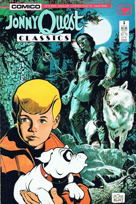
I love the way the illustration style goes from extremely realistic in the background, to more abstract and cartoony with Jonny in the middle-ground, to very cartoonish with Bandit the dog in the foreground. You rarely see this kind of layering of abstraction in American comics, where the style tends to remain the same throughout. You feel more sympathy for and empathy with more abstract, more cartoonish characters like Bandit, while the more realistic Indian and his wolf -- being more concrete and visually informed -- are scarier. Look at the detailed line work of the tree, for instance, compared to the completely linear and hatch-free inking on Bandit.
The coloring takes this even further. Jonny gets some nice color shading, halfway between the very tonal background and the stark black and white of the dog. I also love the use of cool blue tones for the background layer, progressing to warmer reds and oranges in the foreground. Color itself provides movement, pushing the background further back and pulling the foreground further forward, ironically making this cover more animated than most of the t.v. show's moments.
An excellent cover by one of illustration's icons, Doug Wildey. I also appreciate that Comico opens the issue with an inside-front-cover short biography of Wildey, and couples that with a lengthy three-page interview with him in the back. There's one particularly good bit where Wildey (who was the main designer for all of the Quest characters) talks about Jonny's lack of a hair part, and what a pain it was for the animators.
Perhaps those elements contribute to the book's "hand-crafted" feel, something completely lacking in the animated series; you get the sense that this has been produced by someone who cares about what he does, a far cry from the soulless corporate hackery that doomed so many of Hanna-Barbera's offerings.
The story itself is just so-so, featuring gold-smuggling Canadian loggers dressing up as werewolves, and ... wait a minute, now that I write that out, it sounds awesome! Go Jonny!
(Cover and characters ©1987, Hanna-Barbera Productions, Inc.)
Comments Off on Good cover
Posted in Cool Characters
In actual English, onomatopoeia means both "a word with way too many vowels in a row" and "the formation of a word, as cuckoo or boom, by imitation of a sound". Changing that to onomontoPOWia eliminates excess vowels from the concept (which, given the critical shortage of vowels in many former Eastern Bloc nations is the responsible thing to do), and narrows the concept down to mean sound words used as visual effects in comic books. Sometimes, though, the two cross over, as we see in these panels from "Sovereign Seven" number 20 (©1997, DC Comics):
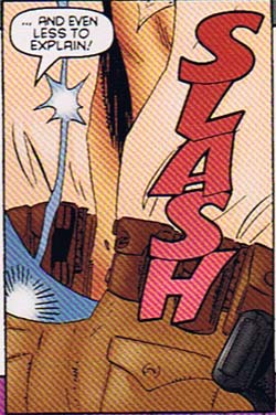
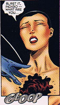
Both "slash" and "gloop" are legitimate words with recognized meanings that arguably originated by naming the sounds for which they stand. In that sense, both of these onomontoPOWias are actual onomatopoeias. They ultimately both fail as onomontoPOWias, though, and here's why.
While I can buy a knife going "slash" as it swings, it does nothing to mark the different ways a leather belt, a cloth shirt, and denim pants would sound as they rip. It's just a ploy to clear the way for one skin-tight-suit-wearing ninja woman to cut the clothes off an unnaturally lithe and winsome country female sheriff.
The second panel fails because while "gloop" is probably the right sound that biogenetic slime makes when flung onto a newly-naked sheriff, the dialog and the art are at complete odds with each other. Her words say she's angry and surprised, but the expression on her face is right out of a bad porn flick.
On balance, though, they fail because the sound effects do not enhance the action or the story in any way. They're just lazy window dressing, when they could have been much more.
Regardless, of course, I think we can all agree that using hot athletic ninja women slicing the clothes off of authoritative assertive in-charge chief female sheriffs so they can leap around in skin-tight biogenetic combat suits kicking the crap out of bad guys is yet another example of why they ought to ditch "Dick and Jane" in our public schools and teach with comic books instead. I can guarantee you more boys would start reading.
Comments Off on OnomontoPOWia meets onomatopoeia
Posted in OnomontoPOWia
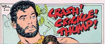
Comments Off on Random Panel: The newest Rice Krispies trio from comicdom
Posted in Daily Random Panel
 Three middle-aged nerds (including yours truly!) review all of the MCU movies in chronological order. Short, funny, and full of good vibes, check it out and let us know what you think!
Nerdmudgeon.com
Three middle-aged nerds (including yours truly!) review all of the MCU movies in chronological order. Short, funny, and full of good vibes, check it out and let us know what you think!
Nerdmudgeon.com