
Home › Forums › The HeroMachine Art Gallery › Posters, Covers, & Cards › Would like peoples opinions
- This topic has 8 replies, 5 voices, and was last updated 12 years, 1 month ago by
 WMDBASSPLAYER.
-
AuthorPosts
-
May 5, 2013 at 9:51 pm #693

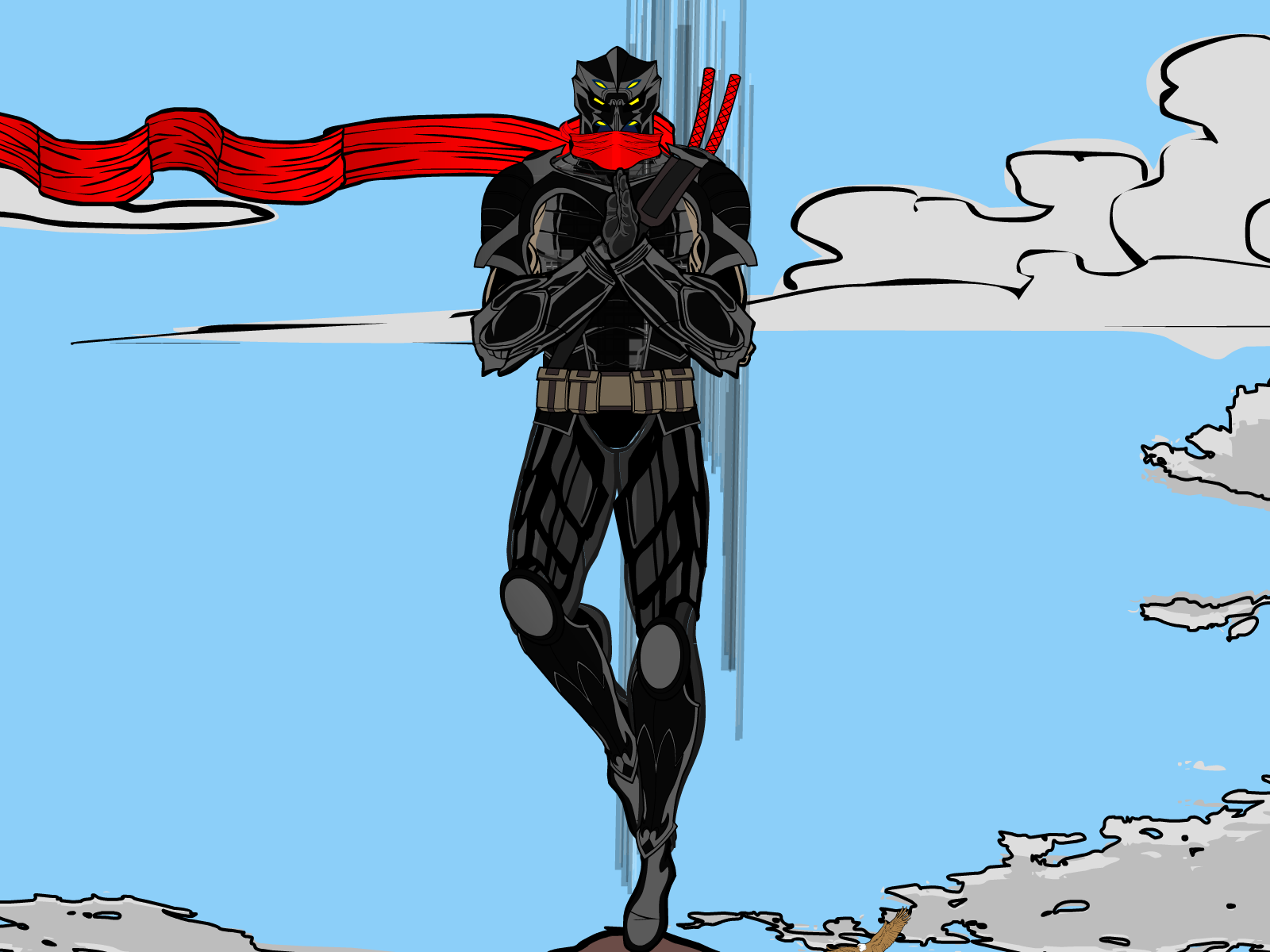
cosmosMemberHello all,
I’ve used hero machine in all its incarnations for some time. I am just recently starting to really try to experiment with what hm3 can do. There are a couple things i really like about this one. The scarf and the head design I think came out very well. I have mixed feelings on the hands and feet. I did the 1 leg to kinda show a supernatural sense of balance, ya know walking on tips of bamboo and that kind of stuff. Anyway I just wanted peoples opinions on what i could do to improve it.
Cheers
 May 5, 2013 at 9:58 pm #23830
VampyristParticipantWelcome and cool character, I love his helmet.
May 5, 2013 at 10:01 pm #23831
The Atomic PunkParticipantWillkommen, cosmos! The design is great. Really liking the head and scarf. The pose is good. The vertical lines say to me that he is either ascending or descending. Would think that the scarf would blow in one of those directions rather than horizontally. Might re-consider the position of the lines. If you get rid of them altogether, that creates a visual that he is hovering and the scarf is simply blowing in the crosswind.
Not quite sure what is going on with his right hand.
P.S. Hammerknight hosts a regular “Open Critique / Share Day” on the blog, usually Thursdays and/or Sundays. If you post there, you will probably receive feedback quicker.
May 5, 2013 at 10:29 pm #23833
cosmosMemberYa I see what your saying about the lines, it was a last min thing I was just trying to find a way to bring out his supernatural side a bit (like what you would expect in stories of ninja’s).
As to the hands I was trying to find a good way to have him either making a hand sign or a look of meditation. None of the existing hands seemed to fit just right. So in this one i have one hand up front in the the vert. flat palm style. The other is actually behind it in a fist.
As to the open critique. Ill keep that in mind , where in the forums is that topic/ section?
May 5, 2013 at 10:49 pm #23834
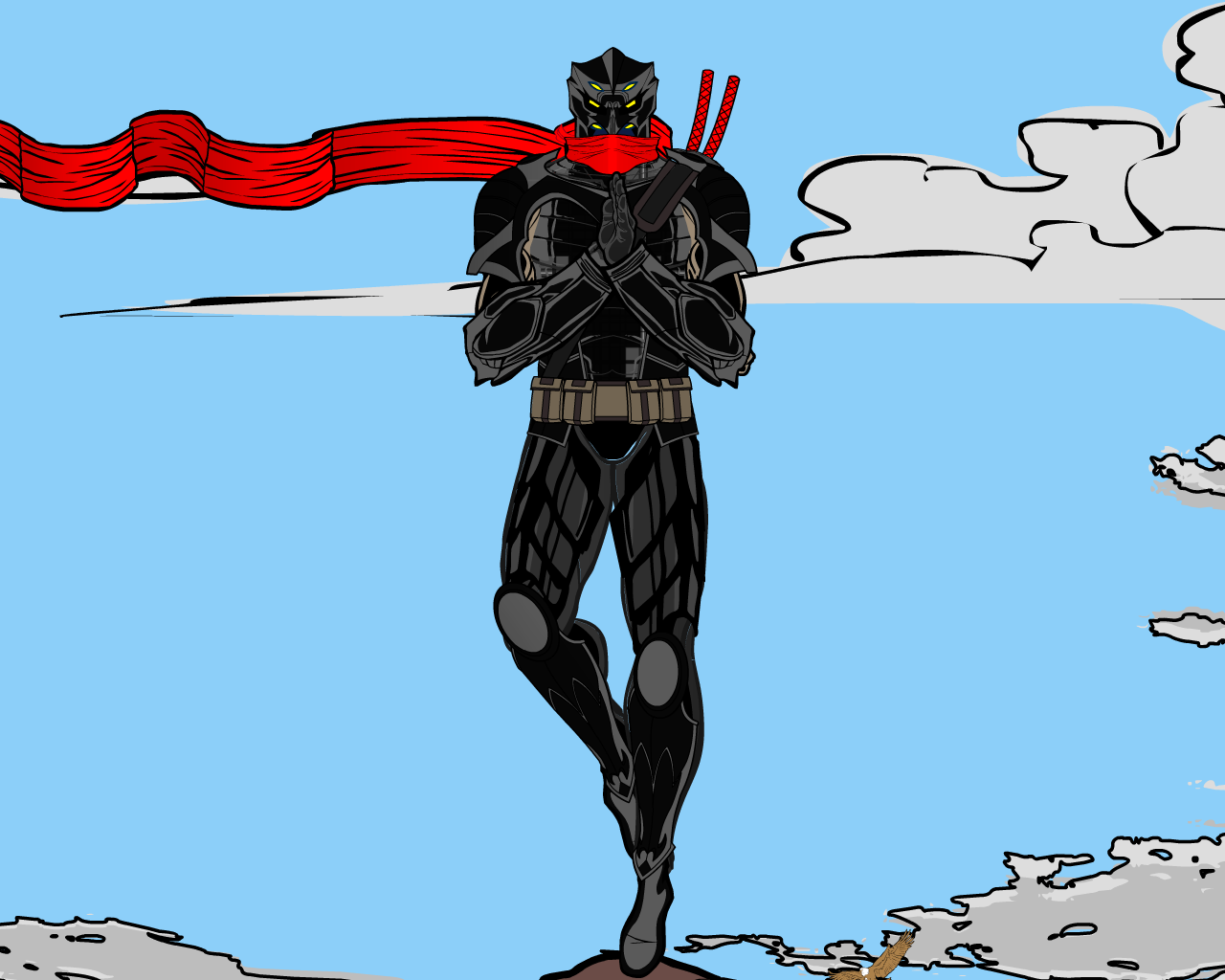
cosmosMemberUpdate without the lines. I am having some issues getting the full wide screen to save right. I actually would like him a bit off center but it doesnt seem to work.
 May 5, 2013 at 11:24 pm #23838
prswirveParticipantthat really looks neat! as if paused from a tv ninja manga show.
May 6, 2013 at 9:11 am #23857
WMDBASSPLAYERParticipantNice pic. It’s better without the lines. As to the hands, a better looking and real martial artist postion would be to have the knife hand, (flat palm), over the fist instead of in front. Or two flat palms, his left hand as it is and his right hand underneath, palm up. that should help get the meditative/energy gathering look you’re after.
May 7, 2013 at 3:00 am #23906
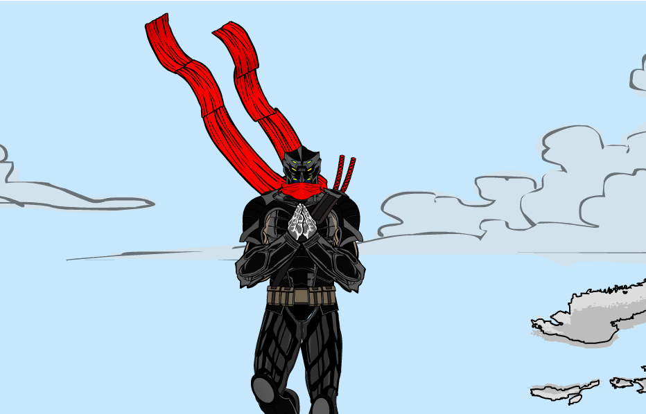
cosmosMemberI left the hands light color just for ease of others to give thoughts. This was the original hand pose i had done its similar to what you suggested but its two knife hands. Im experimenting with the Fist and knife at the moment. And just for the hell of it i moved and added a second scarf mostly just to mess with wind blown effects and that kinda style.
 May 11, 2013 at 4:55 pm #24286
WMDBASSPLAYERParticipantAre you familiar with the game Space Channel 5? This character reminds me of the head villain in Space Channel Pt.2.
-
AuthorPosts
You must be logged in to reply to this topic.
