
Home › Forums › The HeroMachine Art Gallery › UrbanVanguard's House of Cards
- This topic has 20 replies, 8 voices, and was last updated 7 years, 5 months ago by
 headlessgeneral.
-
AuthorPosts
-
January 14, 2018 at 2:06 pm #149142

UrbanVanguardParticipantHey all! I am UrbanVanguard and I’m new around here. I have been browsing around the forums for a while now, silently taking tips from some of HeroMachine’s greatest. I love all of the work I’ve seen so far and I can’t wait to start posting some of my designs! I hope you all enjoy my gallery!
So, let me give you all some back story on my first character and how I found HeroMachine. If you wish to just skip this paragraph and go straight to the art then be my guest, although you may not understand the name of this character or my gallery. So here we go!
Ever since I first learned how to use a computer I loved to make card games. Mostly trading card games in the same vein as Yu-Gi-Oh or Magic: the Gathering. I would design the cards in originally Microsoft Powerpoint – and as I got older, Adobe Photoshop and simply add images from google. It was my favourite thing to do but I always wanted to create my “own” card game. All of the games I had created were based on licensed properties like Star Wars or Marvel. So because I couldn’t draw for the life of me, I went searching for a way to make some art. I eventually came across HeroMachine which I quickly fell in love with. I have been practising and messing around on the site for about two or three months now and I finally made the first character for my game. I have learned from the best and I am really happy with how it turned out. So basically all of the characters I create are for my card game. Most of them will have superhero names and such but there are around eight characters – known as Champions – that have a name like “Champion of …” My first character is a ‘Champion of Strategy’. The goal of the game is to defeat your opponents champion so these characters are an essential part of the game with unique abilities. Anyway, if you read this entire wall of text then I applaud you and I hope that you enjoy my first character and the many more ideas that I have planned. You are now free to enjoy my art
 😉
😉Attachments:
You must be logged in to view attached files.January 14, 2018 at 2:36 pm #149144
amsParticipantWelcome, bud! Great first character and awesome highlighting and shading. Cheers!
January 14, 2018 at 3:39 pm #149145
UrbanVanguardParticipantThanks so much! I’ve taken a lot of inspiration from your amazing art, AMS.
January 15, 2018 at 3:56 am #149146
UrbanVanguardParticipantNot sure for this is the best place to ask this but i was wondering if any of you amazing people had any suggestions on the colour of peoples skin. I was partially satisfied with the colour and shading on my previous character but any suggestions. Especially for darker skinned characters as that is what I’ll be attempting next. Thanks!
January 15, 2018 at 2:38 pm #149154
SulemanParticipantWhen I’m creating a black character, I typically use custom colors, with a dark brown skintone as a base. I check the hex value and tweak the RGB values until I’m satisfied. I then use a lighter-colored highlight, typically something slightly red, like the “Midtone Asian Dark” skintone.
I don’t have a solution that always works, because there are so many possible skintones and different types of lighting. Play around, try all kinds of different base color and highlight variations, see what fits the character.
January 15, 2018 at 3:19 pm #149155
UrbanVanguardParticipantThanks Suleman! I’ve tried using custom colours before but it never really turns out the way I want it to. I probably just need to practice with the hex codes more. I’ll play around with it and see what looks good.
January 15, 2018 at 7:05 pm #149156
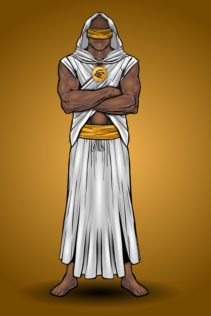
UrbanVanguardParticipantSo here is my second character. Once again, he is one of my universe’s Champions. I give you – The Champion of Insight (Ironic seeing as he is blind)
This character took a while to get right. The robes across his chest required a lot of masking to be able to go both over and under the arms. I believe the design consisted of nearly 300 layers but I could be wrong. The shading on his robes took quite a while but I think it turned out alright. What do you think?
I picture this character to use some sort of telepathy to see into peoples minds and to “feel” what is around him. He is a secluded and secretive guy and is sort of like an old sage character. I hope you like him and stay tuned for more characters to come!
January 16, 2018 at 7:23 am #149163
G. W.ParticipantWow. These are really good, especially the Champion of Insight. While it has a simple color scheme, the colors really pop out at you.
January 16, 2018 at 3:26 pm #149171
UrbanVanguardParticipantThanks gjc6664, before I did any shading I wasn’t sure how the colours would look because they looked kind of bland but after I started shading I really began to like it.
January 16, 2018 at 5:47 pm #149173
VengeanceParticipantgreat job on insight very simple design , but looks great , shading is on point
January 16, 2018 at 5:51 pm #149174
UrbanVanguardParticipantFor this character I decided to take a break from creating my Champions and create something different. So for my next creation, here is Poseidon! Greek god of the Seas and Oceans!

The design for Poseidon consisted of almost 600 layers as I was trying to give his pants a silky-oceany look to them. I also forced myself to shade every little bead on his staff in order to satiate my OCD :p
I felt like his hair and beard turned out alright. This is actually the first character that I have posted with hair and I wasn’t sure if it would look good but the blend of whites and greys makes his hair look more realistic to me.
I was also really happy with how I made his fishnet robe thingy. I used a robe piece from ‘male medieval common’ and then made colour 1 and colour 2 transparent. I then added a pattern to get those lines and I think it really completes the ‘god of the sea’ look. What do you guys think?
Hope you guys like this one. If you have any suggestions on what gods you would like me to make next feel free!
January 17, 2018 at 2:17 am #149177
SulemanParticipantThe colors do look rather wonderful! That being said, 600 layers is an awful lot. That level of detail is more than viewers can actually notice.
It might be a good idea to adjust the line color for the fishnet piece. Right now the outlines seem a bit too thick and dark for the rest of the item. Playing with line colors is fun in general!
Something about the forward foot seems off to me, but I’m not sure why. Maybe the forward leg should be a bit longer than the back leg, because of perspective?
January 17, 2018 at 4:33 am #149178
UrbanVanguardParticipant@Vengeance thanks! I love trying to shade flat objects to make them look 3D and the simple design I felt simply fit the character but I really dig it!
@Suleman I agree that while it looks good, a lot of the detail just kind of blends in. Maybe more simple shading is in order… although to be fair, most of those layers are on his trident as I had a highlight and a shadow on every bead of his staff. I’ll also try a different line colour for the fish net. I don’t really ever change the line colour as I like the contrast that the black lines give to the background but then again the fishnet isn’t on the background so I’ll defin try it!I see where you’re coming from with the perspective. I’m not that great at posing so it was kind of a basic attempt. I probably won’t bother fixing it but in future I’ll look at making them seem more accurate, perspective wise. Thanks for the input, I really do appreciate it!
January 17, 2018 at 9:19 am #149179
AnarchangelParticipantIt’s a little late but welcome to the forums!
You’re off to a great start.
January 17, 2018 at 12:22 pm #149182
UrbanVanguardParticipantThanks Anarchangel – your work has inspired me alot!
-
AuthorPosts
 😉
😉

You must be logged in to reply to this topic.
