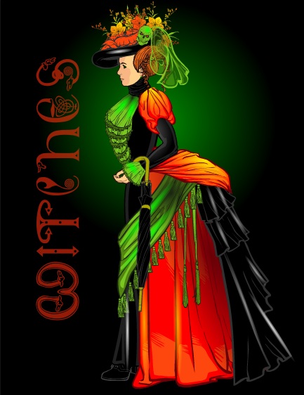
Pop Quiz Results

Our tribute to the leaves of autumn in the last Pop Quiz went really well! Here are all of the entries we received:

Continue reading

Along Came a Doctor

Along Came a Doctor

By: Andrew Hines

As many of you may already know I'm a Whovian (Doctor Who fan). That being said, my solitary heart skipped a beat when I saw this comic on the shelves of my local comic shop this week. It's got history, the Doctor, Amy and Rory, and alternate dimensions. No Daleks as of yet, but give it a few issues, they'll show up.  AnyWho (see what I did there?), it's set in London in the 1850s and in the middle of a bit of mild oddness. A perfect setting for an entrance by the Doctor and the Ponds.

Andy Diggle scripts the first bit of a two-part story arc that is actually very in the feel of the current Who-niverse. There's the classic shtick of the Doctor, where he just pops in unannounced and begins to take things over without much of a fuss. This is Doctor Who at its best in the comic book realm. The writing is good, pacing is adequate and the dialogue feels as if Steven Moffat himself were writing it for Matt Smith. Amy and Rory are exactly as they are in the show, so there's very little missing if anything at all.

Mark Buckingham's art isn't the best I've ever seen, but fits the story beautifully and for that I love it. If it had been in the future, his style would not have worked as well. Given, however that it was London shortly before their industrial revolution, it's spectacular. It works even better when paired with Charlie Kirchoff's colors. It really does feel like the 1850s as you read it. It's a wonderful feeling once you see the machine as a whole. I honestly don't think anyone else' art or colds would have worked for this story.

I give this one an "A", simply because the writing and the art work splendidly with each other. If you're a fan of Doctor Who and a Matt Smith fan to boot, I highly recommend this one.

Moognation Prize

I'm starting to work on the five winning prizes from Character Design Challenge 100. The idea here is that I will use their image as the basis of an illustration. It isn't necessarily to recreate the image they made, or to redraw it, but to do something inspired by it. After all the originals are already kick-ass, I don't know that I could really improve them at all.

First up is the number one vote-getter, Moognation's "Ninja". To refresh your memory, here it is again:

Continue reading

Pop Quiz: Fall

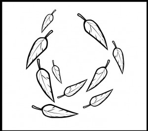
Happy Saturday, folks! The colors have changed here in Colorado, and my wife and I will be taking them in while on a hike today. So your one-day quick-fire challenge is to create an awesome image using the leaf aura from ItemRight-Energy:

You can use it once or a hundred times. It can be front and center as the main centerpiece, or a background element, so long as at least one copy is in there somewhere.

You only get one entry -- that's right, just one! So make it your best. Most of the other rules are the same as for a regular challenge, but instead of a whole week I'll announce my favorites some time tomorrow. Here's how to make an entry:


(Click to embiggen.)

I'll pick one entry as my personal favorite, which will get to be featured in the side bar to the right for ultimate glory! As a bonus you're allowed to say you won the Internet for a few days.

Good luck!

Facebook?

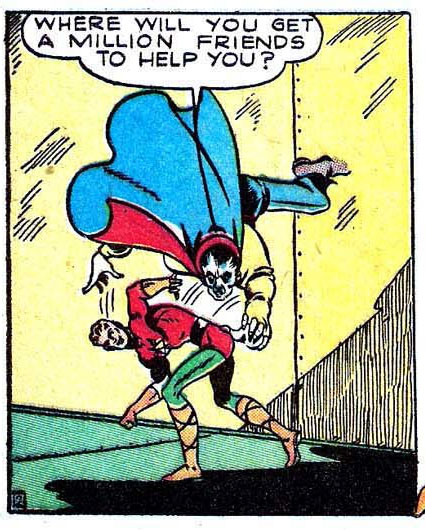
(From "Lightning Comics" volume 2, number 3, 1941.)

The Green versus The Grey

The Green versus The Grey

By: Andrew Hines

In the last few months, we've seen a few of the "old guard" join the fight for a better Earth. The ranks of the soon-to-be-formed Justice Society now include Flash, Hawkgirl, Green Lantern and Atom. We even see appearances and a mention or two of others in here that are among the founding members of the classic JSA. We even see Terry Sloan come back into the picture in a rather intriguing way. The Green and the Grey are going strong in both universes. Seeing that alone makes this worth a read. I can't reality say much here without bringing in spoilers, sorry.

James Robinson keeps surprising me at every turn, giving me everything I've been hoping for and even some stuff I didn't know I wanted to see. The pacing is good but not great, and the transitions are about the same. One page leads seamlessly right into the next. Even the concept of the Grey on Earth 2 looks fantastic. Then there are the inclusions of such folks as Wesley Dodds, the original Sandman, who is apparently from the Great White North. There is a mention of Jay "pulling a Ted Grant" which just filled me with fanboy glee. The dialogue is good, though not his best work. I can't decide whether the most fantastic part is Alan Scott's new take-charge attitude or the cliff-hanger ending.

The art is still good, with Nicola Scott being as awesome as she is. Trevor Scott is doing a good job on the inks, giving us decent lighting effects. Alex Sinclair's colors are good and make the roots that Grundy commands very organic/decayed in color. The team is doing a better job on every issue, slowly pushing onward and upward. The best look is on the Wolrd Army's Central Command Center. Despite the fact that it looks alarmingly like a room you'd find on the second Death Star, it's a really cool space. The World Army's uniforms are a nice touch as is Wesley Dodds' new look, particularly his gas mask.

I give this one a "B+" on account of the slightly slow pacing in this one. We don't really get much farther from where we ended in issue 4. I'd love to sit here and tell you that it's the best stuff I've ever read, but I really think he needs about 3 or 4 extra months to bring in everyone to the Justice Society.

Sharing Day: Good Reads edition

My question for you today is:

If a friend came to you who had never read a comic book/fantasy novel/science fiction novel before (your choice) asking for your advice on what to read, what one book would you give them to introduce them to the genre?

You only have to do one of the three (though you can do more if you like), but I'm going to take a crack at them all.

In science fiction, I always recommend they start with "Ender's Game" by Orson Scott Card. It's well written, with intriguing characters you really come to care about, and it's nothing so crazy far-out that it would scare them off.

If they're a religious person, I recommend "The Sparrow" by Mary Doria Russell. It posits that First Contact with an alien planet was made by a group of Jesuit priests. Only one returns, and the novel is about figuring out what happened. It's great science fiction, raises some excellent moral and spiritual questions, and is accessible to anyone even if they know nothing about sci-fi.

On the comics front, I'd probably go with the Frank Miller/David Mazzucchelli Daredevil collection "Born Again". (For a non-religious person, that's two religious books. Hmmm.) I think it's grounded enough in reality for anyone familiar with pop culture to be comfortable with, but with enough super-hero elements to be a decent introduction to the modern incarnation of the genre. Plus it's a gorgeously illustrated and written book.

Finally, on the fantasy front I think you probably can't go wrong with "The Sorcerer's Stone", the first Harry Potter book by J. K. Rowling. It has all the juicy fantasy tropes presented in a friendly way. If they were a darker sort of person, I'd go with Steven Brust's "The Book of Jhereg". Because it's written in first person, I think it's easy to get into the character's head, and I love the way that Brust makes the magical world very commonplace in the mind of the main character. After all, for him it's just normal; it's only magic to us. Or, if they're a more literary sort of person, I'd give them Brust's "The Phoenix Guards", set in the same universe but with different characters, told in the style of Dumas' "The Three Musketeers". It's just a rollicking good read all the way around.

Most of those (and more) can be found on my Amazon Listmania list of sci-fi/fantasy books that I love.

Now, your turn!

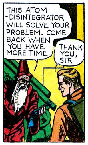
The moral of the story is, a disintegrator solves any problem. The End.

(From "Lightning Comics" volume 2, number 2, 1941.)

Forum Highlight: djuby

I knew djuby made fantastic illustrations, but wow, I had no idea just HOW awesome until at AMS' suggestion I checked out his forum here on HeroMachine.com. The images are simply outSTANDing. Here's a sample:


If you're looking for some inspiration, I highly recommend you check out his work. It's pretty incredible stuff.

Return of the Hobgoblin(s)

Return of the Hobgoblin(s)

By: Andrew Hines

With two and half months to go before the end of Amazing Spider-Man at #700, there really aren't any punches being pulled on this one. There've been some big changes in the least few months on ASM, but some of the biggest were Peter's "nobody dies" rule that he's been strictly enforcing wherever he goes. He thought he'd let himself down with Silver Sable's apparent death until the new Madame Web told him otherwise. Then there was the super-douche sidekick, Alpha and thankfully that didn't turn out at all. Now  the original Hobgoblin is back as is the third iteration who now works for Kingpin. Also, Madame Web/Julia Carpenter has been getting odd prophetic dreams of the world changing *spoiler alert* Marvel NOW! *end spiller alert*.

Dan Slott has done a great job on the last couple years of writing Amazing Spider-Man. The fact that the title is soon coming to a screeching halt hasn't deterred him from putting out great material. Getting help from Christos Gage on this issue didn't hurt. It actually gave us more awesomeness. We get more Peter Parker this issue, which I really liked. Seeing how he deals with his world beginning to unravel certainly doesn't hurt the story, in fact it makes it far more interesting. The inclusion of two different Hobgoblins is great as is Peter's visit to the Daily Bugle. I really can't find much of anything in the script that didn't work. Way to go, folks.

Giuseppe Camuncoli's pencils are a nice change of pace from Humberto Ramos' pencils in the last arc. Likewise with Dan Green's inks and Antonio Fabela's colors. The inks are good and clean and the color are more subdued, which I think works better than the overly contrasted work that some colorists go for. The title page (pg 3) and the spread on pgs 17 & 18 are the best examples of the spectacular work this team has done.

This is a better issue than the ones before in many aspects and as such, earns an "A-". The only thing stopping it from being a solid "A" or an "A+" is that it sort of feels like it's borrowing from DC on the double-page spread: dWLuh.jpg.