Pop Quiz 32 Results

Many thanks to everyone who entered our Halloween Pop Quiz! Your challenge was to design a mask like you might see someone wearing at a Halloween party, and you all did a great job:

While I think all of these are really well done, a few did jump out as particularly impressive. In no particular order, they were Debochira, djuby, Harlequin, Keith Kanin, and Scatman.

Out of those, I'm going with Scatman's as my personal favorite:

Thanks again everyone!

And Now For Something Completely Different

And Now For Something Completely Different

By: Andrew Hines

The great thing about DCU Presents is that you can just pick out the few with a storyline and characters that grab your attention. It's perfect for the picky completist in all of us comic geeks. This one in particular gives us two cool bench warmer heroes in one great starter issue. Blue Devil and Black Lightning have been relative unknowns for a while, with the exception of the latter's appearance in Final Crisis. I really can't recall much about Blue Devil, save for the fact that I always loved the idea of him. He was mentioned a bit in Infinite Crisis, but hasn't had a starring role in quite a while. Anyway, this might be the time to learn more about him.

Marc Andreyko's writing here is very good. The pacing is great as are the character introductions, both in and out of "costume". The setting of Los Angeles is really cool and not something we've seen yet in the New 52. Then there's the inclusion of what looks like both Spanish and Portuguese. That alone is more than other writers have done in a long time. The interaction between Daniel Cassidy (Blue Devil) and Jefferson Pierce (Black Lightning) is about what you'd expect when a new superhero meets someone dressed like the devil. It ain't pretty. Again, gotta say that the pacing is pretty good for a four-part story arc such as this.

The art team is awesome as well. The pencils from Robson Rocha are pretty damn good. The interior page on the right should be all the proof you need. Every other interior page follows this level of awesomeness. As you can see, Oclair Albert's inks work very well with Rocha's art. There's almost exactly the amount of shading you'd expect from late night in L.A. Gabe Eltaeb's colors sort of pull everything together. Even better than this creative team, I think, are the costume designs themselves and the effects that the team has given us. Danny's suit in particular is just a huge step up from the old days. The same can be said for most of Jefferson's costume, with the exception of the Booster Gold-style headgear/glasses.

This ends up just being a great issue and a wonderful start to what could be the best DC Universe Presents storyline so far. This get's a straight "A".

Gotta Clear This Up

There seems to be a misunderstanding about who does the reviews. While Jeff takes care of the site and the regular posts, I (Andy aka McKnight57) write and post all of the reviews. There seem to be a few comments to these reviews that are addressing Jeff. Just wanted to be clear on that. I'm not annoyed so much as I honestly don't know if he's reading all of the comics that are being reviewed here.

Return of Lady Shiva

Return of Lady Shiva

By: Andrew Hines

There's been a lot going on in Dick's life since #1. His old "home" came back to town. (The dude grew up in the circus. It's complicated.) His old buddy came back from the dead, became a freelance assassin and came after Dick. Then, Mr. Grayson got handed ownership of Haly's Circus. He wants to employ everyone in a concrete location at the old amusement park of Gotham. Add to that someone framing Nightwing/Dick Grayson for a double homicide. That's where things get tricky. He's thwarted that and now two of his deadliest enemies have returned to Gotham.

Let's have a moment of silence for Kyle Higgins leaving Nightwing for this issue and the next. . . . Okay, now let's deal with Tom DeFalco's writing. Suffice it to say, it's average. Better than even the writing of Liefeld, but then again, it's Liefeld. DeFalco gives us some interesting pages, but it's not the best pacing. The dialogue is alright, but only really shines in a few panels. The action sequences are written well, but then we're partly back to the issue of pacing. Then there's the fact that the issue is supposed to be about Lady Shivabeing back in Gotham. She's only there for a page or two and has absolutely no lines. The writing could be a lot better, so here's me looking forward to issue 15.

Andres Guinaldo's art is pretty good and feels pretty consistent from issue to issue. the pencils are great and the different angles don't really change the look of the character much. For some artists, this is a problem, but Guinaldo, as I said, is quite consistent. Mark Irwin's inks lend themselves nicely to the nourish setting of Gotham. It pulls the pencils and colds together pretty well. This leads me to Rod Reis' colors, which are superb as usual. The dude rarely misses a beat. He really puts his all into it as is shown in the lighting on the page shown at right.

All things considered, this issue earns a "B-", which is probably the lowest grade I've given an issue of Nightwing to date. I say buy it if you're a completist or for the artwork, not the writing.


Pop Quiz: Halloween Masks

With Halloween in the U.S. fast approaching, I wanted to share this awesome article from Lifehacker about making your own custom vacuum molded masks. It sounds like so much fun! But since I can't code that into HeroMachine, instead I'll challenge you to create your own Halloween mask in the program. To be clear, I just want the mask, nothing else -- no bodies or backgrounds, no elaborate full costume. All I want is an image of a mask you might find in a store that someone would wear to a Halloween party.

You only get one entry -- that's right, just one! So make it your best. Most of the other rules are the same as for a regular challenge, but instead of a whole week I'll announce my favorites some time tomorrow. Here's how to make an entry:


(Click to embiggen.)

I'll pick one entry as my personal favorite, which will get to be featured in the side bar to the right for ultimate glory! As a bonus you're allowed to say you won the Internet for a few days.

Good luck!

It's never lucky to have a guy dressed like that come on you.

(From "Cat-Man Comics" number 2, 1942.)

A Force to be Reckoned With

A Force To Be Reckoned With

By: Andrew Hines

I've been an Image/Top Cow fan for a long while. I'm talking since the beginning of The Darkness, back in '96 and WildC.A.T.s before that in '92. The former is also the length of time I've been a Marc Silvestri fan. They'vd always managed to have really dark sic-fi type characters. Cyber Force is no different, save for the fact that it's one of the very few teams in the Top Cow universe. I'm especially a fan of characters like Aphrodite V, Cyblade and Ripclaw. The fact that this first issue is free certainly doesn't hurt anything. Yeah, that's right. FREE. Rethinking whether to pick it up now, huh?

The writing by Silvestri and Matt Hawkins is a good start for anyone who's not all that familiar with the team. The pacing is good and it introduces most of the characters in one fell swoop. I like that it keeps a more suspenseful tone in the beginning, but gives way to more of an action-adventure/fantasy tale. For including nearly everyone in the first issue, it does a good job of not straying too far from the core elements of the story. The dialogue isn't the greatest I've ever seen, but it does the trick. There's slightly more expository dialogue than necessary, but at least it's not George Perez' Superman scripts. Thankfully the narrators do a great job of setting up what we'll be seeing in the future.

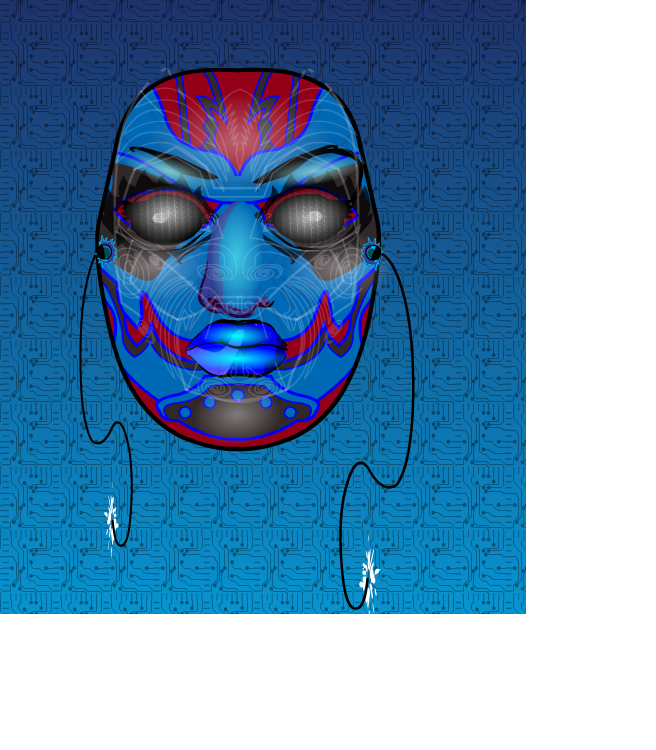
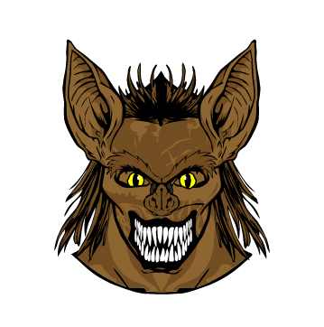
The art by Khoi Pham is pretty damned good. Not Silvestri good, but close enough. He gets the different looks of the characters down, with the necessary updates as required. Sal Regla's inks aren't nearly as heavy as what you might see in darker titles, such as Darkness and Witchblade, but it's actually pretty balanced. Sunny Gho's colors are really good, as he keeps the effects specific to each character. Where Heatwave and Impact seem much more battle damaged, Cyblade and Ares prime appear fairly polished. I mean, just look at the dome on that dude. It's somewhat similar to Silvestri's work without really looking as though he's copying it. I really like the character designs the backgrounds too.  I haven't really said much about those, because this is the first time I can't see the characters any other way.

This is a good start to a promising series. I give it an "A-", based solely on the fact that I know something better is just around the corner. It's a great jumping-on point for anyone who was ever curious about Cyber Force.

Open Critique Day #48

My full-time (non-HeroMachine) job might keep me from actually getting to these before this evening, but it's time for another Open Critique Day!

If you have a HeroMachine illustration or another piece of artwork you've done that you'd like some help with, post a link to it in comments along with your thoughts on it -- what you think is working, what you're struggling with, etc. I will post my critique of the piece, hopefully giving some tips on how to improve it.

Of course everyone is welcome to post their critiques as well, keeping in mind the following guidelines:

  • Make sure your criticism is constructive. Just saying "This sucks" is both rude and unhelpful without giving specific reasons why you think it sucks and, ideally, some advice on how to make it better.
  • Each person should only post one illustration for critique to make sure everyone who wants feedback has a chance.
  • I will not critique characters entered in any currently running contest, as that doesn't seem fair to the other entrants. You can still post it if you like for the other visitors to critique, but I will not do so.

That's it! Hopefully we can get some good interaction going here and help everyone (me included!) learn a little bit today.

Attention Batman, this is how REAL detective work is done!

(From "Lightning Comics" volume 2, number 4, 1941.)

Sweet Car, Bro

Sweet Car, Bro

By: Andrew Hines

He's actually doing better than ever in this issue, which is awesome. We see Kate Bishop again, which always makes for an interesting comic. Clint seems to still be acting as Kate's "superhero big brother", despite no such program existing. This issue seems to revolve around a 1970 Dodge Challenger, a redhead and the, I'm quoting Clint here, "Tracksuit Draculas" from the first issue, bro. See what I did there? Probably the best part of this issue, okay, there are 2: the car and the trick arrows. If you can find anything better than that, let me know.


Matt Fraction is still writing this awesome piece of comic literature. It feels like an action movie in almost every way. Not just an action movie but the classic Steve McQueen Bullitt-type action movie. The narration is really good and seems to fit Clint's personality really well. Bringing Kate back on this one seemed to help the story quote a bit. The dialogue was good and rather fitting for each character. The pacing works, as does the Sunset Boulevard flashback-style intro. It's also cool to see the bad guys from the first issue too.

David Aja and Matt Hollingsworth are still bringing their signature styles. Aja's artwork is still great and fitting of the story being told. This is just great artwork and coloring. Period. There was no panel out of place or anything of the sort. It was as close as anyone could get to perfect interior artwork. Even the cover was phenomenal. It feels like the stylized intro to a James Bond movie, which works for the sort of stories we've had in the last two issues.

This is possibly the best comic I've read in along time, partly because each one feels like a standalone issue. I give this a rare "A+" simply because it's fully deserved.