
Home › Forums › The HeroMachine Art Gallery › LiveWyre’s Freelance Comics
- This topic has 767 replies, 70 voices, and was last updated 4 years, 7 months ago by
 ams.
ams.
-
AuthorPosts
-
May 30, 2013 at 5:31 pm #25525

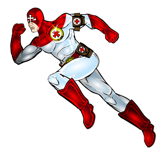
RobMParticipantThe cross on the mask is a really great addition.
May 31, 2013 at 3:28 pm #25598
livewyre1014ParticipantAnd here he is, the super speed medic…EMS!!!
 May 31, 2013 at 8:09 pm #25614
amsParticipantVery cool!
June 1, 2013 at 10:32 am #25647
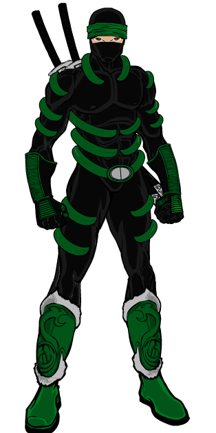
livewyre1014ParticipantUp next…a mercenary ninja assassin…the Shadow Serpent!!! Opinions or critiques before I polish the design are, as always, welcome.
 June 1, 2013 at 10:42 am #25648
VampyristParticipantNice, my only critique is that the ribbing seems flat. This can be fixed by zypping, though it may also be done by darkening color 2. I’d suggest a mix of the two. Good job on him either way.
June 1, 2013 at 6:44 pm #25654
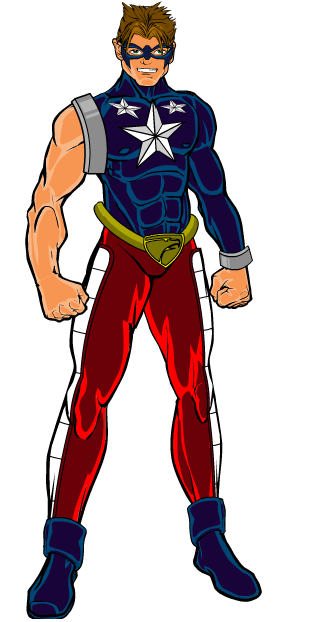
livewyre1014ParticipantHere’s a concept Im working on…working name is the All-American!! What do you guys think??
 June 1, 2013 at 6:55 pm #25656
Alexander of LimboParticipantvery nice, however the arm and wrist bands appear to hover/ But otherwise very nice
 , just don’t give him a shield =PJune 2, 2013 at 10:21 am #25680
livewyre1014ParticipantHere’s the finished All American!!!
 June 2, 2013 at 3:17 pm #25684
Alexander of LimboParticipantvery nice
June 3, 2013 at 6:59 am #25704
ScatmanMemberthe only thing that stands out from the shadow serpent is the eye area looks alittle off.maybe weaking a bit would bring the eyes some good placement.I usually do the face with a already made face to place the eyes and nose,then go ahead and cover it with the mask.Just a suggestion.otherwise I too love that ribbibg idea,cool character!
June 3, 2013 at 8:49 pm #25744
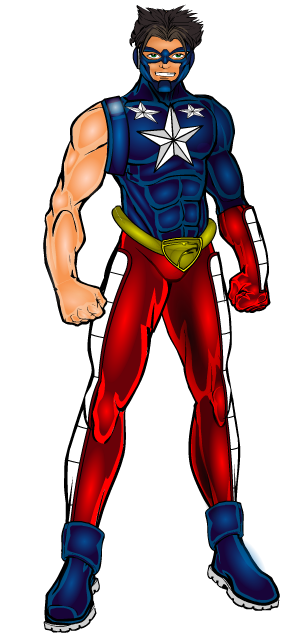
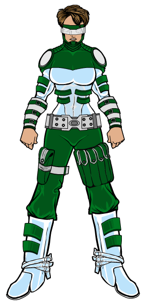
livewyre1014ParticipantWorking on some designs for a writer friend of mine. He’s working on an AMAZING series of stories, and I’m helping him design the characters. I promised not to give away any or his story ideas, but I wanted y’all’s ideas on some of the concepts I’ve got. All I can say about this one is she is a “super soldier” kinda archetype. Thoughts??
 June 4, 2013 at 7:55 am #25753
ScatmanMemberThe uniform is great,it’s the lower half that looks alittle large.The legs and feet seem to bloat as you go lower .other than that I really dig the design.And if you meant to give it that strong stance look than don’t do anything.I hope I was a help.
June 4, 2013 at 8:08 am #25755
livewyre1014Participantyou are always a help my friend. Thanks.
June 4, 2013 at 8:55 am #25760
amsParticipantGreat design. I agree with Scatman about the lower half looking bigger. I think it’s just the boots though that need to slim down a bit. I would also flip the green “buckles?” on the boots to keep the curve lines parallel with the top of the boot lines. Raise the whole head to show more of the neck and drop the hand and glove items lower to increase arm length. Colors are bang on. Can’t wait to see it when you trick it out with the highlights. Cheers!
June 4, 2013 at 10:47 am #25764
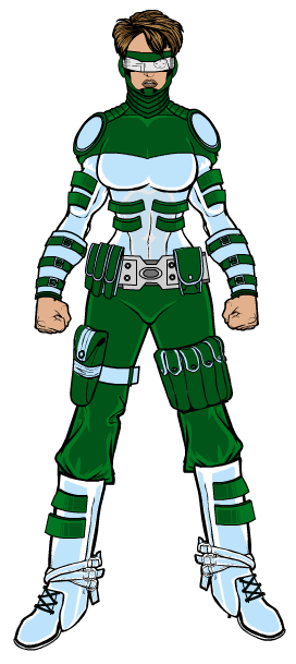
livewyre1014ParticipantThank you to AMS and Scatman for their help with this one. Two of my favorite machiners helping me out like that is pretty awesome. Does this second draft look better??

-
AuthorPosts
You must be logged in to reply to this topic.
