
Home › Forums › The HeroMachine Art Gallery › asubtledagger's characters
- This topic has 59 replies, 11 voices, and was last updated 9 years, 1 month ago by
 hawk007.
-
AuthorPosts
-
January 28, 2015 at 6:07 pm #119510

asubtledagger28ParticipantReally nice character, but that hand is bothering me… in real life it doesn’t turn that way and it would be equally nice if it was with the other arm (the one that is turned around) and with the hand upside down.
Thanks Trussos. I totally agree with you about the hand. I forgot how gnarly it looked… I should’ve put a bit more effort in on that one.
January 30, 2015 at 6:28 am #119556
GuyGenesisParticipantGoing to post this…
Dazzle Shadow

…(traveling from one shadow to another)!
A few things if I may, the hand is a simple fix just needs an arm positioned to match, and the colors are too dark, the details are lost in it. I included a text file with a few examples including how to fix the arm and hand and masking the background image onto the character to give the appearance of transparency while keeping it cleaner without showing everything layered underneath (I discovered this technique while creating a character phasing through a wall). To hide the extra insignia and/or background (red outline) used for masking I either mask to another piece(each item can only hold one mask) on the character or simply make it transparent.
EDIT* Use txt 1 (I don’t know how to erase the other and had the masked background colors off)
Attachments:
You must be logged in to view attached files.February 3, 2015 at 5:44 pm #119732
asubtledagger28ParticipantA few things if I may…
Thanks GuyGenesis, I appreciate you taking the time to share some fixes for the hand and arm and some tips/tricks for giving the appearance of transparency.
February 3, 2015 at 10:24 pm #119737
GuyGenesisParticipantI don’t want to step on any toes, though I’m always willing to help if I can.
How to put this?
HM is a fantastic program with many great artists. The possibilities of what can be done are nigh impossible. You have your solid character designers, the “zyping”(shading) masters, those that truly have an eye for color, some that can pose like nobodies business, others that can take a predefined style and make it not only their own but completely recognizable from others(a feat in itself), and still more willing to try new things which sometimes don’t work, but when they do you find they’ve created something special in a way that makes you appreciate the programs capabilities all over again, for they’ve pushed past its’ perceived boundaries. Of course there are still, including the formerly mentioned, machiners that can do it all to some extent, and there’s always the up and comers bringing their own flare to it, but as with the program we all have or strengths and weaknesses. When someone excels at one aspect another usually falls short, and that’s not intended a knock on anyone or even the program itself. Personally I’m proud of my designs overall (I feel this is what I do best), I can do a little posing, but I find it becomes increasingly harder the more dynamic the pose to cloth them where most items are designed for and thus I stick to the base figure. I can do a little shading, (I feel my faces become too muddied, but due to a great community I know I can look to AMS or Candruth, among others for help in overcoming this weakness) whereas I also find it very time cosuming and thus wave the results which truly speak for themselves. I kinda lost the point I was trying to make somewhere alongside Han(within the wall). Anyways if for whatever reason a dynamic pose is not on your radar(its’ usually not on mine), sometimes something as small as arm placement can still achieve the desired effect.February 22, 2015 at 6:32 pm #120334
asubtledagger28ParticipantI have been working on this guy for a while but can’t come up with anything that i am happy with. He can live here for a while so I can come back to him later. Gonna take a break and move onto something else.

Here’s a revision with more highlights and shadows not sure if I like it any better or not:
March 1, 2015 at 7:17 pm #120699
asubtledagger28ParticipantHaven’t spent a lot of time machining lately, but have been trying to work on this guy a few minutes here and there. The pose was from agatharights. He goes by the name Zathruk.
March 6, 2015 at 8:21 pm #120954
asubtledagger28ParticipantThinking of going back and touching up a few of my characters. Comments/suggestions always welcome. Here is the original Otsu and the revised version:
 March 8, 2015 at 9:59 pm #121066
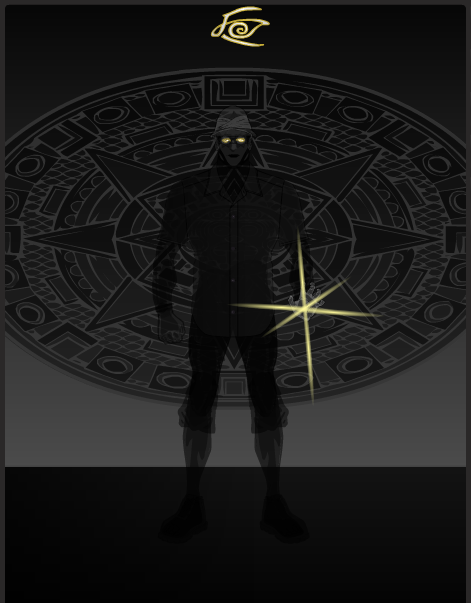
asubtledagger28ParticipantI’ve been trying to make an energy character and after many hours this is all I have to show for it. I’m gonna post and walk away for a while. Any suggestions for improvement are welcome.
Red Man:
March 9, 2015 at 9:00 pm #121143
asubtledagger28ParticipantI have been working on this dude tonight and think its worth posting.
Sasquec:
 March 10, 2015 at 10:00 pm #121232
asubtledagger28ParticipantHere is my entry form the Mage Contest. I added some more shadows and highlights to her.
Maggie Mage:
March 15, 2015 at 8:06 am #121410
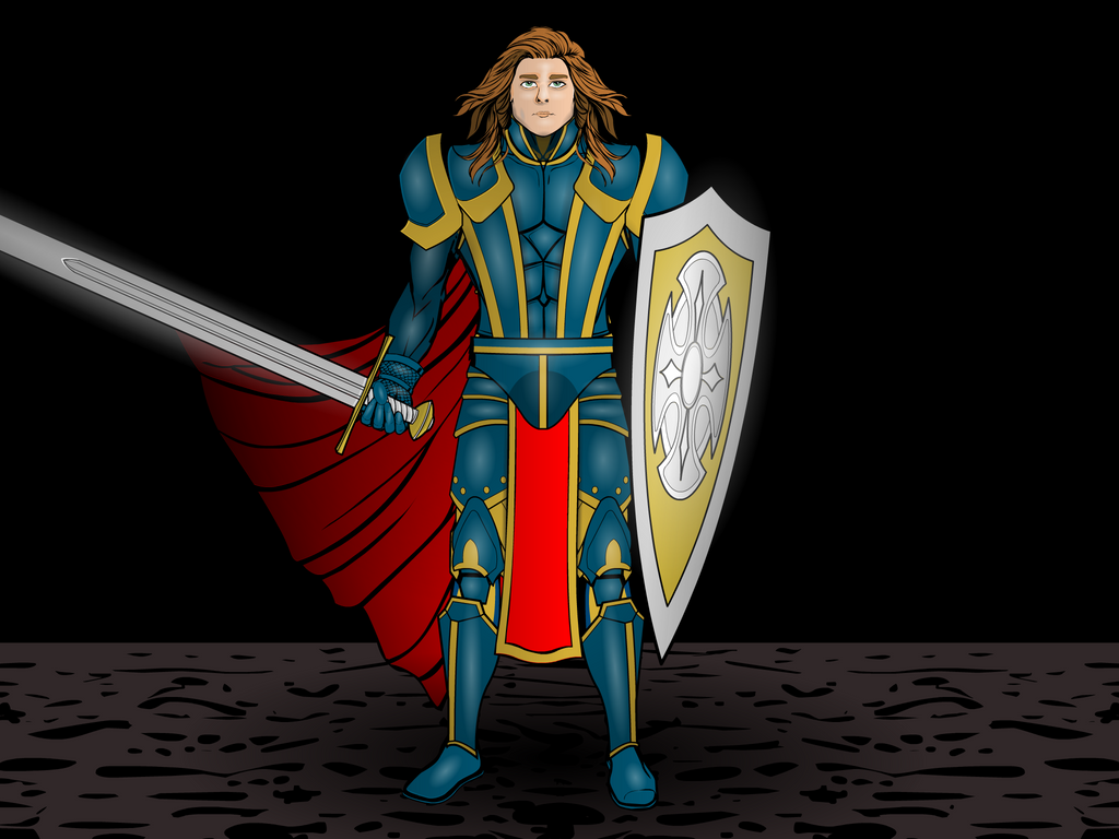
asubtledagger28ParticipantThis is my submission for the Paladin contest.
Tarakk the Virtuous:
March 15, 2015 at 10:00 pm #121434
asubtledagger28ParticipantThis guy’s been bugging me for a while now. He was one of my first HeroMachine attempts. He is the Original Canadian Shield. He has since passed on the torch but 40 years ago, this is how he should have looked. I’m still not satisfied but for a quick revision this makes up a little bit for what the original design lacks. Redoing characters is where my head’s at lately in between contest work. It’s an interesting process to try to honour the original design/concept but improve it. Revisions, revisions, revisions. As I see in other machiner’s posts, most works are never 100% fait accompli.
Here was my first attempt from my early days with HM3:
March 16, 2015 at 12:47 pm #121468
asubtledagger28ParticipantAnother redo. On holidays and spent the morning machining. Productive use of time off? That’s up for debate. Here is an updated version of Haywyn:
Here is the original version:
 March 16, 2015 at 6:34 pm #121482
GuyGenesisParticipantRedman – Is a very solid design, the only thing I could suggest is some highlights to break up the color, but I think its’ great as is.
Maggie Mage – I like the way you used the cape as a dress, I almost didn’t notice it and the energy effect on the staff especially the handle is very well done. A simple yet solid design, though I wonder if the hood shouldn’t be part of the golden cloak?
Canadian Shield – Like the update better, the pants seem too dark(maybe try some light highlights), and probably because of the pants the feet seem to small
Haywyn – I like it. You kept the design and basically just detailed it
For someone who doesn’t use many highlights I sure suggested them enough, I’ve just noticed from others works that they break up a solid color.
March 17, 2015 at 8:55 pm #121557
asubtledagger28ParticipantThanks @GuyGenesis. Solid feedback. I will try some highlights on Redman, I agree this would break up the colour. Any suggestions for a name would be much appreciated. Naming is not one of my strong points.
You know, I tried the hood in gold and I didn’t like it myself, but now that you mention it, a gold hood would probably better suit the design. I might go back and experiment a bit more.
I agree that the Canadian Shield’s pants seem too dark and that the feet seem too small. I will tweak at some point.
I appreciate having an objective set of eyes looking at these and value your feedback. Thanks for your time.
-
AuthorPosts


You must be logged in to reply to this topic.
