Home › Forums › The HeroMachine Art Gallery › Sabrina's Characters
- This topic has 23 replies, 10 voices, and was last updated 8 years, 8 months ago by
Sabrina.
-
AuthorPosts
-
October 21, 2014 at 7:51 pm #113686
SabrinaParticipantThis is my first time every posting any art on here. I’ve had a few weeks now to use HeroMachine and I’m semi-getting the hang out it. Just for fun, however, I wanted to show how my artwork has evolved in that short time span.
Note that the character names are not my favorite… but they work. I am the game master for an RPG and both of these names were made up on the fly because although I had created the characters, I hadn’t expected my players to run into them yet. Thus I hadn’t picked out names. The names actually don’t belong to the characters themselves, per se, but their armor. (I won’t bore you with the details.)
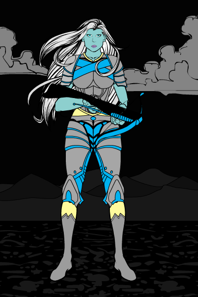
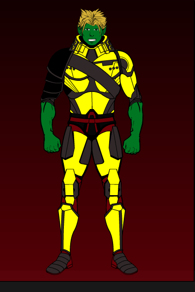
Here are my original attempts to create Xena and Xelpho: (I’m really not proud of Xelpho’s name :/ Oh well…. They had to match with a player character’s armor named Xenos, so I said the first thing I thought of. Alien-sounding names are my weakness.)

Old Xena

Old Xelpho
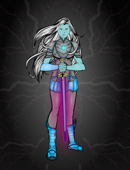
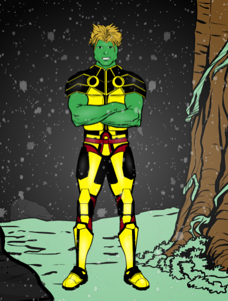
So those are pretty much the worst images to ever be uploaded to the forums, right? (I don’t even know what’s up with that random grey box at the bottom.) But after I figured out how to use HeroMachine I recreated them…

New Xena

New Xelpho
…and they’re still pretty bad. But they’re better! And they’re much closer to my original vision. (Xena still needs work. I’m going to try to fix her hair.) I’m still figuring out how to use the basic shapes as they were intended, let alone be super creative. But I’m improving in that too.
I’d just like say thanks for all your tips, tricks, and patience with my questions. My character certainly leave much to be desired, to put it nicely, but I’m getting there. 😉 Thank you guys!
October 21, 2014 at 9:47 pm #113695
amsParticipantWow! Awesome evolution in just a few weeks. Great job.
October 23, 2014 at 4:21 pm #113780
NugParticipantWelcome to the forums, Sabrina! Good to see you here! Nice work so far… keep em coming! 😀
October 23, 2014 at 6:17 pm #113782
hawk007ParticipantI’ve seen worse. By me (though I never posted them). Don’t worry, the old ones are still pretty good, and the new ones are pretty good, too. The names aren’t horrible, in my opinion. The shading looks pretty good, too.
October 23, 2014 at 10:45 pm #113805
StulteParticipantHey, I was hoping you’d make a gallery!
Really like what I’ve seen of you so far, looking forward to seeing more.
October 31, 2014 at 12:28 am #114144
SabrinaParticipantThanks for the encouraging comments! I owe hawk007 for explaining how to use the pattern objects to shade. Originally I was trying to do repeating circles of different gradients stacked on top of each other to create a similar effect. A single highlight could take up to thirty circles (if I was being lazy that day), so finding out that there was a much better way was appreciated.
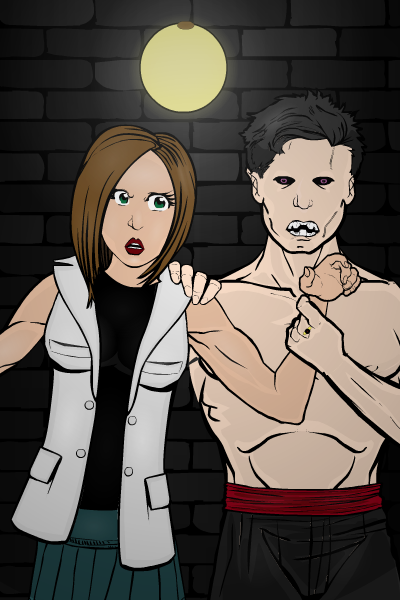
Here’s something inspired by the current contest:
Distraught over the death of her long time boyfriend, Jessica felt herself drawn to her father’s laboratory as a source of comfort and removal from the world. His research involving the creation of life fascinated her. Over time, Jessica found herself wondering what would happen if she tried to return life to a body that had already lost it…
Needless to say, I think Jessica was hoping Derrick would come out of her experiments a little more loving and a little less… bloodthirsty.

What did I learn from this project? I experimented with using shades instead of just highlights and I’ve decided that shadows are harder, but still fun to do. Actually, all the highlights in this image are very subtle and if I didn’t know where they were I might not see them. (Except for a few on the girl’s face that might be too prominent; I’m not sure.)
I didn’t do much beyond using the objects for what they were intended, though, unless you count Jessica’s body actually being a head. But doing the light on the wall was fun. It doesn’t look anywhere near as cool as it did before I put a layer of darkness over everything, but everything in the image just felt too bright. It was a necessary sacrifice.
Thoughts? I’ve love any feedback on improvements you guys recommend. 🙂 As always, this community continues to inspire me.
October 31, 2014 at 1:50 am #114146
JR19759KeymasterHow did you add the layer of darkness can I just ask. Because it seems that it’s uneven between the foreground characters and the background scenery, as if the characters are lit by a different light source than the rest of the pic. What I would suggest is using the dark-> light gradient circle (rather than the light-> dark gradient circle used for shading/ highlighting) and remove the 2nd colour and place it so it covers the whole picture as the top layer. If you then experiment with the placement you can get some really interesting atmospherics that look natural on both background and foreground at the same time and still work with shown light sources, such as the light in the background.
Hope this is helpful. Keep up the good work.
October 31, 2014 at 6:19 pm #114170
SabrinaParticipantThanks for the tip, JR19759! That’s actually what I attempted to do, but there’s a very good chance that I placed it off center or did something else with it that made the lighting rather awkward. Or it could have been some combination of the lighting underneath that particular pattern that didn’t blend well.
I think you’re right though. The light is set more in the background, so the light should be coming from behind them, versus shining on them from the front. (Unless there’s another light on the opposite end of the hallway that we can’t see… but seeing as that wasn’t intended, using that as a cop out doesn’t feel like a valid excuse.)
If I rework this image I’m thinking I will try having the light come from behind the characters, sor tof like what you see with a silhouette. Again, thanks for the advice!
November 2, 2014 at 11:32 am #114226
StulteParticipantYes, the shading is very subtle. I honestly wouldn’t even think it was shaded unless you said so. Like you say, if you don’t know they’re there it’s very hard to see the highlights.
Don’t be afraid to make the shading more prominent. You can get some great results by overdoing it, so to say.
That being said, the picture is very good. The faces and the posing work very well with the narrative.
November 26, 2014 at 7:05 pm #115624
SabrinaParticipantThanks for the tips! I think I’m getting better… albeit at a snail’s pace. I haven’t done anything lately that was worth posting.
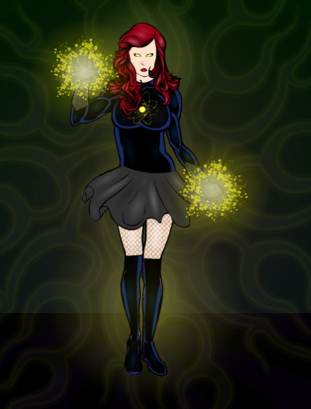
Just for fun, I decided to enter the current contest and redesign Legatus’s character Fusionella.
Here’s the link to his thread (to give full credit where credit is due): http://www.heromachine.com/forums/topic/the-legatus-universe/page/26/
And a direct link his image: http://www.heromachine.com/wp-content/uploads/2014/11/Legatus-Fusionella.png
So I took a stab at it. Originally I had a much more dramatic pose but then I kept having issues making it look right… so I ended up doing a “static” pose. I tried to make it a little more fun with the skirt, but it’s still pretty lame.

At least I was a tiny bit more daring with the shading. (Emphasis on the word “tiny”). I still have this aversion to doing it really dramatically, an aversion which I am completely aware of.
I think I may have rushed this character a bit because I’m heading to California in a few hours and I wanted to get it done before the trip. If anyone has some tips on doing boots on non-standard legs, they would be much appreciated. I wanted to keep the blue tone on them that Legatus had in the original, and masking the boots over the legs doesn’t look quite right. I did it anyway, but I’m wondering if any of you wiser folk have a better idea. 🙂
November 26, 2014 at 7:35 pm #115625
Maverik1313Participantnice work I’m still iffy on shading as well but I make due keep up the good work:)
December 20, 2014 at 2:04 pm #116692
SabrinaParticipantMost of the characters I create are rather simplistic, because I’m the Game Master in a rather new campaign that needs filling with lots of villains, allies, and those in between. I haven’t had a chance lately to do anything on HeroMachine simply for the sake of playing with HeroMachine.
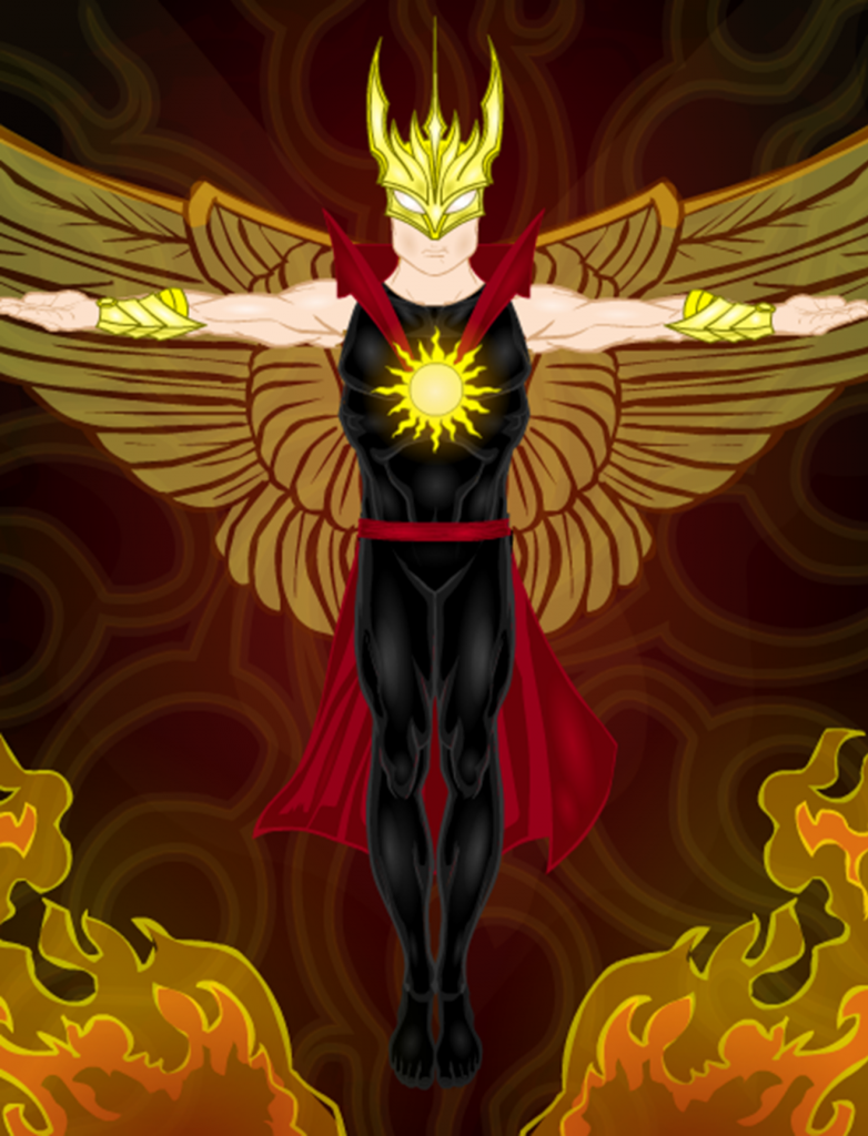
Here’s a villain that my fellow players will run into soon:
(Sorry it’s blurry; export never seems to work for me so I have to do a screen capture. The end result is that my images are always rather blurred.)

His name is Sunstrike and he’s got an axe to grind with one of the PCs. Heatstroke, a character played by a member of our gaming group, has tremendous power. Yet he also struggles with insanity. His family has been plagued with these abilities for several generations, and the powers have been known to consume many of them. Heatstroke’s mother nearly killed all of her children when she started receiving psychic visions of her eldest son, Andrew (or “Sunstrike”), destroying entire worlds in a fit of rage. She went insane because of the horrors she could perceive and set fire to their house. Her husband separated their three children in hopes of protecting them from themselves and each other.
Sunstrike and Heatstroke haven’t seen each other since they were very young and are unaware that they are brothers. But the fact that their powers are remarkably similar will very likely arouse suspicions from both the PCs and the players.
I’m excited to see what they make of him. 🙂
December 22, 2014 at 9:41 pm #116789
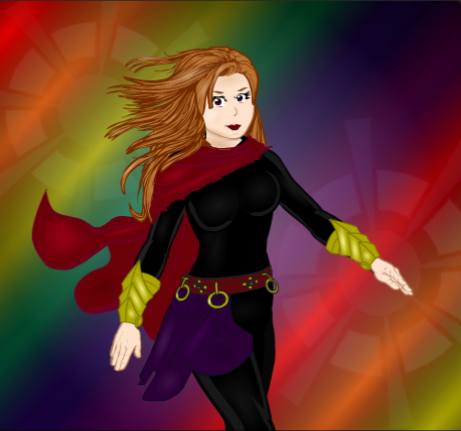
SabrinaParticipantI tried many different experiments with this character, all of which went horribly wrong. The posing looks somewhat off to me, but I can’t pinpoint the problem. I made the torso using insignias, so I didn’t have much to go off of. The shading on the face looks awful. The coloring is bad. I’m not sure I really like that background.
I’m going to post it anyway because I plan on redesigning her at some point and it would be fun to see her evolution. Any critique is welcome, but I know during the holiday season most everyone is going to be busy and I don’t expect anyone to be checking the forums all that often.

She could be a lot worse, I suppose. She could be like my earlier characters. 🙂
December 23, 2014 at 12:53 am #116794
JR19759KeymasterI think you’re being a bit harsh on yourself there. The colouring isn’t that bad, the only bit that really needs looking at is the cape, because the line colour needs to be darker (maybe go into custom colours for that bit). I’d also change the left hand, because it’s a right hand on a left arm (not much flexibility with the item choice there I’m afraid). Oh and maybe add a right ear, just peaking out from behind her hair? I can’t really comment on the skin shading on the face, because I suck at shading skin (as this weeks Character Building video proves).
But apart from that, I really like the background, I mean, I REALLY like the background. I love the fade to black in the top left corner, it looks so natural. Her expression and pose are pretty good as well, kinda sassy. So yeah, it’s not as bad as you think, you just need to make a few minor adjustments.
December 23, 2014 at 4:25 am #116797
Herr DParticipantYour Nov 26 pic might benefit from masking a rectangle gradient to the boot. That will shade for you if you apply the right colors. You’ll need to play with it until it looks roughly like a cylinder. Also you might try masking to multiple transparent boots for more complicated fx. Shading doesn’t come easy to me at all–I usually try to get out of it on faces anyway.
-
AuthorPosts
You must be logged in to reply to this topic.

